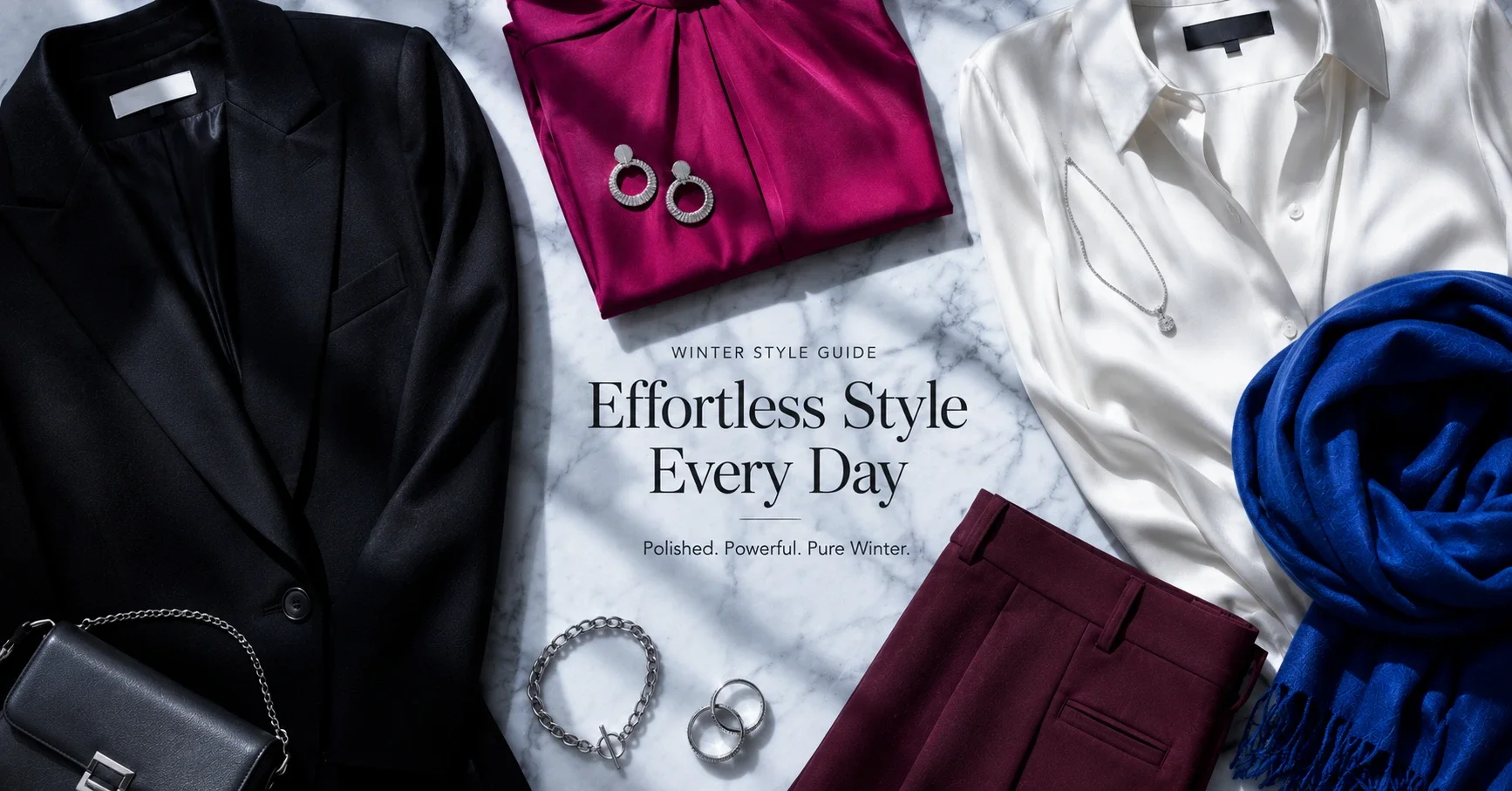
Winter is the cool, clear family. All three Winter seasons — True Winter, Bright Winter, Dark Winter — share a palette that is cool (blue-based undertone, no warmth) and clear (vivid, saturated, no muddiness). Winter is the only season that makes the most dramatic, vivid, high-contrast colours work as everyday wear.
Winter is also, paradoxically, one of the easiest palettes to shop — once you know what you're doing. The colours are not subtle. You are not looking for greyed, dusty, or muted versions. You want the vivid cobalt, the sharp black, the cool red, the pure white. Fashion leans toward these colours seasonally, particularly in autumn-winter collections, and they are never hard to find.
The Shared Winter Principle
Every Winter palette excludes: warm tones (golden, peachy, orange-based), muted or dusty colours, warm brown, warm camel, warm earth tones. Every Winter palette includes: clear, cool, saturated colours — the kind that look vivid and sharp, with no yellow or earth in them.
When shopping, look for: "cobalt," "fuchsia," "cool red," "pure white," "stark white," "charcoal," "true black," "cool burgundy," "cool emerald," "royal blue," "icy." Be wary of: "warm," "golden," "camel," "dusty," "muted," "peach," "earthy," "cognac."
True Winter
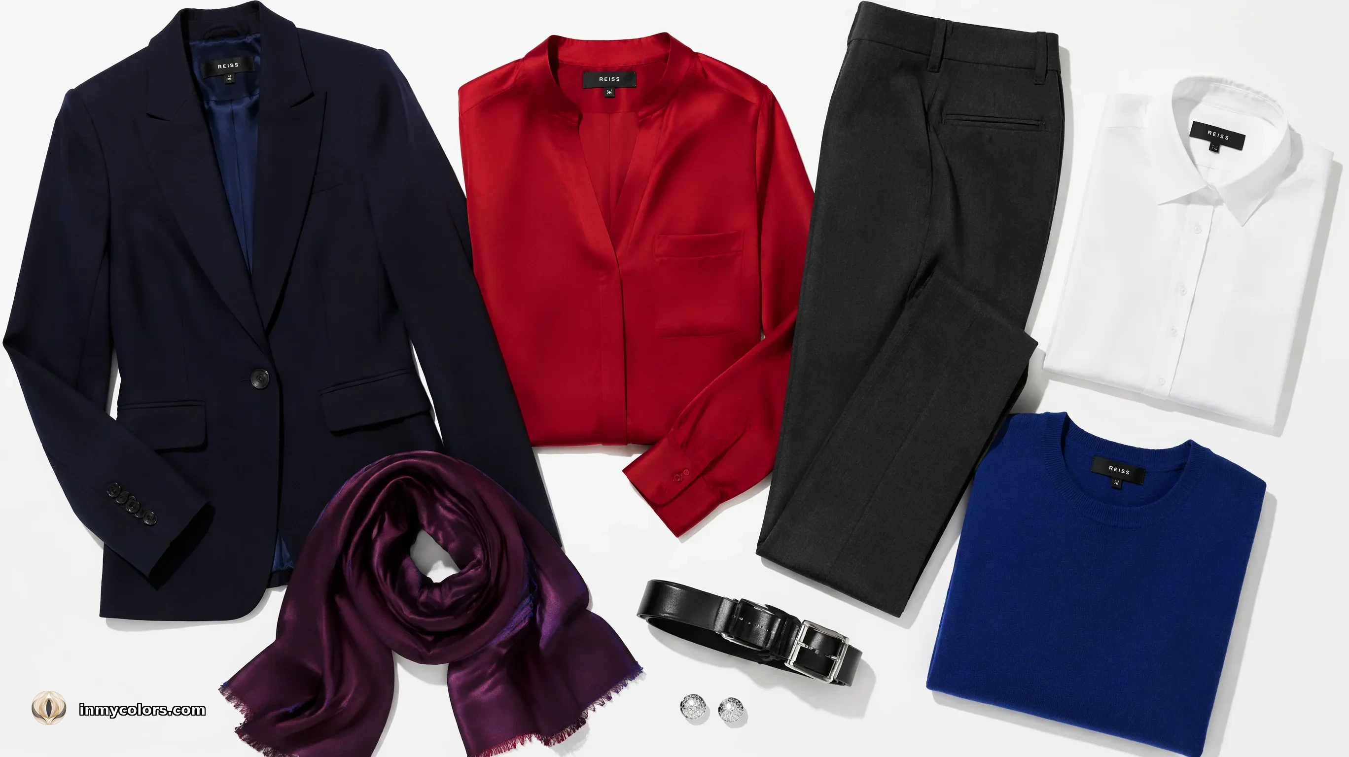
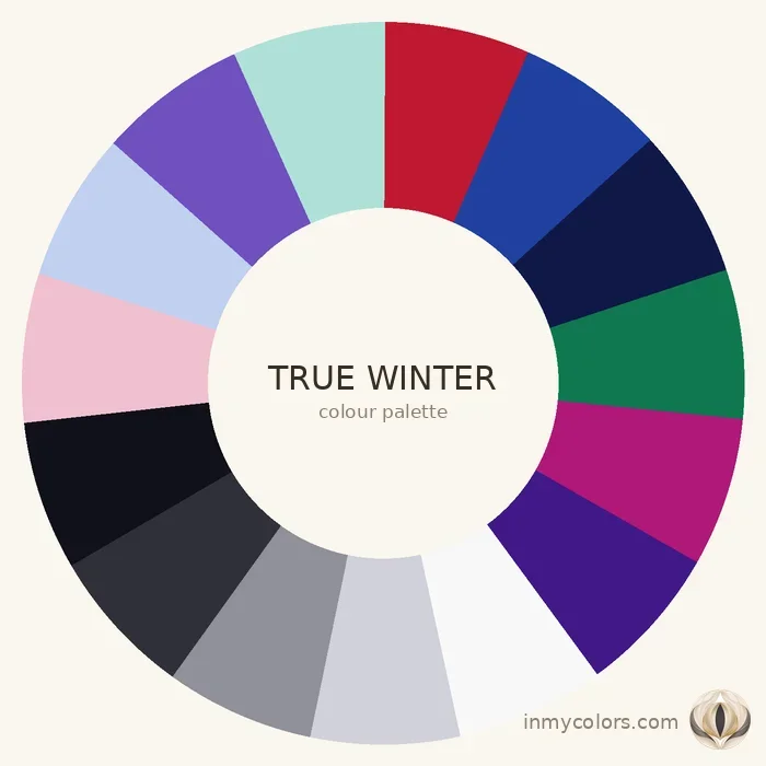
True Winter has clear, cool colouring with medium to high contrast. It is the most balanced of the three Winter seasons — not the most vivid (Bright Winter) and not the deepest (Dark Winter), but the most archetypal cool-and-clear.
What to search for:
- ✦True black (Winter's primary neutral — flatters in a way no other season achieves)
- ✦Pure white or optical white
- ✦Cool red (the red with blue in it — think deep rose-red, not warm tomato)
- ✦Royal blue and cobalt
- ✦Cool emerald (the green with blue in it, not warm yellow-green)
- ✦Soft icy colours: ice pink, ice blue, ice lilac — used as light neutrals
- ✦Cool navy (dark, crisp, no warmth)
- ✦Charcoal grey (cool — with blue cast, not warm)
- ✦Deep plum and cool violet
Investment pieces: A sharp cool-red coat or blazer (the single most powerful True Winter investment piece), a perfectly fitted black jacket, a pure white shirt. These three define the True Winter wardrobe.
Avoid: Warm tones in any form. Also avoid muted versions of any colour — dusty teal, dusty rose, muted mauve belong to Summer, not Winter.
Bright Winter
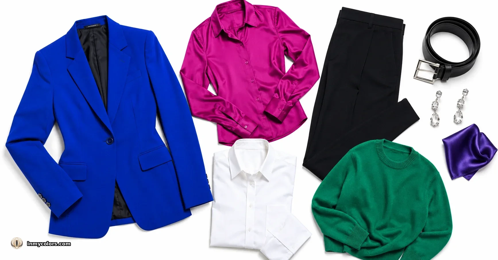
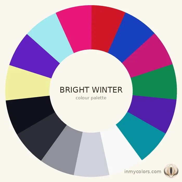
Bright Winter is the most vivid of the three Winter seasons — cool in temperature but intensely saturated in chroma, with very high contrast. The palette can carry colours so vivid they would overwhelm any other season.
What to search for:
- ✦Electric blue and vivid cobalt
- ✦Fuchsia (the clear, vivid cool pink — not warm pink)
- ✦Vivid cool red
- ✦Pure white (Bright Winter's best neutral)
- ✦Vivid cool green (think clear, bright emerald)
- ✦Cool turquoise (vivid and clear)
- ✦True black (very high contrast with Bright Winter's fair-to-medium skin)
- ✦Vivid purple and vivid violet
Investment pieces: A vivid fuchsia statement piece (this season owns this colour entirely), a vivid cobalt blazer, and a pure-white dress or shirt. These are not quiet purchases — they are intended to be worn, noticed, and repeated.
Avoid: Muted anything. Muted colours drain Bright Winter more dramatically than any other season. Also be careful with very deep, dark colours — dark navy and charcoal work, but the very deep, dusty territory of Dark Winter can feel heavy for Bright Winter's clearer colouring.
Dark Winter
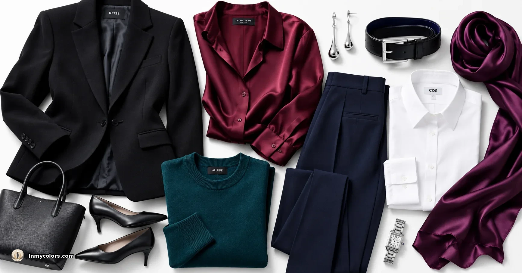
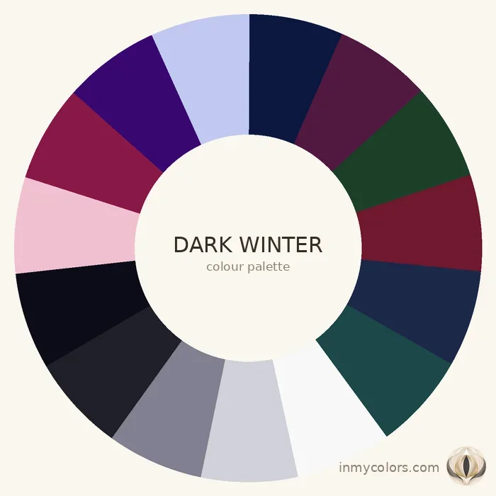
Dark Winter occupies the deepest, most intense territory of the Winter family. The palette can carry both depth and vividness simultaneously — the unique capability of this season.
What to search for:
- ✦True black (essential)
- ✦Deep charcoal
- ✦Cool burgundy (the wine-red, with blue in it — dark, cool, rich)
- ✦Deep plum
- ✦Midnight navy
- ✦Deep emerald (cool, dark, clear)
- ✦Deep teal (cool-blue teal, not warm)
- ✦Taupe-dark (the cool warm-appearing neutral)
- ✦Ice colours used as contrast accents: ice white, icy blue
- ✦Dark chocolate-cool (the one near-warm colour Dark Winter can occasionally use as a very dark anchor)
Investment pieces: A midnight navy coat, deep cool-burgundy blazer, and a pure-black wardrobe spine (trousers, blazer, dress). Dark Winter's palette thrives on depth — these deep investment pieces are endlessly wearable.
Avoid: Warm earth tones (Deep Autumn territory). True camel and cognac read immediately as wrong against Dark Winter's cool-dark skin. Also avoid the very vivid, light-bright territory of Bright Winter — Dark Winter's version of colour is deep and rich, not electric.
Why Black Works So Well for Winter
Black is a universal wardrobe colour for many people, but it is genuinely flattering only for Winter (and to some extent Dark Autumn). For every other season, black tends to create a slight visual flatness — the face loses colour and vibrancy. For Winter, particularly True Winter and Dark Winter, black is a neutral that activates the colouring. It creates exactly the high contrast that Winter needs. The skin looks clearer, the eyes look brighter, the overall impression is sharpened.
One caveat: Bright Winter can be overpowered by black in large quantities, since Bright Winter's beauty is in its vibrancy rather than its depth. Bright Winter may find pure white a more powerful neutral than black in many contexts.
The "Safe" Trap: When Winter Dresses Too Conservatively
This is the most common Winter wardrobe mistake. Because Winter's palette includes dramatic colours (cobalt, fuchsia, vivid red), many Winter people retreat to all-black or navy-heavy wardrobes in the name of sophistication. This is a waste.
Winter colouring is built to carry drama. When a Winter person wears the full range of their palette — with vivid cobalt, clear fuchsia, and cool red appearing alongside the black and white — the effect is powerful, elegant, and unmistakably purposeful. When they retreat to an all-black wardrobe, they look fine, but not activated. The natural contrast of their colouring is underused.
The investment in one vivid cobalt blazer, one cool red coat, or one fuchsia statement piece is one of the highest-return wardrobe investments a Winter person can make.
Pattern Guidance for Winter
Bold geometric and graphic: Winter's palette thrives in bold, clear pattern — sharp graphic prints, high-contrast geometric, black-and-white patterns. These look purposeful and sophisticated on Winter colouring.
Stripes: Bold, high-contrast stripes — the kind with clear definition. Thin subtle stripes read as Summer; Winter's stripes have presence.
Animal print: Black-and-white animal print, cool-toned snake print. Avoid warm-toned leopard (Autumn territory).
Abstract and art-print: Bold, clear abstract art prints with cool colour palette — black, white, cobalt, red. Winter can carry prints that would overwhelm any other season.
Avoid: Soft florals, watercolour prints, and muted abstract pattern — all Summer/Autumn territory.
The Jewellery Principle
Silver is always Winter's metal. White gold, platinum, cool-toned silver, gunmetal. Gold reads warm against Winter's cool skin and disrupts the temperature harmony of the overall look. This is not a rule to occasionally break — it's a consistency principle. Every piece of jewellery Winter wears reads better in silver.
Exception: fashion jewellery that uses gold as a colour accent within a bold, graphic design can work if the overall piece is cool-dominant. But choose silver as the default and gold only intentionally.
Winter Capsule Starter Pack (10 Items)
- 1.Black blazer (tailored, sharp — the single most important Winter piece)
- 2.Pure white shirt (crisp, no warm yellow — optical white)
- 3.Cool red coat or blazer (the statement anchor)
- 4.Cobalt blue top or blouse
- 5.Cool navy trousers (dark, crisp — no warmth)
- 6.Charcoal grey trousers (cool grey with blue cast)
- 7.Fuchsia top or statement piece (the colour only Winter carries)
- 8.Black dress (versatile — day and evening)
- 9.Silver jewellery (rings, earrings, watch)
- 10.Black leather bag and shoes (the cool anchors that complete every Winter outfit)
Two Tools That Eliminate Shopping Guesswork
Knowing your season gets you most of the way there. The remaining uncertainty happens in the moment — when a product image calls something "warm coral" but you're not quite sure, or when in-store lighting flattens the difference between two adjacent shades.
In My Colors includes two tools built for exactly this.
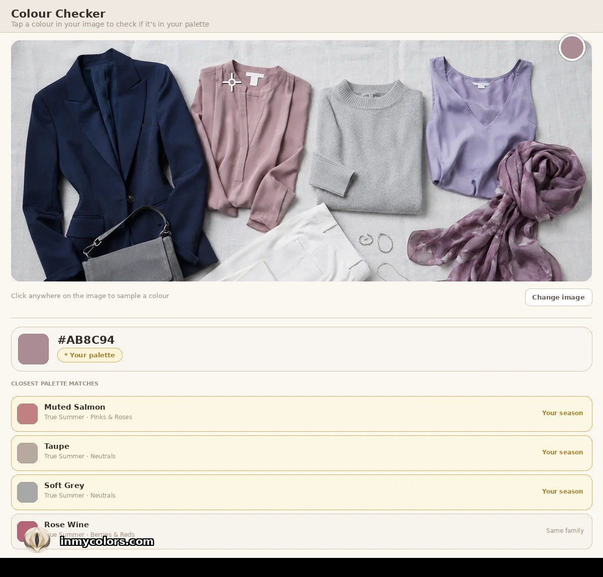
Colour Checker is for online shopping and wardrobe audits. Upload a photo of any item — a product shot, a screenshot, or something already in your wardrobe — and tap any colour in the image. The tool identifies it and shows you how it aligns with your Winter season palette.
Colour Matcher works in real time, in the store. Tap a colour from your palette to fill the screen, then hold your device next to the item you're considering. You're comparing the actual item against your actual palette colour, side by side, in the same light. The guess disappears.
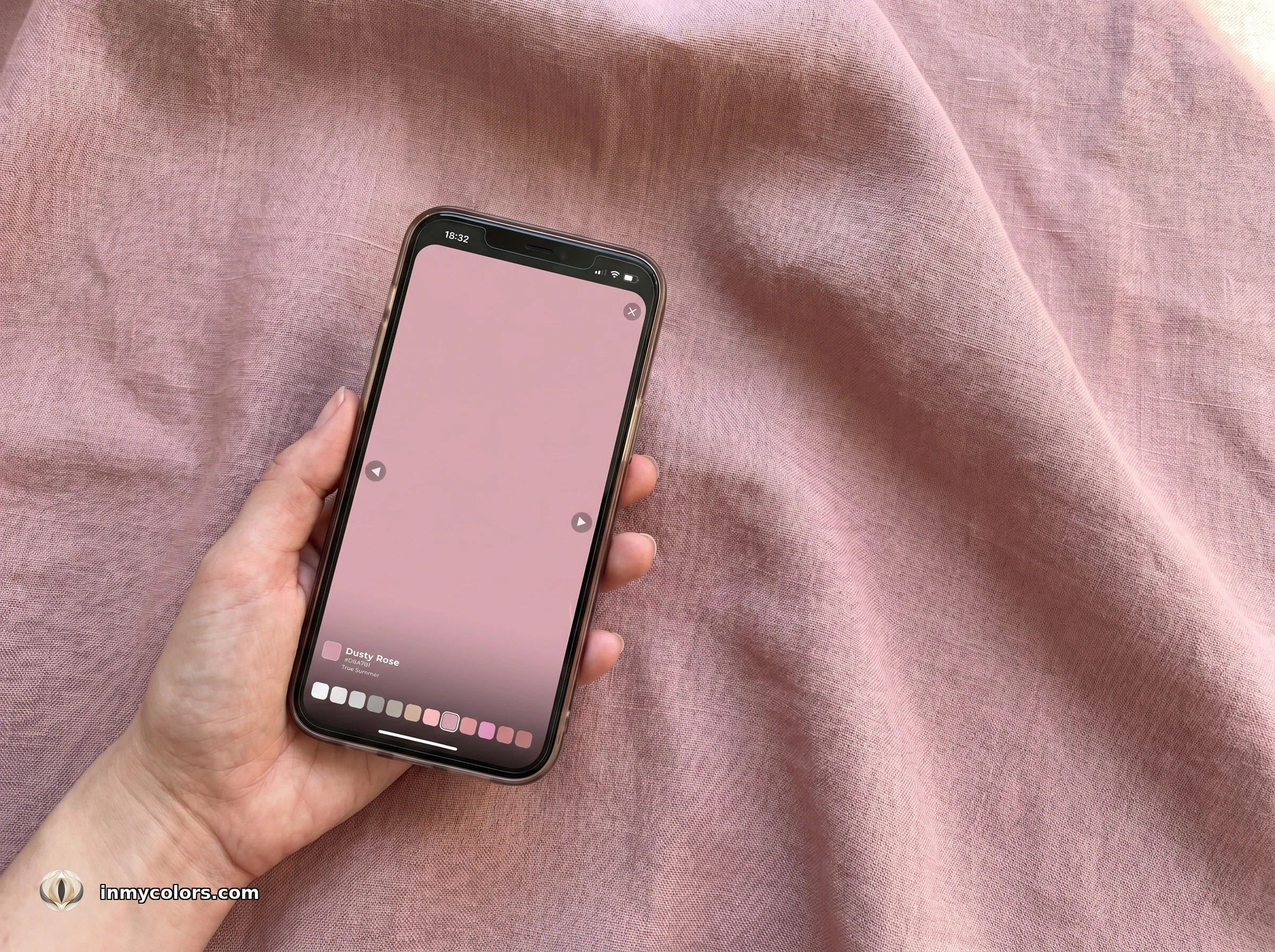
Both tools are available with the full In My Colors report at inmycolors.com.
Getting Your Answer

Winter shopping is directional: clear, cool, no muddying. When a colour makes you look sharp, vivid, and defined — buy it. When it makes you look flat or drained — it's either too warm or too muted. When it makes you look overwhelmed (i.e., the colour wears you) — it may be too vivid for your specific Winter sub-season.
Find your exact season — True, Bright, or Dark Winter — at inmycolors.com.