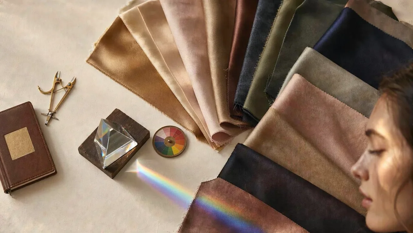
In 1920s Germany, a teacher at the Bauhaus school made an observation that would eventually reshape the global fashion industry. His name was Johannes Itten. He noticed that his students consistently produced their most compelling work when they were allowed to choose their own colours — and that those colour choices bore a striking resemblance to each other's physical appearance.
A student with warm golden skin and dark eyes gravitated toward ochres, rusts, and deep earthy tones. A student with cool porcelain skin and ash-blonde hair chose dusty blues, soft roses, and cool greys. Left to their own instincts, people were reaching for the colours that harmonised with their natural colouring — even without being told to.
Itten called this phenomenon subjective colour. It became the foundation of everything we now call personal colour analysis.
Where It Began
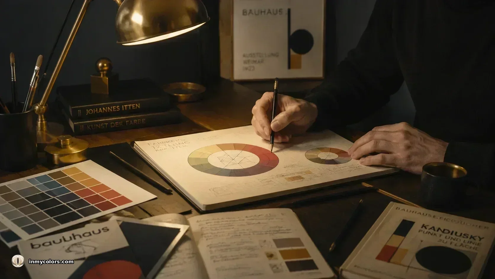
Itten's insight was not merely aesthetic. He was working in the shadow of rigorous colour science — Goethe's theory of colour perception, Chevreul's law of simultaneous contrast, and the emerging field of colour psychology. What he added was the human dimension: the observation that the same colour behaves differently depending on the face it is placed next to.
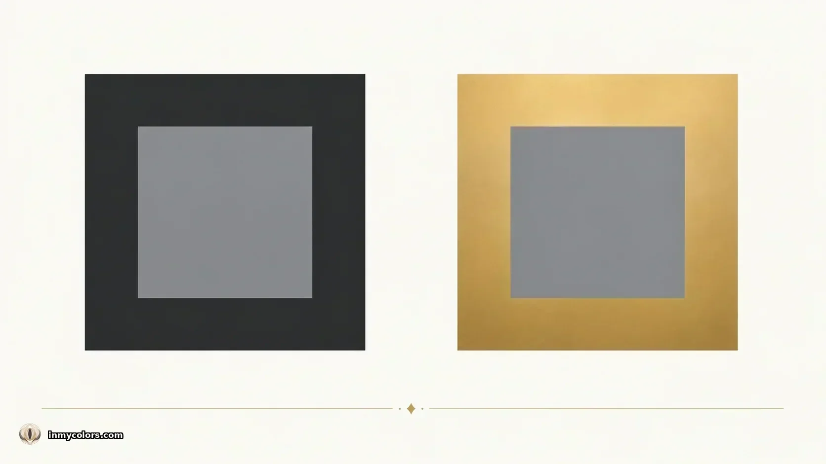
His 1961 book The Art of Color codified the principle. The eye, Itten argued, is never passive. It is always seeking equilibrium. Every colour forces the eye to generate its complementary — stare at a red square, close your eyes, and you will see green. When the colours near your face are in harmony with your natural colouring, the eye rests on you. When they clash, the eye fights to correct the dissonance. The result: you look tired, the colour looks wrong, and neither you nor anyone else can easily say why.
This is the scientific basis for why some colour-face combinations feel immediately right and others feel perpetually off.
The System That Emerged
Itten's original observation was refined and systematised over the following decades. The American colour consultant Suzanne Caygill developed the first detailed personal colour system in the 1950s, later formalised by Carole Jackson's Color Me Beautiful (1980) — the book that brought seasonal colour analysis to mainstream audiences.
The four-season model was intuitive but limited. Subsequent work by analysts including Kathryn Kalisz expanded the system to 12 seasons — the model now considered the industry standard — by introducing three subtypes per season and incorporating the three dimensions of colour more precisely.
Those three dimensions are:
Temperature (warm or cool). The most fundamental axis. Every skin tone has an undertone — a warm golden-orange cast, or a cool pink-blue cast. The colours that harmonise with a warm undertone are themselves warm; those that harmonise with a cool undertone are cool. This is why a colour that looks luminous on one person can look sallow on another.
Value (light or deep). How light or dark the overall colouring is — from pale ivory skin and light eyes to deep brown skin and dark eyes. A palette that matches your value depth creates coherence. A palette that fights it creates visual dissonance.
Chroma (muted or vivid). How saturated or softened the colouring is. Some people have naturally muted, dusky colouring — their best colours are equally muted. Others have clear, vivid colouring and can carry high-chroma colours with ease. The wrong chroma level overwhelms the first type and drains the second.
These three axes — temperature, value, chroma — produce the 12-season classification system used today.
What the Research Shows
The science behind personal colour analysis extends beyond Itten's perceptual observations into contemporary psychology and consumer research.
A 1989 thesis by Nancy Streng at Ohio State University found that most people consistently choose clothing colours they prefer over colours that enhance their natural colouring — and that these are reliably different things. Adolescents with lower colour discrimination ability were particularly prone to choosing colours that created discord with their natural colouring, generating what Streng described as "inadvertent incorrect clothing image messages."
The mechanism is partly explained by simultaneous contrast. As Itten documented, the eye seeks the complement of every colour it fixates on. When the colours near your face share the same temperature as your skin undertone, the contrast enhances rather than fights — the skin appears more luminous, the eyes more vivid, the overall impression more coherent. When they conflict, the correction the eye demands manifests as visual noise: the face looks drawn, the colour looks off, the whole combination generates a sense of wrongness that most people experience but cannot name.
More recent work reinforces the practical stakes. Research published in the Journal of Experimental Social Psychology (Adam & Galinsky, 2012) found that clothing affects not just how others perceive us but how we perceive ourselves — what the authors called enclothed cognition. Wearing the right colours is not, in this framework, superficial. It is a signal to both the observer and the wearer that the person inside the clothes is presenting accurately.
How the Analysis Works
Modern personal colour analysis — including the AI-powered approach used by In My Colors — operates on the same three axes Itten identified, but applies them with considerably more precision than a draping consultation.
The process measures:
Skin undertone using LAB colour space — a colour model designed to approximate human colour perception — rather than the subjective visual assessment used in traditional consultations. The LAB model separates lightness from colour information, making it possible to detect the warm-cool axis of the skin undertone with accuracy that the eye alone cannot reliably achieve.
Iris colour using a ring sample of the iris (excluding the pupil and outer edge, where lighting artefacts are most common). The iris provides an independent undertone signal — warm hazel and brown eyes confirm a warm season; cool grey-blue eyes confirm a cool one.
Hair colour using temporal and crown sampling, with automatic detection of obviously unnatural colours. Hair depth contributes to the contrast axis of the classification.
Sclera colour — the white of the eye — using an elliptical sampling zone that avoids eyelid contamination. Sclera warmth provides a fourth undertone signal, particularly valuable in cases where skin and iris readings diverge.
These measurements are fed into a Gaussian scoring system — a mathematical model that calculates the probability of each of the 12 seasons given the observed colour values. The result is not a binary classification but a scored ranking: the most probable season, the second-most probable, and the confidence margin between them.
Why It Matters
The practical value of personal colour analysis is well-documented — and considerably broader than most people expect.
Appearance. The most immediate effect: wearing your season's colours makes the face look more alive. The skin appears more luminous, the eyes more vivid, the overall impression more coherent. This is not an aesthetic opinion. It is a function of simultaneous contrast, undertone harmony, and the eye's natural response to colour equilibrium.
Psychology. Streng's research established that most people are not good, unaided, at selecting colours that enhance their colouring. Season knowledge closes that gap — replacing guesswork with a reliable filter.
Economy. A wardrobe built around a coherent colour palette produces dramatically more outfit combinations from fewer items. Wrong-temperature impulse purchases — colours that looked compelling in a shop and wrong in a mirror at home — are the primary driver of wardrobe waste. Season knowledge eliminates most of them.
Sustainability. Every unworn garment is an environmental cost. Knowing your season is, in this sense, one of the most straightforward sustainable fashion interventions available — not by reducing consumption through willpower, but by improving the accuracy of each purchase.
The 12 Seasons
The final classification places every person in one of 12 seasons, arranged across four families:
Spring (warm, clear, light to medium). Light Spring, True Spring, Bright Spring. Golden, warm, luminous. Best colours: warm ivory, peach, coral, golden yellow, warm teal, spring green.
Summer (cool, soft, light to medium). Light Summer, True Summer, Soft Summer. Cool, muted, dusty. Best colours: soft rose, lavender, powder blue, cool grey, dusty mauve.
Autumn (warm, muted, medium to deep). Soft Autumn, True Autumn, Deep Autumn. Rich, earthy, golden. Best colours: camel, rust, terracotta, olive, warm brown, deep teal.
Winter (cool, clear or deep, high contrast). True Winter, Bright Winter, Deep Winter. Cool, deep, crisp. Best colours: navy, black, pure white, burgundy, deep plum, cool teal.
Each season has a palette of approximately 30–40 colours — the range within which the person's natural colouring will be enhanced rather than fought.
Where to Start
The traditional route to personal colour analysis was a draping consultation with a trained analyst — a process that could take two to three hours and cost several hundred dollars. The AI-powered approach makes the same analysis available in minutes, from a photograph, with scientific measurement rather than subjective visual assessment.
In My Colors uses facial landmark detection to identify the skin, iris, hair, and sclera zones, samples colour values from each using LAB colour space, and applies a 12-season Gaussian scoring model to produce a classification, a confidence level, and a full seasonal palette.
The analysis is free. The science behind it is over a century old.
The principles in this article draw on Johannes Itten's The Art of Color (1974 English edition), Nancy Streng's Personal Color Analysis, Color Discrimination, and Clothing Color Preference (Ohio State University, 1989), and Adam & Galinsky's Enclothed Cognition (Journal of Experimental Social Psychology, 2012).