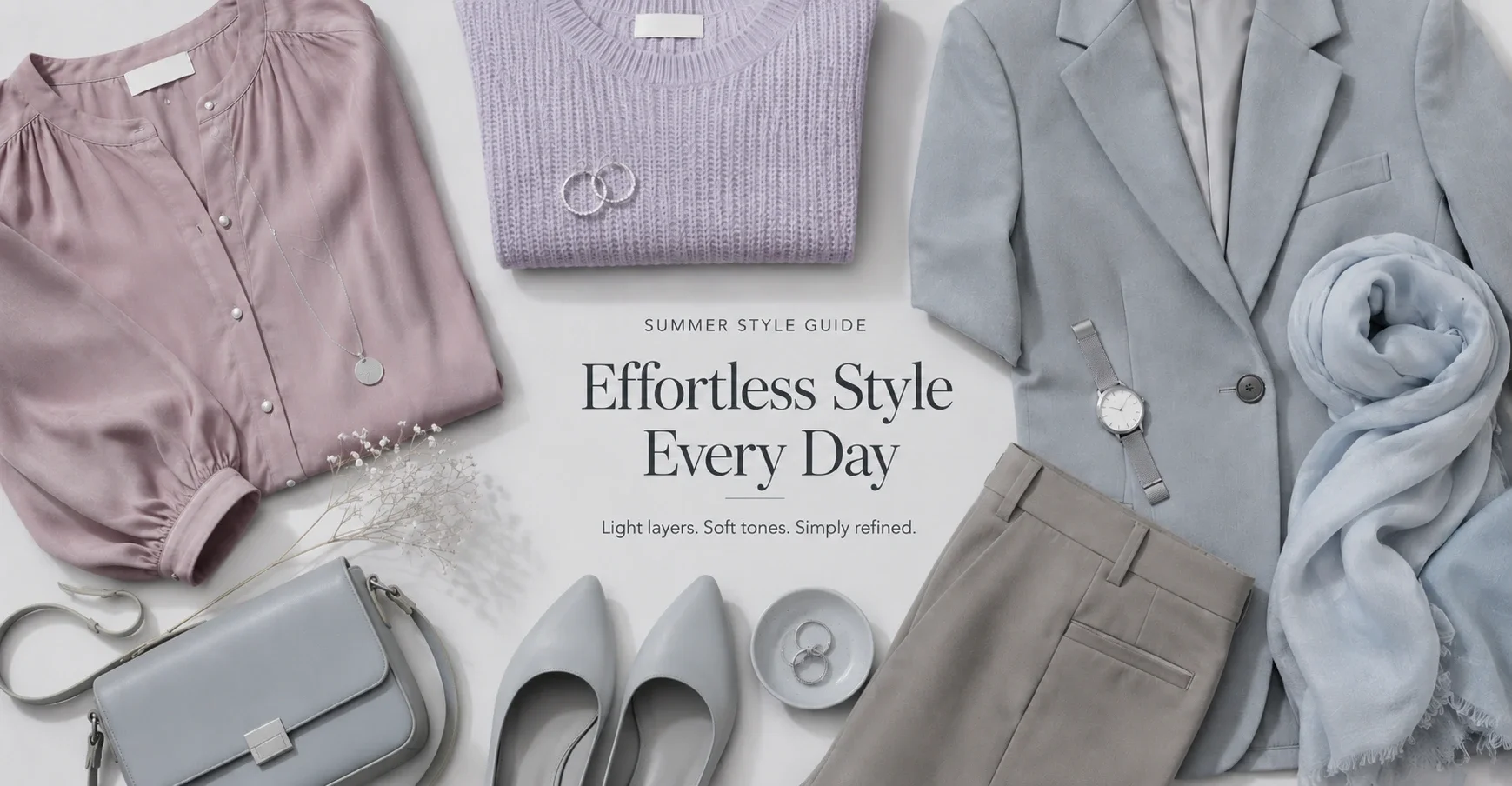
Summer is the cool, muted family. All three Summer seasons — Light Summer, True Summer, Soft Summer — share a palette that is cool (no yellow, no warm undertone) and softened (greyish, dusty, never vivid or saturated). The enemy of every Summer is anything vivid, warm, or harsh in contrast.
Shopping for Summer is harder than it sounds, because the fashion industry doesn't reliably label "muted cool" in ways that are useful. "Dusty rose" can mean anything. "Blush" is often warm. "Mauve" can be cool or brownish. This guide helps you develop an eye for what actually belongs in a Summer palette.
The Shared Summer Principle
Every Summer palette excludes: warm tones (anything golden, orange-based, peachy), vivid or saturated colours, true black (it's too harsh — use charcoal or soft navy), warm brown, and stark optical white.
Every Summer palette includes: cool-based colours with grey mixed in — the dusty, muted, greyed versions of pinks, purples, blues, and greens. Summer's neutrals are cool taupe, cool grey, soft navy, and greyed white.
The word to watch for when shopping: "dusty," "muted," "ash," "cool," "greyed," "powder." These are Summer signals. Flags to avoid: "warm," "golden," "vivid," "bright," "coral," "peachy."
True Summer
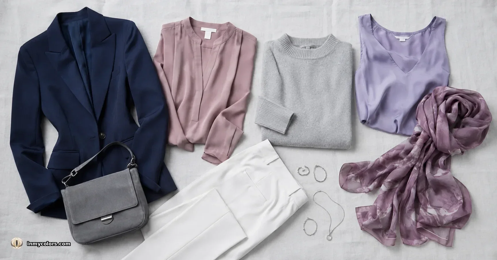
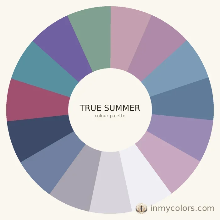
True Summer is the clearest archetype of the season — cool, muted, medium in contrast. The palette is identifiably soft and rosy.
What to search for:
- ✦Dusty rose (the defining True Summer colour — rosy, cool, not warm pink)
- ✦Raspberry (cool, medium-dark, not warm red)
- ✦Soft lavender and muted violet
- ✦Cool blue-grey and slate blue
- ✦Soft navy (not vivid — should feel muted)
- ✦Mauve and dusty plum
- ✦Cool taupe and warm-medium grey (with blue or pink cast, not yellow)
- ✦Rose-beige as a skin-adjacent neutral
Investment pieces: Soft navy blazer, dusty rose blouse, cool grey trousers. These three items function as the working spine of a True Summer wardrobe.
Avoid: Anything vivid (cobalt, fuchsia, vivid red — these belong to Winter), warm tones, stark white (use soft white or the palest cool grey instead), warm brown.
Light Summer
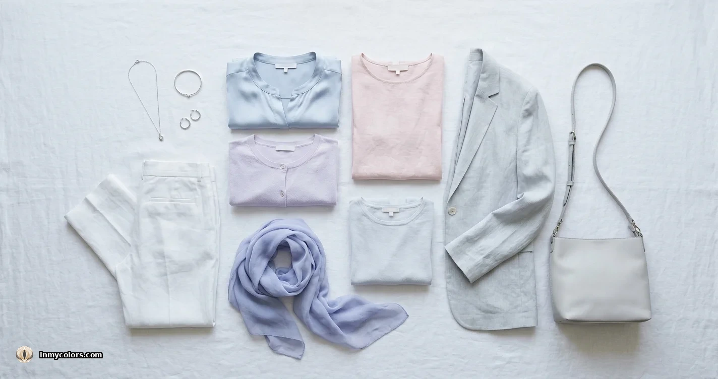
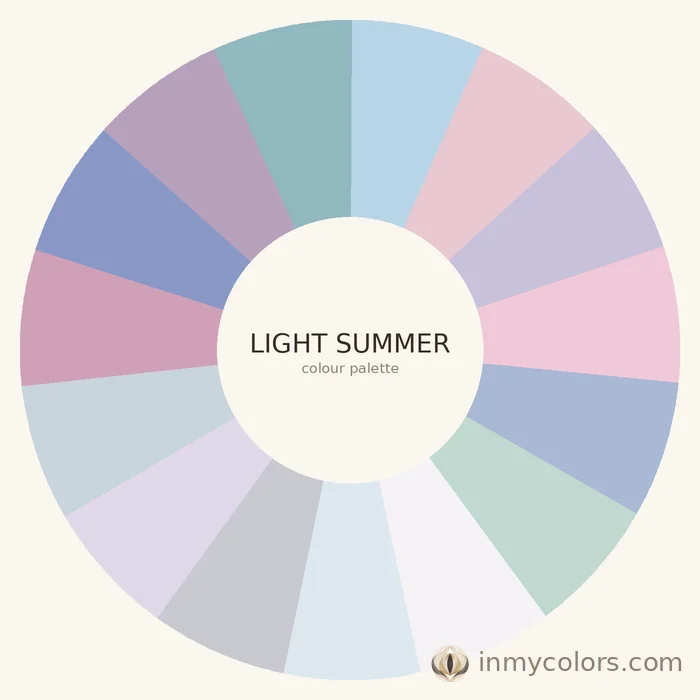
Light Summer is the fairest, most delicate Summer — very low contrast, very fair colouring. Colours must be very light and very muted; anything deep or vivid overwhelms.
What to search for:
- ✦Powder pink and pale dusty rose
- ✦Pale lavender and soft lilac
- ✦Light powder blue and pale periwinkle
- ✦Soft white (not warm cream, not optical white — the in-between)
- ✦Light cool grey
- ✦Pale dusty mint (very greyed, not vivid)
- ✦Cool nude in light-medium tone
Investment pieces: Powder blue lightweight knit, pale grey-white blouse, cool nude tailored trousers. These quietly elegant neutrals carry Light Summer further than anything obviously coloured.
Avoid: Anything with depth. Even True Summer's dusty rose can feel slightly heavy for Light Summer — always reach for the lighter version. Definitely avoid anything warm or vivid.
Soft Summer
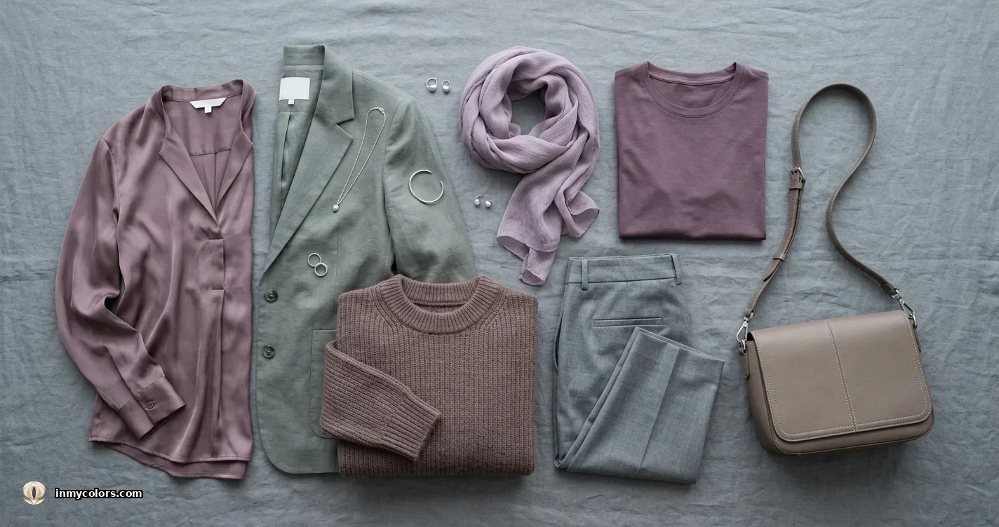
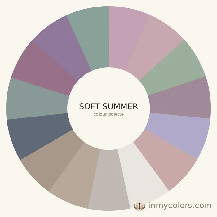
Soft Summer is the most neutral of the three Summers — closest to the Autumn family in its neutrality, though firmly cool. This is the most muted, greyed Summer, and the one most often confused with Soft Autumn.
What to search for:
- ✦Greyed mauve and cool cocoa
- ✦Muted sage (very greyed, cool-leaning — not warm olive)
- ✦Cool medium taupe
- ✦Dusty teal (greyed, not vivid)
- ✦Rose-brown (a warm-looking colour that is actually cool — the brown has pink not yellow in it)
- ✦Muted periwinkle
- ✦Charcoal (softer than Winter's charcoal — lighter, more medium)
Investment pieces: A greyed mauve knit, cool taupe wide-leg trousers, dusty teal blouse. These three items prove that Soft Summer's palette — often dismissed as "boring" — is actually quietly sophisticated.
Avoid: Vivid anything. Also avoid warm brown (which suits Soft Autumn). Soft Summer's brown must be cool (rose-brown or cool taupe), not golden.
The Colour Naming Problem: How to Identify Muting
"Dusty rose" and "hot pink" are both labelled pink. "Warm blush" and "cool rose" are both labelled blush. The fashion industry's colour naming is aspirational, not precise. Here's how to identify true muting:
In-store: Hold the item at arm's length. Does the colour look like it has grey in it? Does it look soft rather than vivid? Does it look like it could appear in a watercolour painting? These are signs of muting. Vivid colours look clean and clear. Muted colours look slightly dusty or fogged.
Online: Look at the image on a high-quality screen. If the colour looks slightly greyed, slightly soft, less saturated than the colour's name suggests — that's a good sign for Summer. If it pops loudly, it's too vivid. Check the colour from multiple product images; studio photography often desaturates or oversaturates depending on the setup.
Fabric texture as a proxy: Matte textures (linen, cotton, matte jersey) photograph more accurately than shiny or satin fabrics, which amplify saturation in photography. If a colour looks vivid on satin, it may be more muted in person. If it looks vivid on matte linen, take it at face value.
Pattern Guidance for Summer
Soft florals: Yes — watercolour florals, ditsy prints in Summer's palette. No bold graphic florals.
Abstract and painterly: Watercolour prints, abstract soft washes of colour, painterly textures. These suit Summer's low-contrast aesthetic.
Geometric: Soft geometric works if the colours are muted. Hard graphic geometric (sharp black-and-white grid) belongs to Winter.
Stripes: Narrow, tonal, soft-coloured stripes suit Summer. Bold wide contrast stripes are Winter territory.
The "Summer-Adjacent" Trap
Several colours are marketed as blush, nude, or rose that are actually warm rather than cool — and don't work for Summer. Specific traps:
- ✦Warm blush: Peachy-pink blush belongs to Spring. Summer's pink has rose, not peach.
- ✦Bright coral sold as "blush": Coral is warm. Summer's version of this territory is dusty rose.
- ✦Warm beige: Golden beige is Spring/Autumn. Summer's neutral is a cool greyed beige or taupe.
- ✦Yellow-green: Olive and warm yellow-green are Autumn. Summer's green is muted and cool — sage green with blue in it.
Summer Capsule Starter Pack (10 Items)
- 1.Soft navy blazer (muted, not vivid — navy with grey in it)
- 2.Dusty rose blouse (the defining Summer top)
- 3.Cool grey trousers (medium grey with blue or pink cast)
- 4.Lavender or soft mauve knit
- 5.Powder blue lightweight top
- 6.Cool taupe wide-leg trousers or midi skirt
- 7.Rose-beige or cool nude simple dress
- 8.Soft white button-down (cool, not warm cream)
- 9.Silver-toned jewellery pieces (Summer's metal)
- 10.Greyed blue-green or dusty teal scarf or accessory
Two Tools That Eliminate Shopping Guesswork
Knowing your season gets you most of the way there. The remaining uncertainty happens in the moment — when a product image calls something "warm coral" but you're not quite sure, or when in-store lighting flattens the difference between two adjacent shades.
In My Colors includes two tools built for exactly this.
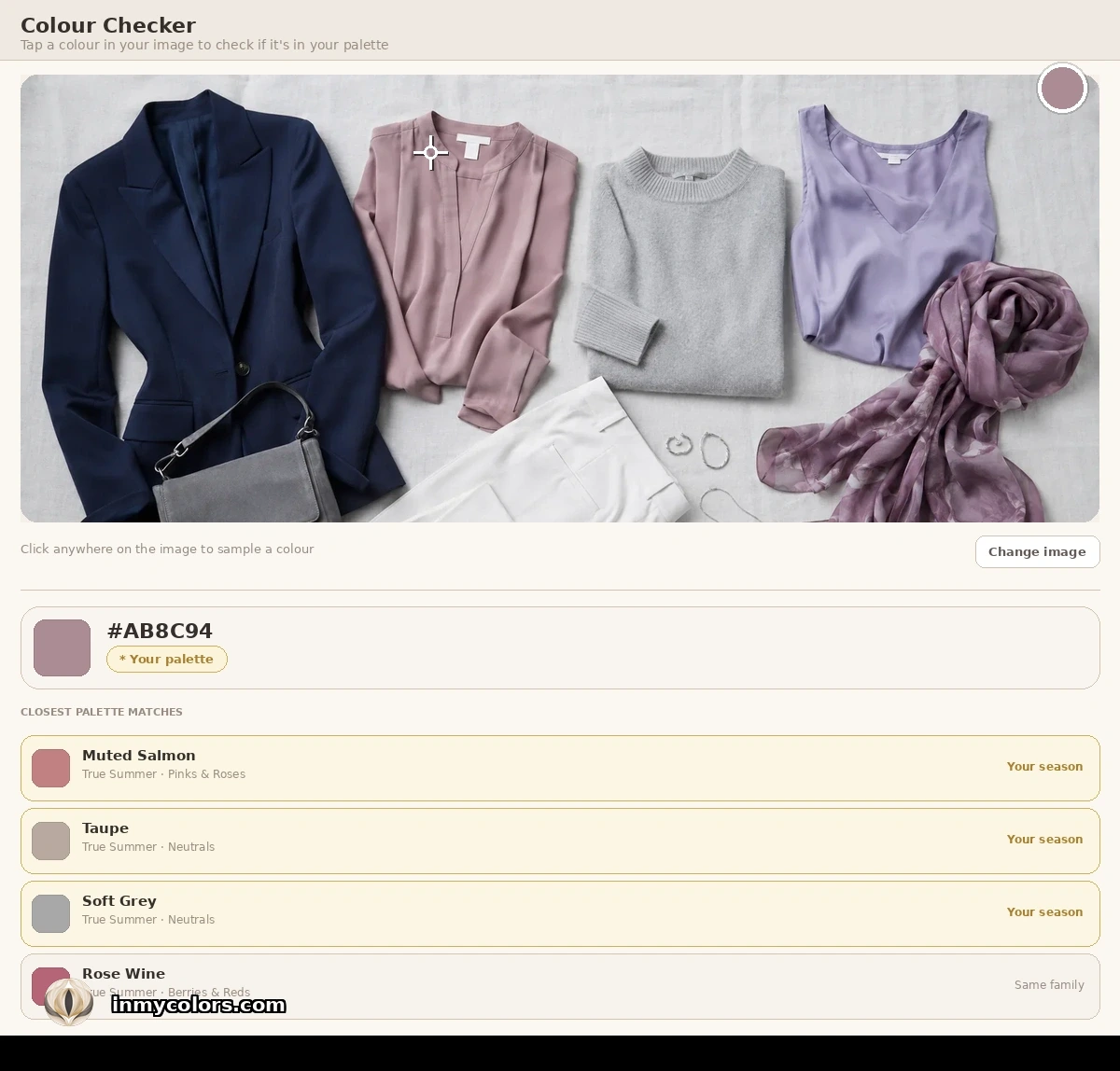
Colour Checker is for online shopping and wardrobe audits. Upload a photo of any item — a product shot, a screenshot, or something already in your wardrobe — and tap any colour in the image. The tool identifies it and shows you how it aligns with your Summer season palette.
Colour Matcher works in real time, in the store. Tap a colour from your palette to fill the screen, then hold your device next to the item you're considering. You're comparing the actual item against your actual palette colour, side by side, in the same light. The guess disappears.
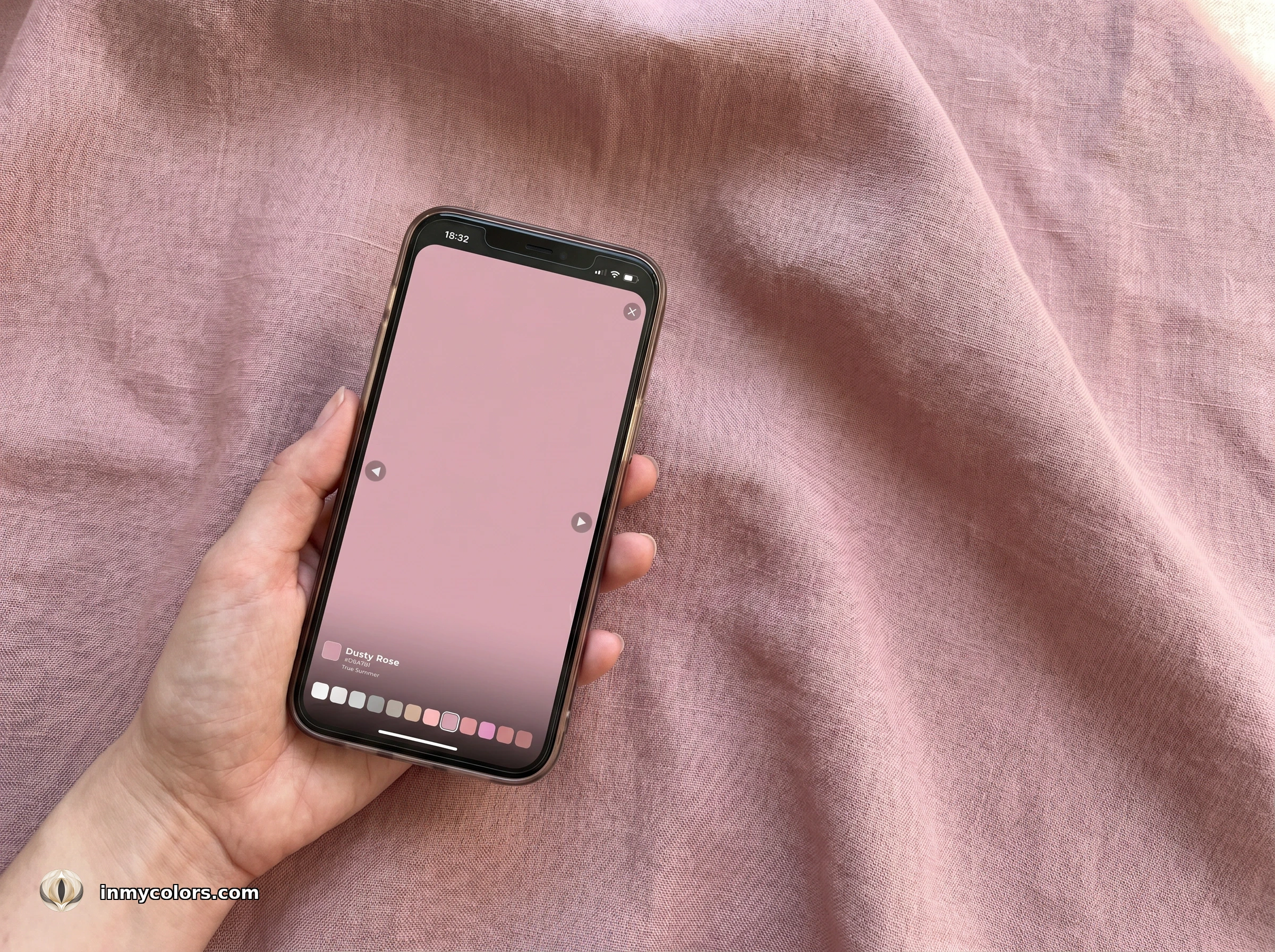
Both tools are available with the full In My Colors report at inmycolors.com.
Getting Your Answer

Summer shopping clicks once you train your eye to see muting. In any rail of clothes, Summer's colours will look quiet, slightly fogged, watercoloured. They won't grab your attention from across the room. They'll look elegant up close. When a colour makes you look rested, rosy, and defined without overpowering you — that's your Summer palette working.
Find your exact season — Light, True, or Soft Summer — at inmycolors.com.