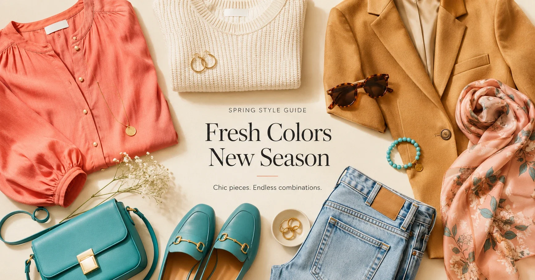
Spring is the warm, clear family. Every Spring season shares a core principle: your palette is warm (yellow-based undertone), clear (no muddiness, no grey mixed in), and relatively light to medium in depth. The enemy of every Spring is anything muted, cool, or charcoal-heavy.
Shopping for Spring sounds straightforward until you're standing in a store holding a coral that might be warm or might be salmon-pink, trying to decide if the "warm beige" is actually warm or just labelled that way. This guide cuts through the ambiguity.
The Shared Spring Principle
Every Spring palette excludes the same colours: true cool grey, stark blue-white, dusty or greyed tones, cool navy (warm navy is fine), deep charcoal, ash-toned anything. Every Spring palette includes warm, clear versions of colours — warm peachy pinks, golden yellows, warm corals, warm aqua blues, warm ivory.
The word to watch for in product descriptions: "muted," "dusty," "ash," "cool." These are flags that a colour may not work for Spring. Conversely: "golden," "warm," "peachy," "coral," "bright" are positive signals.
True Spring
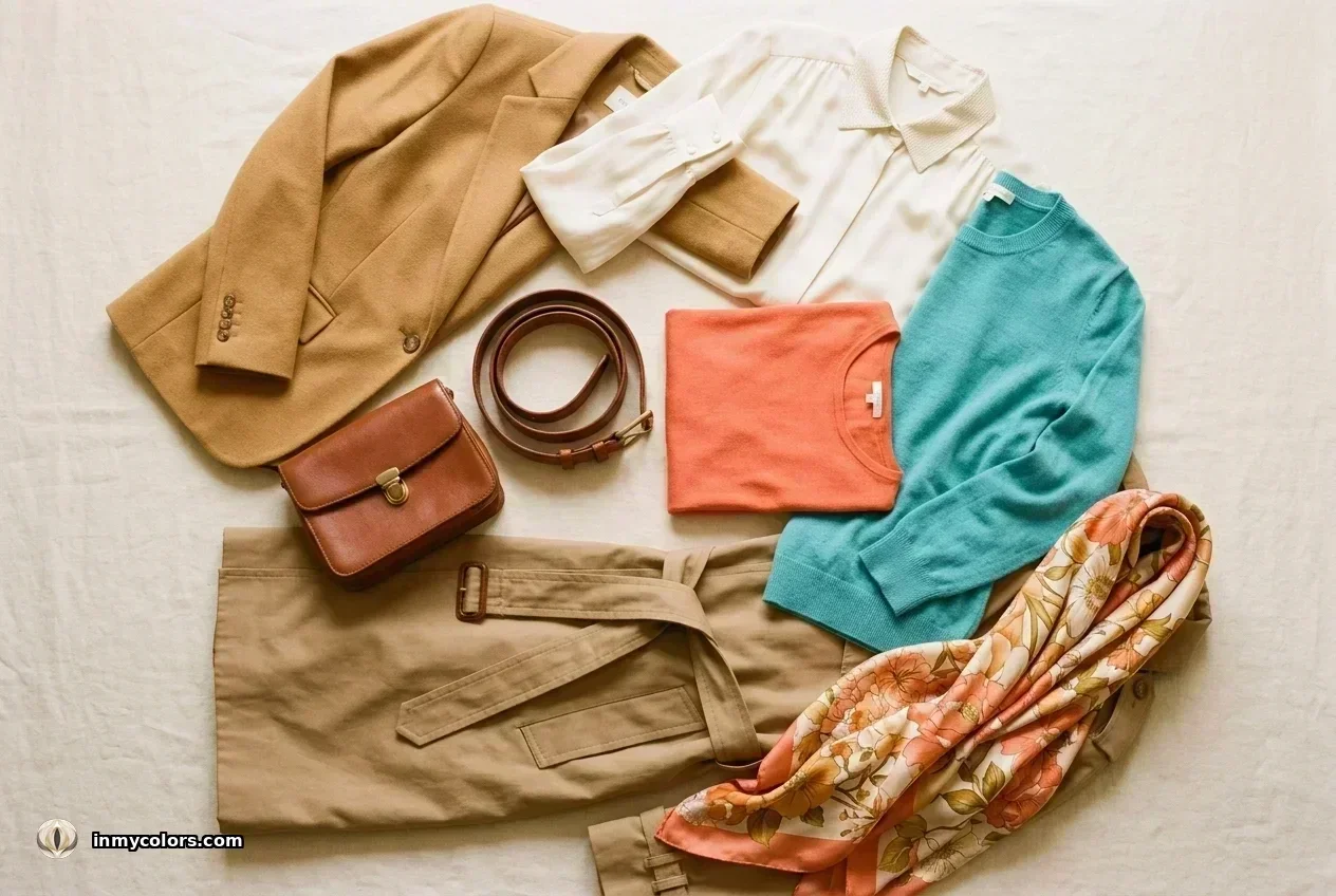
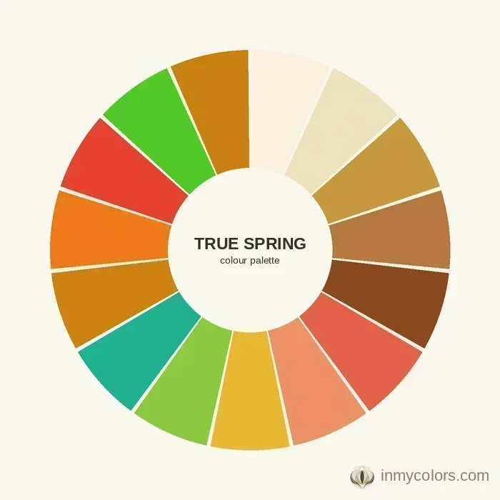
True Spring is the archetypal warm-and-clear season. Medium in depth, vivid enough to carry relatively saturated warm colour.
What to search for:
- ✦Coral and warm salmon (not pink-salmon — warm-orange salmon)
- ✦Golden yellow and golden ochre
- ✦Warm turquoise and warm aqua (the turquoise-teal with yellow in it, not blue-green)
- ✦Warm camel and golden tan
- ✦Warm ivory and light warm gold
- ✦Warm olive (medium depth)
- ✦Clear warm green — think spring grass, not forest
Investment pieces: Camel blazer, warm ivory silk blouse, golden tan trousers. These three items form the spine of a True Spring wardrobe and work together and separately for years.
Avoid: Stark white (too blue), cool navy (use warm medium blue instead), grey (even "warm grey" tends to read cool), dusty rose.
Light Spring
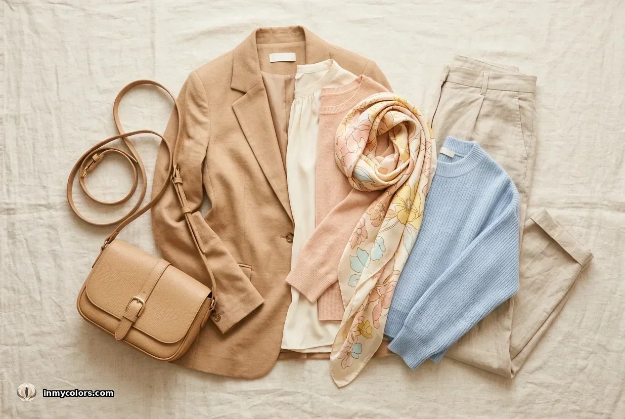
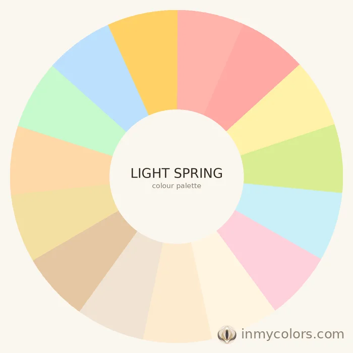
Light Spring is the most delicate Spring — low contrast, fair, with a golden-peach quality to the colouring. Colours need to match this delicacy; deep or highly saturated tones overpower.
What to search for:
- ✦Warm peach and light apricot
- ✦Golden ivory and warm white (not stark)
- ✦Light warm coral (not saturated — think lighter, more washed)
- ✦Warm pink with yellow in it (not cool pink)
- ✦Light warm aqua
- ✦Soft golden yellow (not vivid)
- ✦Light camel and warm nude
Investment pieces: Light camel trousers, warm ivory knit, peach blouse. The combination of these three items is endlessly versatile for Light Spring.
Avoid: Anything very saturated or deep — both overwhelm the delicate contrast of Light Spring. Also avoid cool-toned "blush" (which reads pink rather than peachy).
Bright Spring
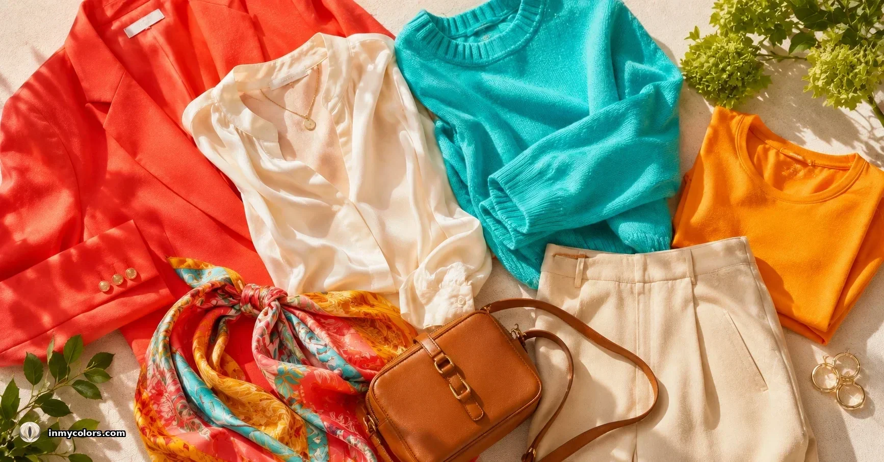
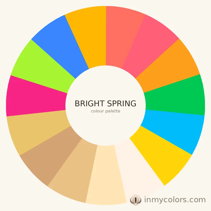
Bright Spring is warm and clear but with higher chroma than True or Light Spring. The palette can carry more vivid, saturated warm colour.
What to search for:
- ✦Vivid coral and bright coral-orange
- ✦Bright warm fuchsia (with yellow undertone, not blue-pink)
- ✦Clear warm green — vivid but warm
- ✦Bright warm aqua and warm teal
- ✦Vivid golden yellow
- ✦Clear warm red (warm tomato red, not cool red)
- ✦Warm bright white (not stark, but clean)
Investment pieces: Bright coral blazer, clear warm aqua top, vivid warm yellow dress. Bright Spring is the season most likely to be underserved by conservative shopping — lean into the vibrancy.
Avoid: Muted, dusty, or greyed versions of any colour. Bright Spring's worst enemy is muting — the palette collapses when colours lose their clarity.
How to Identify Warm Colours When Shopping Online
Photography is your enemy. E-commerce product photography is almost universally shot under cool, neutral, or slightly desaturated conditions because it looks "clean." This means:
- ✦Coral can photograph as salmon-pink
- ✦Golden camel can photograph as cool taupe
- ✦Warm olive can photograph as cool khaki
When shopping online, look at multiple angles and at "lifestyle" images (the model shots) rather than isolated product shots. If available, check reviews for colour accuracy comments. When in doubt, order two adjacent shades and return the wrong one.
In physical stores, always take items to natural light near a window. The difference between warm and cool versions of the same colour name is very clear in natural light and almost invisible under standard retail lighting.
Pattern Guidance for Spring
Florals: Yes, but warm-toned. Coral and peach florals on an ivory background, sunflower prints, tropical botanical prints in warm colours. Not pale cool florals with lavender or cool pink.
Geometric and abstract: Warm-toned geometric works well, particularly for Bright Spring. Look for warm colour combinations in the pattern.
Animal print: Warm animal print (warm leopard, camel-toned) suits True Spring and Deep-leaning Springs. Avoid grey or cool-toned animal print.
Texture: Spring handles texture well — textured knits, linen, broderie anglaise, boucle in warm tones.
The "Wrong Warm" Trap
The most common Spring shopping mistake is buying warm-looking colours that are actually burnt, browned, or muted warm — the territory of Autumn. A warm orange that's been muddied with brown will suit Deep Autumn but overpower and age a Spring. Spring's orange is clear and fresh, not earthy. If a warm colour makes you look tired rather than fresh, it may be too muted (Autumn territory) rather than wrong in temperature.
Spring Capsule Starter Pack (10 Items)
- 1.Warm ivory or golden-cream blouse (silk or silk-look)
- 2.Camel or golden tan tailored trousers
- 3.Coral or warm peach top (solid)
- 4.Warm aqua or turquoise lightweight knit
- 5.Golden yellow simple top (a test of your Spring confidence — buy it)
- 6.Warm green (clear, medium depth) casual jacket or overshirt
- 7.Light warm denim (mid-wash, slightly golden-toned rather than grey-washed)
- 8.Warm print blouse (floral or abstract, warm colour palette)
- 9.Camel or warm tan belt and bag (leather or leather-look)
- 10.Gold-toned jewellery to anchor the warmth in any outfit
These 10 items mix and match to create dozens of outfits and establish the visual language of a Spring wardrobe.
Two Tools That Eliminate Shopping Guesswork
Knowing your season gets you most of the way there. The remaining uncertainty happens in the moment — when a product image calls something "warm coral" but you're not quite sure, or when in-store lighting flattens the difference between two adjacent shades.
In My Colors includes two tools built for exactly this.
Colour Checker is for online shopping and wardrobe audits. Upload a photo of any item — a product shot, a screenshot, or something already in your wardrobe — and tap any colour in the image. The tool identifies it and shows you how it aligns with your Spring season palette.
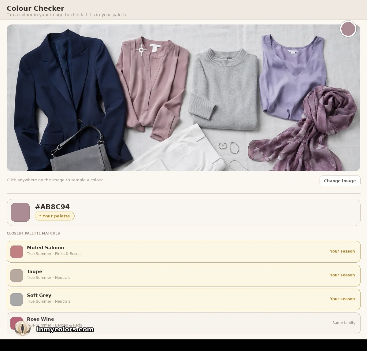
Colour Matcher works in real time, in the store. Tap a colour from your palette to fill the screen, then hold your device next to the item you're considering. You're comparing the actual item against your actual palette colour, side by side, in the same light. The guess disappears.
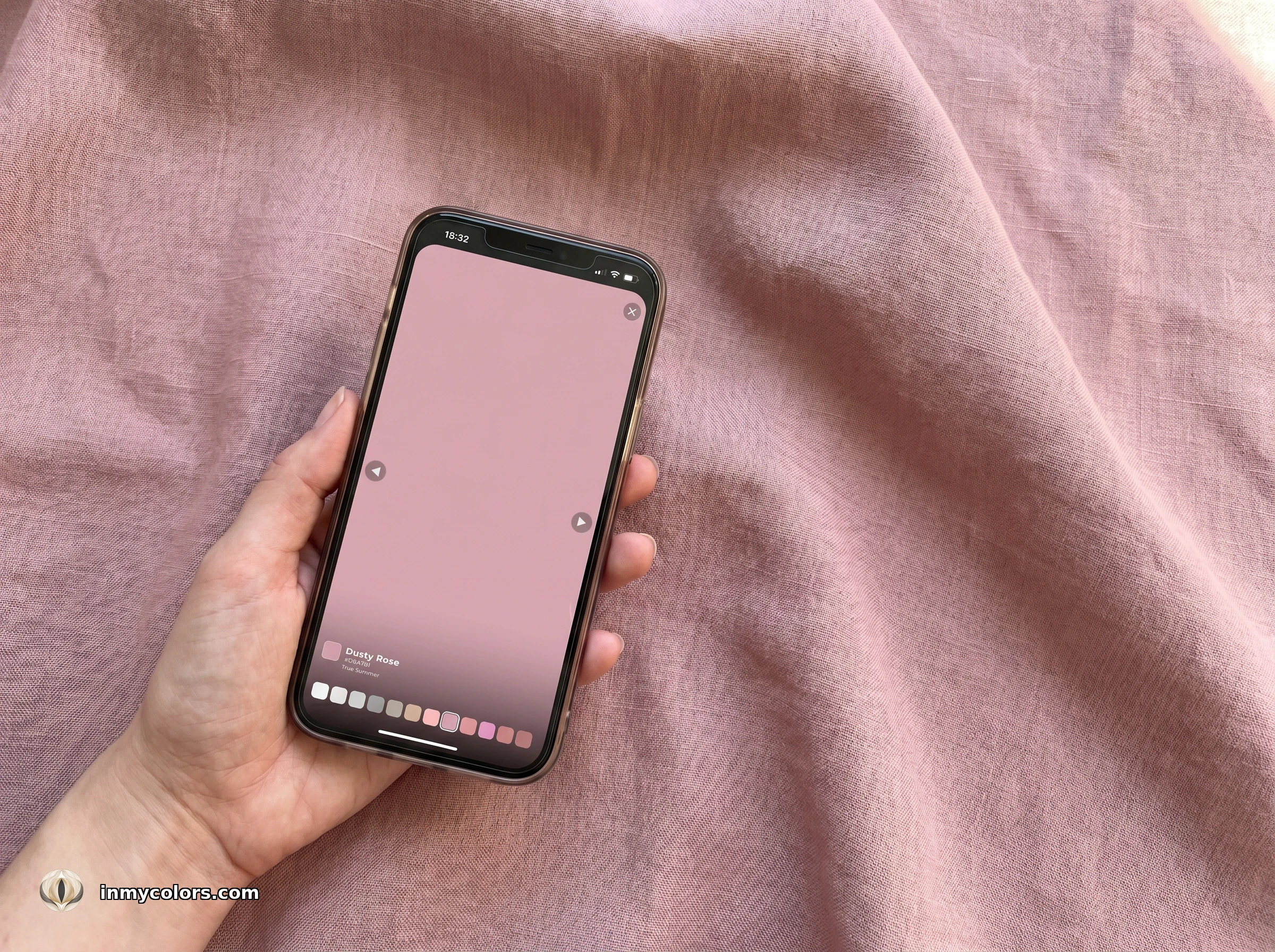
Both tools are available with the full In My Colors report at inmycolors.com.
Getting Your Answer
Shopping for Spring becomes intuitive once you've internalised the principle: warm, clear, no muddying. When you hold something up and it looks fresh, alive, golden — buy it. When it looks slightly flat or dusty or cool — leave it. Your eye trains faster than you expect.
Find your exact season — True, Light, or Bright Spring — at inmycolors.com.