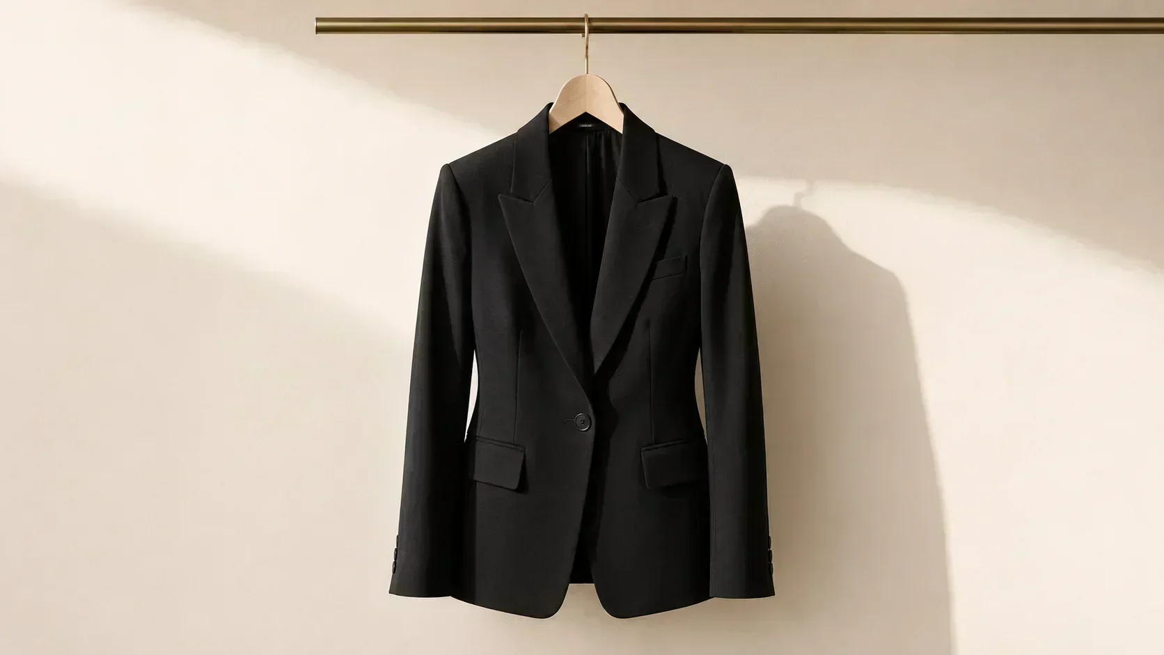
No colour in the world is worn as frequently as black. In the United Kingdom, black is the single most common clothing colour in both men's and women's wardrobes. In most urban centres globally, black dominates professional environments, evening occasions, and casual wear. The "little black dress" is the most widely cited wardrobe essential. Black is the default for formal occasions, job interviews, first dates, and every situation where the wearer is uncertain what to wear.
It is also, for a significant portion of the population, a colour that actively drains the face.
Understanding the psychology of black — what it signals, why it became dominant, what it actually does to different types of colouring — produces one of the more useful practical insights in colour analysis.
What Black Signals: The Research
The colour psychology literature on black is remarkably consistent across different research traditions.
Authority and power. Labrecque and Milne's 2011 research on colour and brand personality found that black — unlike most colours — sits at a point of maximum formality and authority. It is the colour most associated with control, sophistication, and power in professional contexts. This is not cultural metaphor but a measurable association that operates in consumer behaviour and social perception.
Aggression and competitiveness. A notable study of National Hockey League penalty records found that teams wearing black jerseys consistently received more penalties than teams in lighter colours. The black uniform activated both wearer aggression and referee perception of aggression. Black doesn't just signal power to observers — it activates a more aggressive cognitive mode in the wearer.
Mourning and formality. The Western association of black with death and mourning is one of the oldest surviving colour conventions — visible in European mourning dress from the medieval period through to Victorian widow's weeds and contemporary funeral dress. The association is so embedded that formal occasions (black tie) and mourning occasions (funerals) use the same colour precisely because the formality signal and the grief signal operate through the same pathway of "maximum seriousness."
Slimming effect. The perception that black makes the body appear slimmer is one of the most widely held beliefs about black clothing. The research partially supports it: black reduces the visual definition of contour by absorbing light rather than reflecting it, which does reduce the visual emphasis on silhouette. However, cut and fabric have a stronger effect on perceived body shape than colour — a well-cut dress in any colour serves better than a poorly cut dress in black.
Sophistication and confidence. Across studies of self-perceived emotion in clothing (including Soroka, Balode and Kutas, 2024), black was associated with increased feelings of confidence, sophistication, and authority in the wearer. The enclothed cognition effect applies: wearing black activates the schema of "serious, authoritative, in control."
Why Black Became Universal
Black's dominance in Western wardrobes is historically traceable. It is not inherent to human psychology — many colour traditions globally use little to no black in everyday dress.
The Victorian mourning industry. The death of Prince Albert in 1861 and Queen Victoria's subsequent 40 years of deep mourning created an entire industry around black clothing. Mourning dress was elaborate, specific, and commercially significant — the dye industry, the fabric industry, and the dressmaking industry were all structured around it. Black became the most technically refined and commercially developed colour in fabric production.
The industrial revolution and practicality. Black hides dirt more effectively than most colours in urban environments. During industrialisation, when soot, coal smoke, and grime were daily urban realities, black was the most practical dark colour for maintaining an appearance of cleanliness.
Chanel and the democratisation of black. Coco Chanel's "little black dress" of 1926 — described by Vogue as "the Ford of fashion" — transformed black from an aristocratic mourning colour to a democratic luxury. The LBD was the first garment that positioned black as elegantly aspirational rather than functionally utilitarian. This single design event is probably the most significant factor in the 20th-century dominance of black in women's wardrobes.
The New York uniform. The emergence of black as the default urban professional colour in New York, London, and subsequently global cities in the 1980s and 1990s created the convention that black is the "safe" choice — sophisticated enough for any context, professional enough for any formal environment, easy enough to combine. By the 2000s, black had become the wardrobe equivalent of a logical default.
What Black Actually Does to the Face
Here is where colour analysis intersects directly with the psychology of black.
Black is not a neutral. It is a specific colour — cool in temperature (the deepest, most neutral cool dark), very deep in value, and completely without warmth. As a colour, it has specific interactions with the undertones it sits next to.
For cool, deep, clear colouring (True Winter, Deep Winter): black is ideal. The cool temperature of black matches the cool undertone; the depth matches the season's naturally deep, vivid colouring; the high contrast of black against lighter skin amplifies the Winter's natural high contrast. For True and Deep Winters, black is not just acceptable — it is literally their colour.
For cool, lighter colouring (Light Summer, True Summer): stark black is slightly too dark and too high-contrast for the season's naturally lower contrast and softer chroma. The effect is that black sits heavily on Summer colouring — the face recedes behind the dark anchor. Cool charcoal or soft navy is the Summer substitute for black, providing the dark anchor without the high contrast.
For warm colouring (all Springs and Autumns): black creates a direct temperature conflict with the warm undertone. The cool depth of black next to warm, golden skin produces a visible greying effect — the skin's warmth is cancelled, the face appears slightly flat. This is not a subtle effect: in good natural light, a warm-undertone person in stark black looks noticeably less vibrant than the same person in a dark warm brown or very dark warm charcoal.
The reason most people don't identify this: most clothing advice treats black as universal. The warm-undertone person in black receives no specific feedback that black is wrong — they just know they need more makeup, or the photograph never quite looks as good as they'd hoped, or they always feel slightly overdone. The cause is the colour, not the person.
The Warm Undertone Alternative to Black
The Shade Principle applies directly to black. There is a version of "maximum dark neutral" that exists in every season — including warm seasons.
For Springs: very dark warm brown. A brown-black that reads as functionally dark in all outfit contexts while maintaining warmth. In a tailored blazer or a formal dress, very dark warm brown is as versatile as black — it works with the same range of other colours and in the same range of contexts — but harmonises with warm skin rather than fighting it.
For Autumns: very dark warm brown or very dark warm charcoal. Deep Autumns in particular can access a very dark range within their season — warm near-black, very dark warm chocolate, very deep olive. These dark warm anchors serve the same wardrobe function as black without the temperature conflict.
The difference in photographs and natural light between a True Autumn in stark black and the same person in very dark warm brown is consistently clear. The warm brown version of the same outfit looks more alive, more harmonious, and more intentional.
Black in Professional Contexts: A Seasonal Assessment
Professional dressing advice overwhelmingly defaults to black. "Wear black for authority" is the most common single piece of professional colour advice. As established in the colour and professional success literature, this advice is well-supported — for cool-season people.
For warm-season professionals, the alternative is not to abandon the authority signal. It is to find the season-appropriate equivalent of that signal.
Autumn professional alternative: dark warm brown or dark warm olive. Authoritative, grounded, and harmonious with the warm undertone. A True Autumn in a dark warm brown suit reads as equally assured — and considerably more luminous — than the same person in stark black.
Spring professional alternative: dark warm teal or dark warm charcoal. Springs cannot go as dark as Autumns without losing their characteristic luminosity, but a dark warm anchor colour in the top end of the Spring range provides professional authority without temperature conflict.
The Black Capsule: Who Should Own It and Who Shouldn't
The "capsule wardrobe essentials" list almost universally includes black. Here is a more nuanced version:
Buy the full black capsule if you are: True Winter, Deep Winter, Bright Winter (black is your season's primary dark neutral — own it fully).
Buy a modified black capsule if you are: True Summer, Light Summer, Soft Summer (replace stark black with cool charcoal and soft navy — same function, appropriate temperature).
Avoid building on black if you are: any Spring or Autumn season. Build on very dark warm brown or very dark warm charcoal instead. The wardrobe function is identical; the temperature is yours.
The wardrobe implication: a True Autumn who has built a capsule on stark black has built on the wrong foundation. Every outfit will have the same low-level temperature conflict at the base. Rebuilding the foundation in dark warm brown produces a wardrobe in which every outfit harmonises rather than conflicts — a different and better experience of getting dressed.
The Psychology of Black: Final Assessment
Black does what the research says it does: it signals authority, activates controlled attention, and reduces visual silhouette definition. These are real effects, supported by real evidence.
What the research doesn't address is that these effects operate in addition to — or, in the case of wrong-season wearers, in spite of — the colour's interaction with the wearer's undertone. A warm-undertone person in black gets the authority signal but loses the luminosity signal. The face looks slightly flat; the skin doesn't glow; something is slightly off without being diagnosable.
The goal of colour analysis is not to avoid black if you love it or if it serves you professionally. The goal is to understand exactly what black does — the psychological effects, the signalling effects, and the temperature effects — so that you use it deliberately rather than by default.
Black is an extraordinarily powerful colour. For the seasons it belongs to, it is a tool of significant precision. For the seasons it doesn't, there are equally powerful dark tools that do the same job with less cost to the face.
Use whichever is yours.