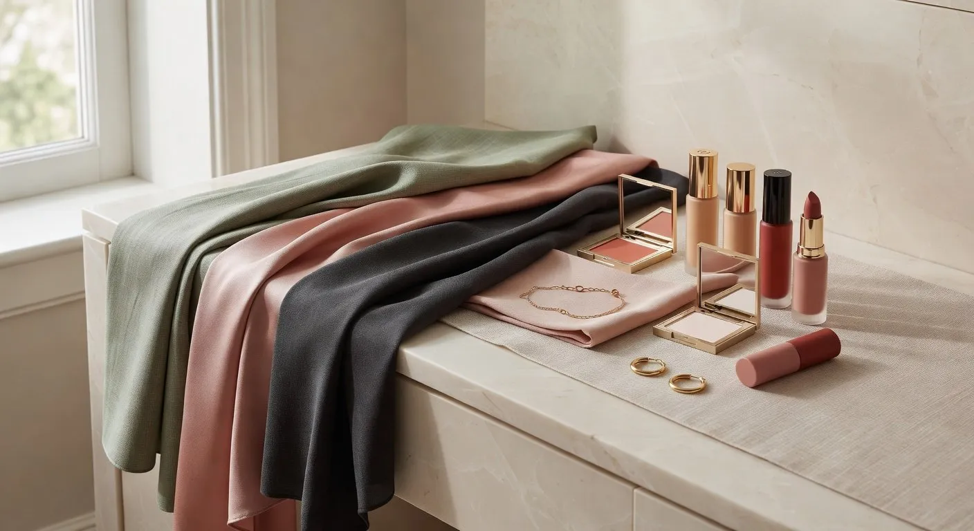
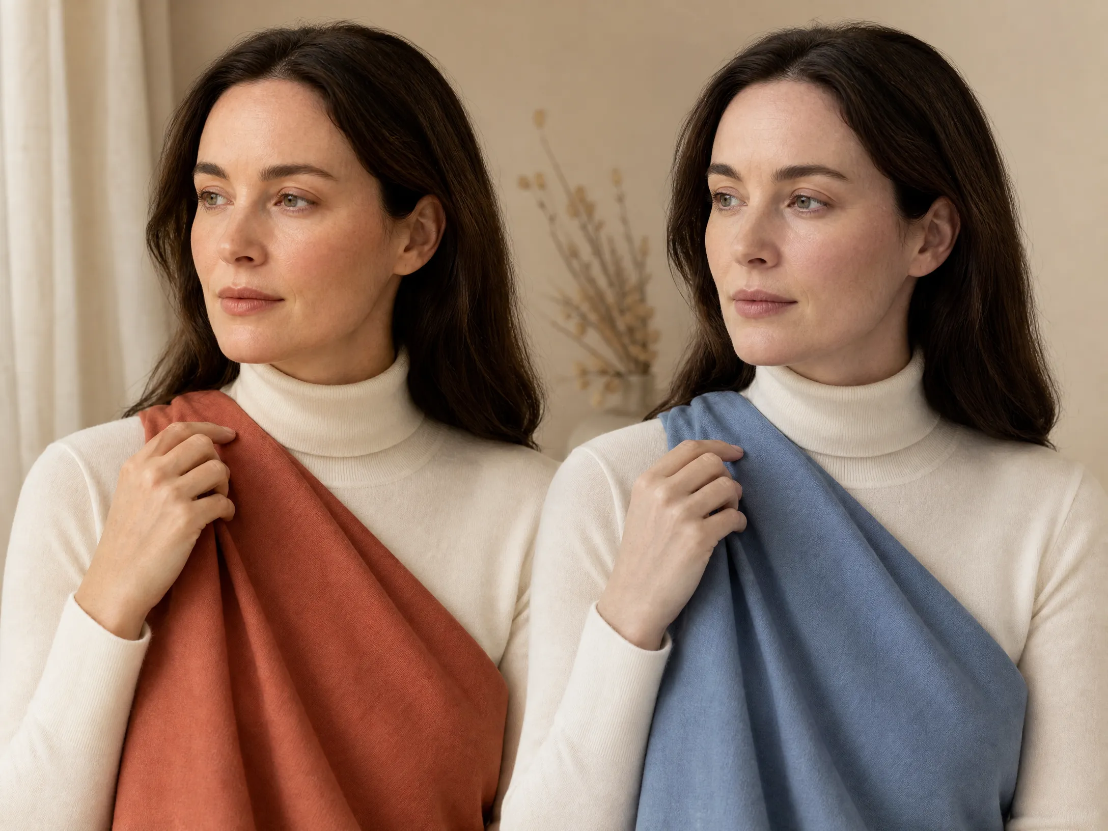
Professional colour analysis consultations centre on one technique above all others: draping. An analyst holds fabric swatches of known colour against a client's face, observes the effect on the skin, and draws conclusions from what they see.
It is a simple technique in principle. The difficulty is knowing what to look for, and avoiding the many variables that can corrupt the result. Done correctly at home, draping is far more reliable than any online quiz, more reliable than vein-checking alone, and comparable in accuracy to a professional reading — if not quite at the same level of speed and certainty.
This guide covers the complete method: what you need, how to set up, how to read the results, and what goes wrong.
What Draping Actually Measures
When you hold a piece of coloured fabric near your face, the fabric interacts with the skin through simultaneous contrast. A colour that is harmonious with your skin's undertone makes the skin appear more even and alive, while a colour that conflicts with your undertone does the opposite.
What harmony looks like:
- ✦Skin appears more even, with less visible redness or blemish
- ✦Dark circles under the eyes look softer and less pronounced
- ✦The face looks more alert and rested
- ✦Jawline looks slightly sharper
- ✦Teeth appear whiter
What disharmony looks like:
- ✦Skin looks slightly greyish, flat, or washed out
- ✦Any redness becomes more visible
- ✦Dark circles and shadows deepen
- ✦The face looks tired or slightly ill
What You Need
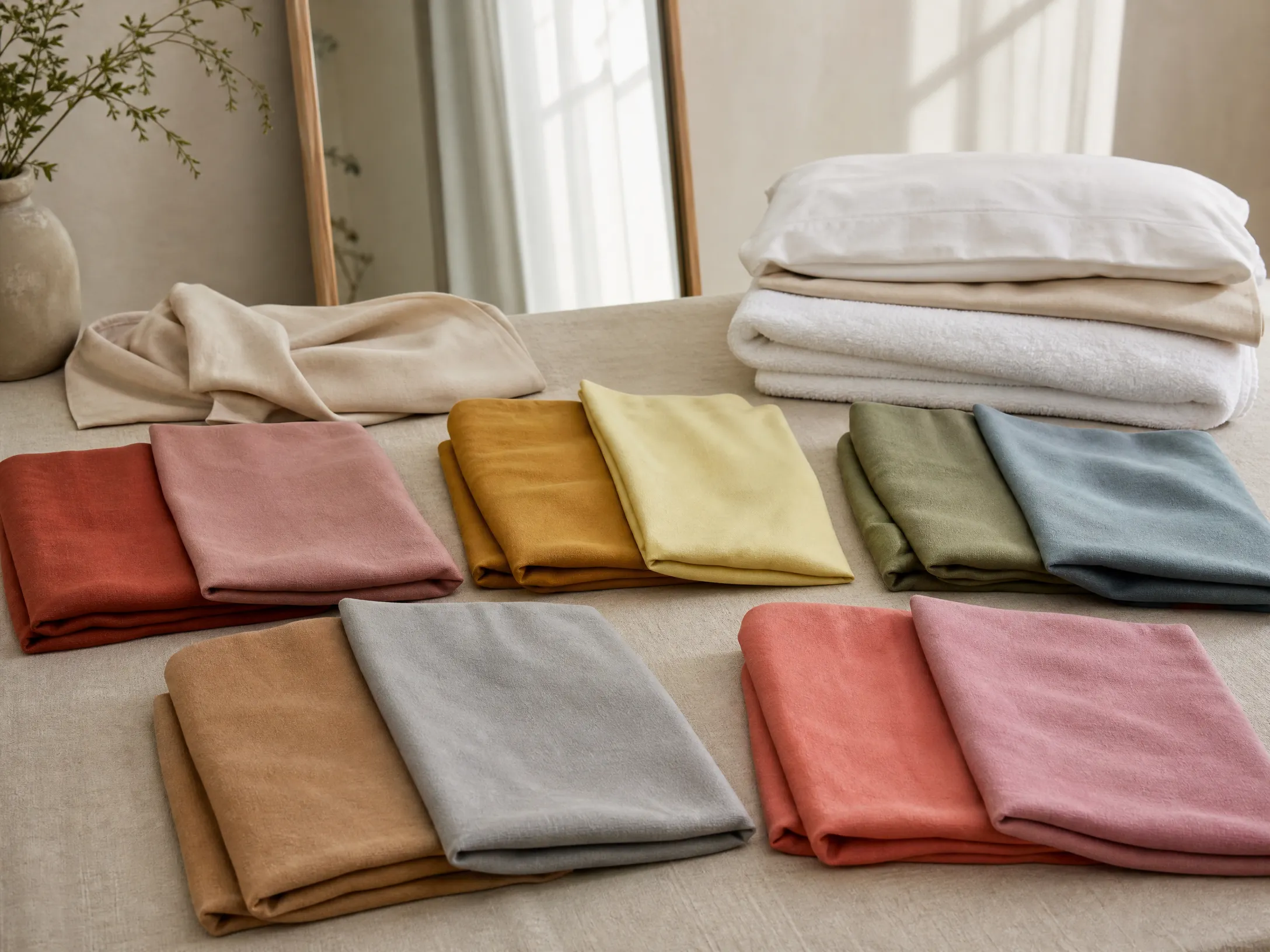
You do not need to buy a professional draping kit. You need solid-coloured fabric or card in specific colour categories. The fabric can be anything — scarves, T-shirts, pillowcases, towels, tablecloths. Key requirements:
- ✦Solid colour only — no patterns, prints, or textures that distract the eye
- ✦Matte or low-sheen surface — shiny fabrics reflect light and distort the reading
- ✦Large enough to fill the neckline area — at least 30×30cm, ideally larger
Colours to gather for a basic warm/cool test:
| Warm version | Cool version |
|---|---|
| Warm terracotta / rust | Cool raspberry / fuchsia |
| Warm mustard / golden yellow | Cool lemon / icy yellow |
| Warm olive / moss green | Cool teal / spruce green |
| Warm camel / beige | Cool grey / taupe |
You are always comparing warm against cool within the same colour category.
Setting Up Correctly
Lighting is the single most critical variable. Get it wrong and the test is worthless.
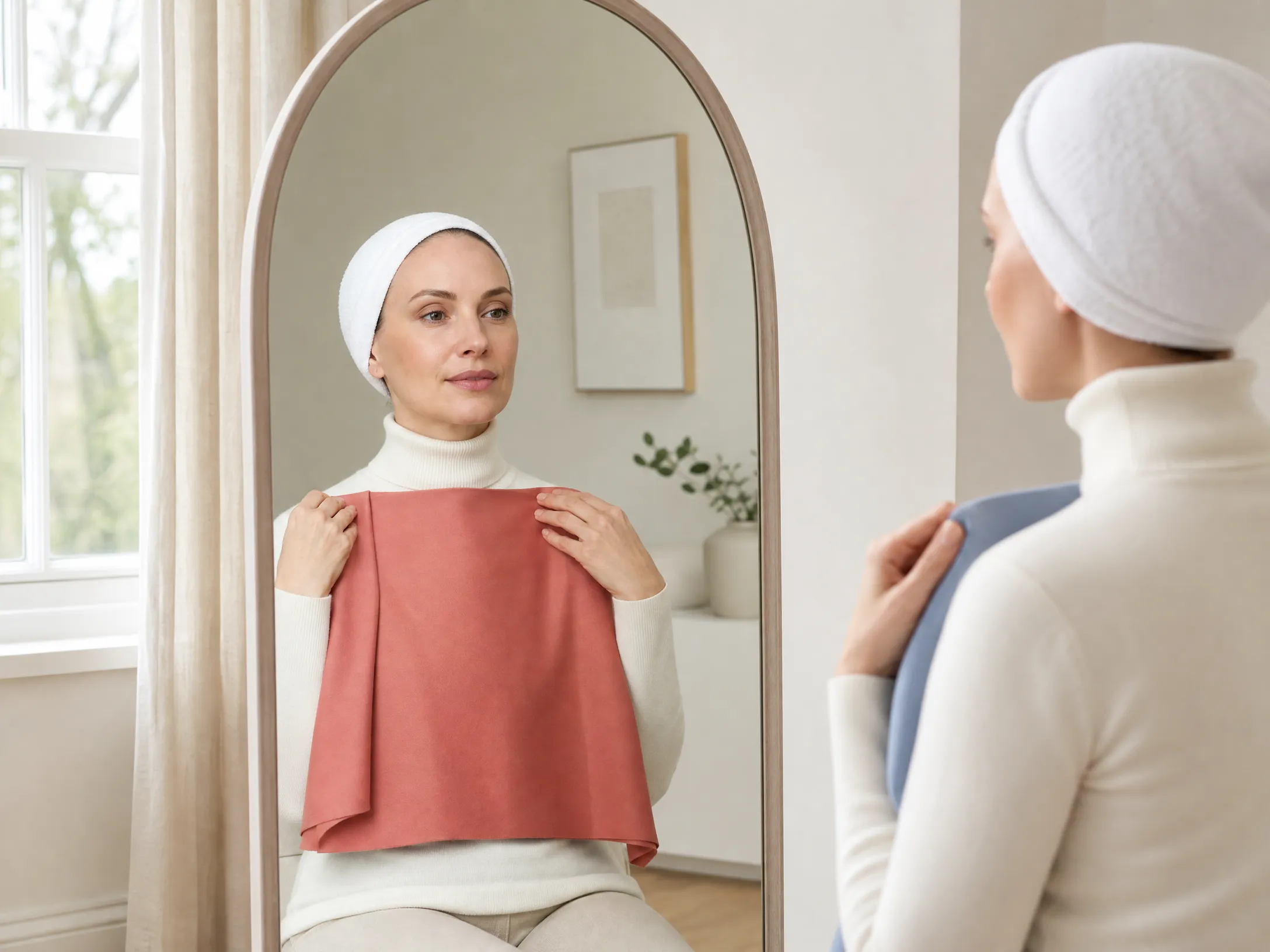
Use natural daylight only. Sit facing a window — not with the window behind you — in indirect natural light. Avoid bathroom lighting, overhead bulbs, LED strips, or any room with mixed artificial lighting.
Prepare your face:
- ✦Remove all makeup, including foundation, concealer, and blush
- ✦Pull all hair off your face completely — use a white headband, clip, or towel
- ✦If your hair is significantly dyed, cover it with a white towel entirely
- ✦Wear a plain white or neutral top, or drape white fabric over your shoulders
The Draping Sequence
Step 1: Establish temperature (warm vs cool)
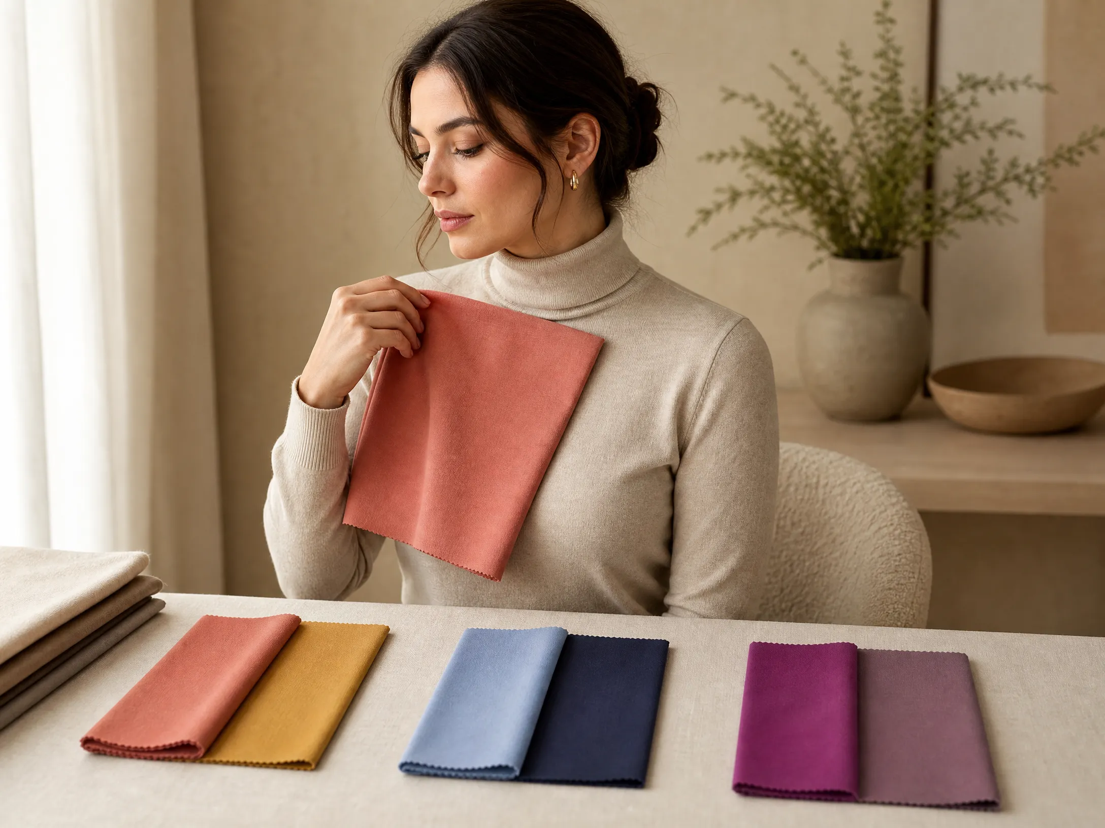
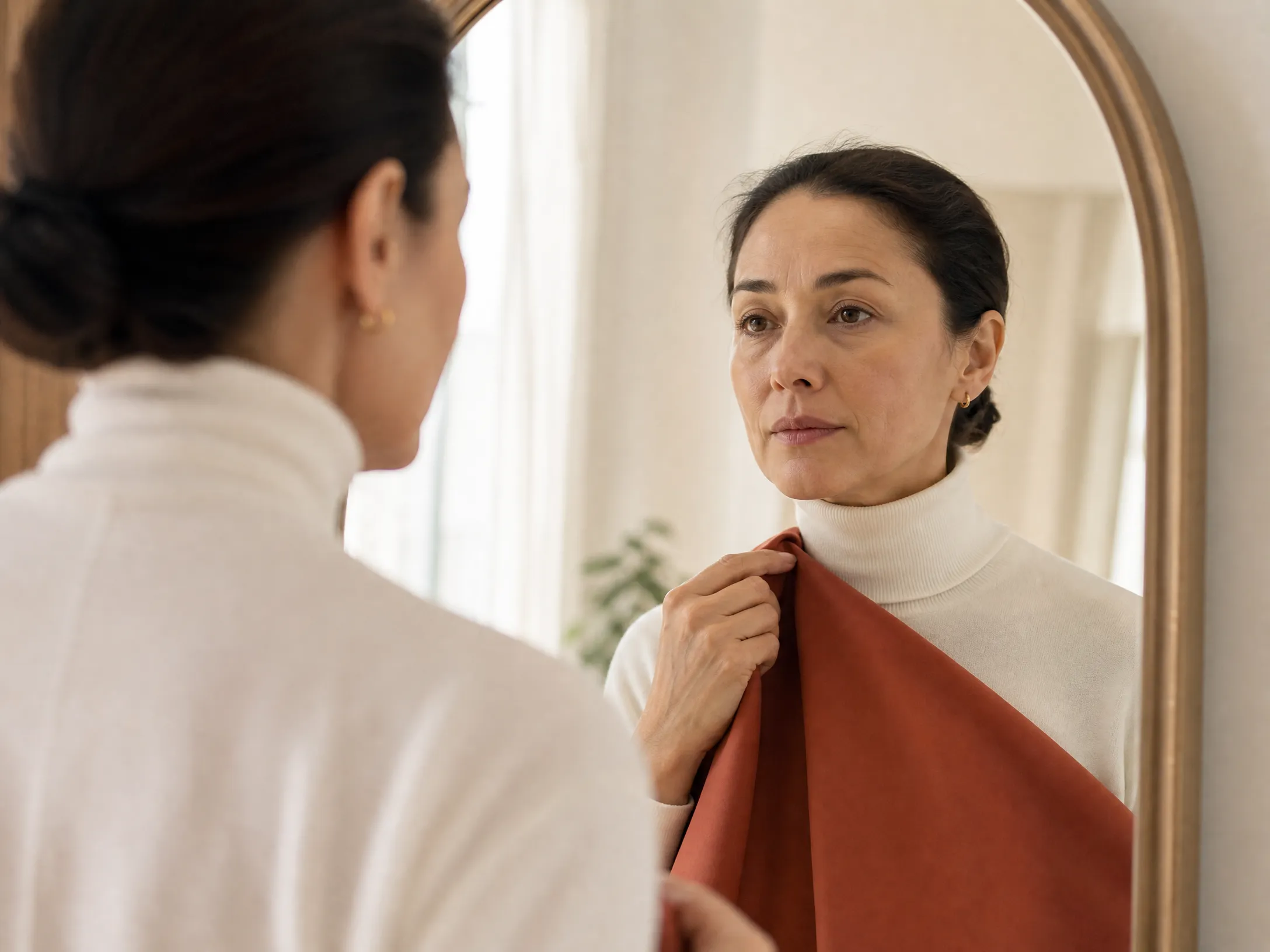
Hold your warm terracotta or warm gold swatch at the neckline and look at your face in the mirror for three seconds, then swap to the cool raspberry or cool silver equivalent. Compare.
Repeat with two or three other warm/cool pairs — mustard vs lemon, camel vs grey. If you consistently respond better to the warm swatches, your undertone is warm. If cool swatches consistently win, your undertone is cool.
Step 2: Establish depth (light vs deep)
Within your confirmed temperature family, compare a light, soft version of a colour against a deep, rich version. Which makes the face look more proportionate and natural?
People with light colouring often find that the deep swatches feel overwhelming. People with deep colouring find that very light swatches look washed out.
Step 3: Establish chroma (clear vs muted)
Within your temperature and depth, compare a vivid, saturated version of a colour against a muted, greyed version.
People with clear colouring look best with the vivid version — the greyed colour makes them look flat. People with muted colouring look best with the dusty version — the vivid colour overwhelms them.
Mapping Your Result to a Season
Your three answers map to a season as follows:
| Warm + Light + Clear | Light Spring or True Spring |
|---|---|
| Warm + Medium/Deep + Clear | True Spring or Bright Spring |
| Warm + Medium + Muted | Soft Autumn or True Autumn |
| Warm + Deep + Muted | True Autumn or Deep Autumn |
| Cool + Light + Clear | Light Summer or True Summer |
| Cool + Light + Muted | Light Summer or Soft Summer |
| Cool + Deep + Clear | True Winter or Bright Winter |
| Cool + Deep + Muted | True Winter or Deep Winter |
At the boundaries — where two seasons could both fit — repeat the specific pairing that separates those two seasons only, and look for the smaller difference.
Common Mistakes
Looking at the swatch instead of the face. The eye is drawn to the fabric. You must consciously redirect attention to the skin every time.
Holding swatches too long. Your eye adapts to any colour within a few seconds. A three-second comparison is more reliable than a ten-second one.
Assessing in artificial light. Artificial light cannot substitute for natural daylight. If the result feels wrong, check the lighting first.
Trusting a single pair. Three or four warm/cool pairs should agree. If they don't, the lighting or preparation is probably wrong — not that you have a contradictory undertone.
When Draping Isn't Enough
The drape test becomes difficult when your colouring is very neutral, when you sit at a season boundary (Soft Autumn / Soft Summer, Deep Autumn / Deep Winter), or when you cannot access good natural light consistently.
At these boundaries, the visual differences between adjacent seasons are genuinely subtle — and self-assessment reaches its limit. A professional colour analysis consultation, or a tool that objectively measures your skin undertone, iris, and hair pigment simultaneously, provides the kind of precision that draping alone cannot.
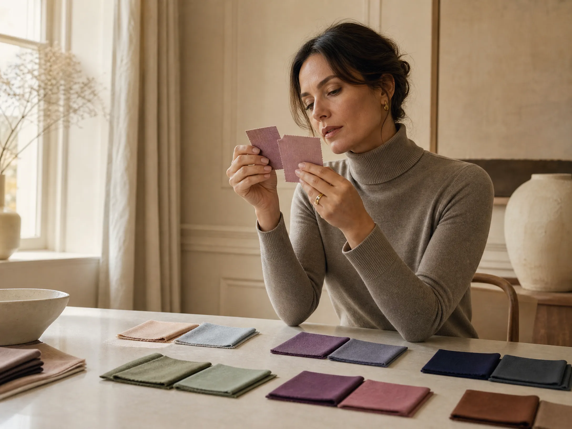
Use the drape test to build intuition and confirm the broad direction. When you need precision at the boundaries, go further.
→ Get a precise season result at inmycolors.com
Draping technique is the central method of professional seasonal colour analysis. The approach described here draws on professional analyst training documentation and published colour analysis methodology.