When someone uploads a photo for colour analysis, what should an AI actually be looking at?
The answer seems obvious: the face. Specifically, the parts of the face that don't change — the skin undertone, the iris colour, the hair, the whites of the eyes. These are the fixed biological properties that determine which colour palette will harmonise with a person's natural colouring.
Most AI colour tools do not look at these things. They look at the outfit.
The Problem with Most AI Colour Tools
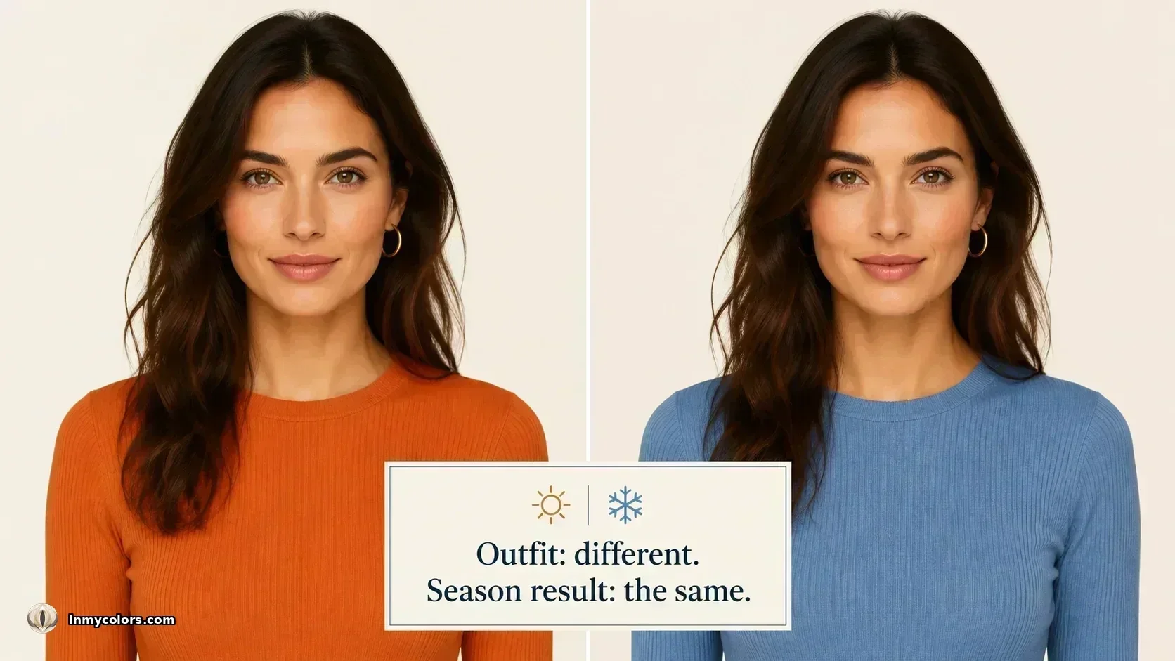
The majority of AI-powered colour tools on the market today use image recognition models trained on general visual data. Feed them a photo of a person, and they identify dominant colours in the image. Those dominant colours are heavily weighted toward whatever the person is wearing — which is often the largest coloured area in the frame.
The result: change your outfit and your "colour analysis" changes with it. Wear orange to your analysis and the tool leans warm. Wear blue and it leans cool. The measurement is not detecting your colouring — it is detecting your current clothing choices.
This is not a minor technical limitation. It is a fundamental flaw in the approach. The purpose of personal colour analysis is to identify the colours that work with your fixed, unchanging natural colouring — not the colours you already happen to own.
What We Actually Measure
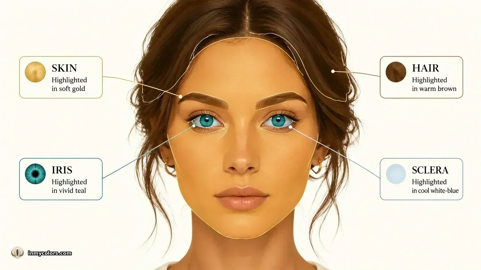
In My Colors measures four biological zones, each providing an independent signal about the person's natural colouring. None of these zones are affected by clothing.
Skin. The primary zone. Using facial landmark detection (MediaPipe FaceMesh, a machine learning model that identifies 468 facial landmarks from a 2D photo), we identify the forehead, left cheek, and right cheek. We sample colour values from each zone, convert to LAB colour space — a model designed to approximate human colour perception — and compute the warm-cool temperature axis (the b dimension in LAB space), value (L, lightness), and chroma.
To prevent a single anomalous zone from skewing the result, we apply zone consensus averaging: if one zone deviates more than 10 LAB units from the median of the three, it is excluded from the final reading. This handles uneven lighting, shadows, and subtle colour casts on one side of the face.
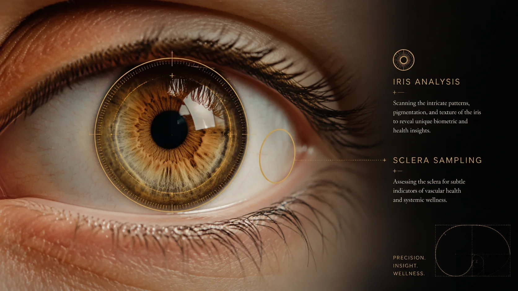
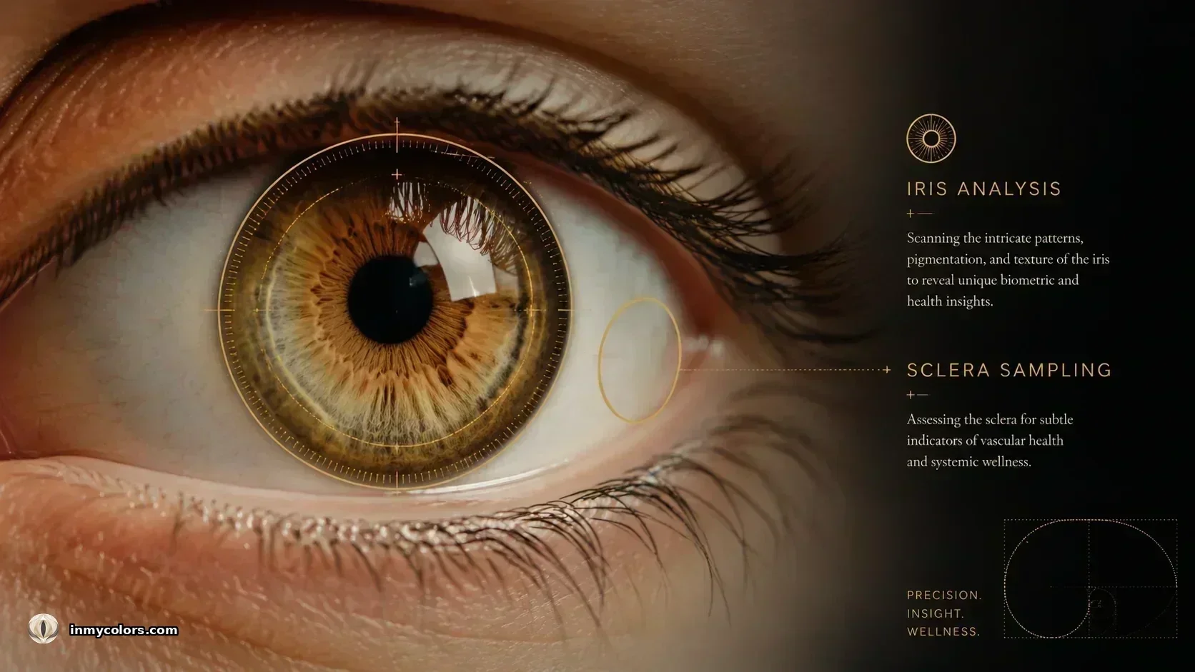
Iris. The iris provides a second undertone signal, independent of the skin. We use a ring sample between 36% and 68% of the iris radius — tight enough to avoid pupil contamination (which is always near-black) and the outer edge (where specular reflections are most common). The resulting colour value is processed through an eye class layer that identifies the iris type across nine categories (IcyBlue, ClearBlue, SteelGrey, CoolGreen, WarmGreen, Olive, Hazel, Brown, DeepBrown). Each class carries undertone and chroma signals that feed into the season scoring.
Sclera. The white of the eye is rarely used in colour analysis, but it carries a meaningful undertone signal — warm ivories indicate a warm season, cool blue-whites indicate a cool one. We sample the sclera using an elliptical ring (wider horizontally than vertically, to avoid eyelid contamination) and apply a three-tier colour filter that ensures only genuine sclera pixels are included. Yellowed or shadowed pixels are excluded.
Hair. Hair contributes to the depth and temperature axes of the classification. We sample from the temple and crown, with bimodal cluster detection to handle highlighted hair (which produces two distinct colour clusters). If obviously unnatural hair colour is detected — blue, green, or purple pigments — we fall back to eyebrow colour as the hair signal, which tends to reflect natural colouring more reliably than dyed hair.
The Lighting Problem
One of the most persistent sources of error in at-home colour analysis — whether AI-powered or human — is lighting.
Warm artificial light (incandescent, candlelight, sunset) shifts every colour in the frame toward orange and yellow. A cool-season person photographed under warm lighting will have a measured skin undertone significantly warmer than their actual colouring. The analysis will lean warm — incorrectly.
We detect lighting warmth using a bias metric (lightingWarmBias) computed from the skin sample pool. When the warmth bias exceeds 0.55 — indicating strong warm lighting contamination — we gate certain undertone-sensitive measurements to prevent the lighting artefact from influencing the classification. We also surface a lighting flag to the user, explaining that the result should be verified under neutral daylight conditions.
This is why the quality of the input photograph matters. The single most important variable in the accuracy of an AI colour analysis is not the algorithm — it is the lighting conditions in the photo.
The Classification Model
Once the four measurement zones have been sampled, the values are fed into a 12-season Gaussian scoring model.
The model computes, for each of the 12 seasons, a probability score based on how closely the measured values match each season's characteristic profile across five axes: temperature, value, chroma, contrast, and iris chroma. The scoring uses a Gaussian function — a bell curve — centred on each season's ideal values, with the probability falling off symmetrically as the measured values diverge from the ideal.
The result is a ranked list of all 12 seasons by probability score. The highest-scoring season is the classification. The second-highest is presented as the secondary season — a useful signal about which adjacent season the person's colouring most closely approaches.
After the Gaussian scoring, a soft plausibility layer applies additional modulation based on known season characteristics: Deep seasons are penalised when value is too high, Light seasons when value is too low, Muted seasons when chroma is too high. This layer prevents edge cases where the Gaussian model might suggest a season that is physiologically unlikely given the measured values.
What Confidence Actually Means
We express classification results as a confidence percentage. This figure represents the margin between the first-ranked season and the second — how decisively the analysis points to one season over its nearest neighbour.
A confidence of 85% or above indicates a clear classification. A confidence of 55–70% indicates ambiguity between two adjacent seasons. A confidence below 50% typically indicates either a photo quality issue (poor lighting, heavy filters, extreme angles) or a genuinely boundary case — a person whose colouring sits precisely on the threshold between two seasons.
Low confidence is informative, not a failure. It tells you that your colouring shares significant traits with two seasons — and that both palettes are worth exploring.
What AI Cannot Do
No AI colour analysis is infallible. Three limitations are worth being honest about.
It cannot handle heavily filtered or edited photos. Instagram and social media filters alter colour values throughout the frame, including skin and iris colour. A heavily filtered photo will produce an inaccurate result. Unfiltered, well-lit photos in neutral daylight are always the most accurate input.
It cannot definitively identify natural versus dyed hair of similar colour. We can detect obviously unnatural pigments (blue, green, purple). We cannot reliably distinguish warm dark brown natural hair from warm dark brown dye. This does not typically affect the classification — the skin and iris are the primary undertone signals — but it means hair depth readings should be interpreted with this caveat in mind.
It cannot replace a human analyst for ambiguous cases. A trained human analyst draping fabric swatches against a person's face in controlled natural light can detect undertone nuances that are invisible in a 2D photograph. For the majority of people, AI analysis is accurate and sufficient. For cases where the colouring genuinely sits on a season boundary, a human consultation remains the gold standard.
What AI offers is something different: speed, accessibility, and scientific measurement free from the subjective biases that can affect human analysts. The two approaches are complementary, not competing.
Why It Matters That We Get It Right
The purpose of personal colour analysis is to give people a reliable, permanent palette — a filter they can apply to every clothing purchase, every makeup choice, every haircolour decision. A palette derived from an inaccurate analysis provides false confidence rather than genuine guidance.
Getting the measurement right — using fixed biological zones rather than outfit colours, correcting for lighting, applying a multi-dimensional classification model — is not a technical nicety. It is the difference between a tool that actually works and one that generates plausible-looking results without genuine accuracy.
Every measurement decision in In My Colors exists to serve that accuracy. The sclera ellipse, the zone consensus averaging, the iris ring bounds, the lighting bias gate — each one addresses a specific source of error that would otherwise corrupt the classification.
The goal is a result you can trust. Not a result that looks convincing.