Most introductions to personal colour analysis focus on two dimensions: warm vs cool (undertone/temperature) and light vs deep (value). These two axes explain a great deal — they place you in a season family and narrow the field considerably.
But there is a third dimension that is often underdiscussed, and it is the one that explains a specific pattern most people have noticed in their own experience: why some people look magnificent in bold, high-contrast combinations and slightly overdone in softer palettes — while others look luminous in soft, tonal dressing and somehow overwhelmed by bold contrast.
The third dimension is contrast — specifically, the contrast level between your natural colouring elements. It determines not just which colours suit you, but which level of tonal contrast in an outfit harmonises with your face.
What Contrast Means in Colour Analysis
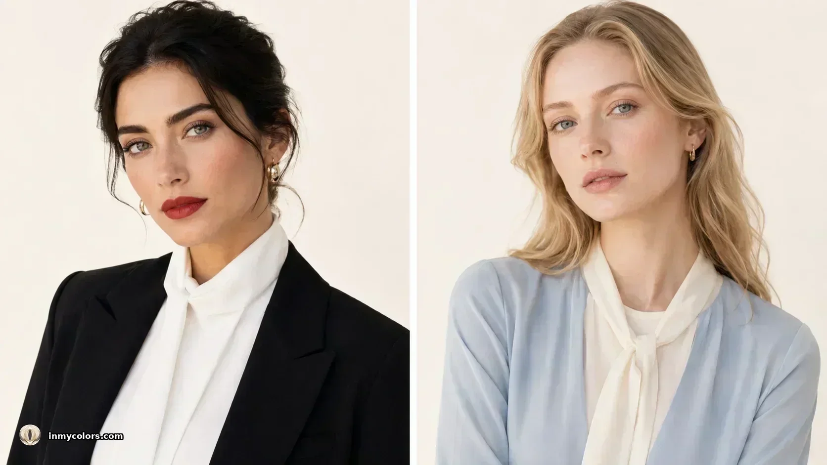
In personal colour analysis, "contrast" refers to the difference in value (lightness vs darkness) between your natural colouring elements — primarily hair and skin, and secondarily iris and skin.
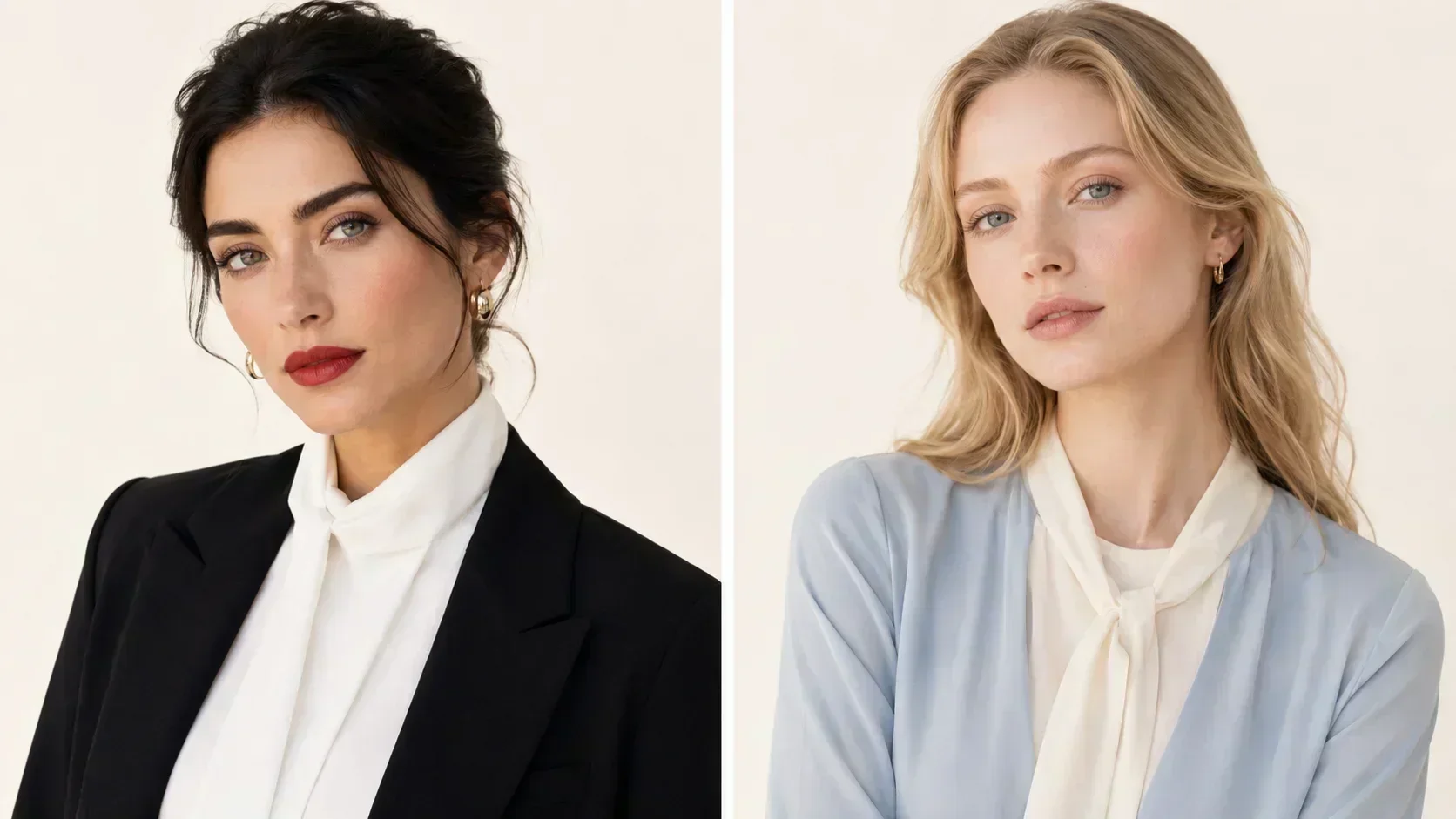
High contrast colouring: there is a large value difference between your hair and skin. The classic example is dark hair (low L value) against fair skin (high L value) — a wide gap on the lightness axis. High-contrast faces can carry high-contrast outfits without the outfit overwhelming the face.
Low contrast colouring: there is a small value difference between your hair and skin. Fair hair against fair skin, or medium hair against medium skin — the face and hair are close in value. Low-contrast faces are overwhelmed by high-contrast outfits; the outfit becomes the dominant visual element and the face recedes.
Medium contrast colouring: medium-depth hair against medium-depth skin, or medium hair against slightly lighter skin — the most common position on the contrast spectrum.
Why Contrast Matters: The Outfit-Face Relationship
The principle is simple once stated: the contrast level of your outfit should approximate the contrast level of your face.
When a high-contrast outfit (stark black and white, or deep navy and crisp white) is worn by someone with low-contrast colouring:
- ✦The outfit becomes the strongest contrast element in the entire visual impression
- ✦The eye travels to the contrast in the clothing rather than to the face
- ✦The face appears to recede — less present, less "there"
- ✦The person appears to be wearing the outfit rather than wearing it
When a low-contrast outfit (tonal dressing, tone-on-tone, soft shades close in value) is worn by someone with high-contrast colouring:
- ✦The outfit provides less visual "anchor" than the face's natural contrast
- ✦The face can appear to dominate awkwardly — the colouring looks stark next to the soft clothes
- ✦The person looks underdressed for their own colouring
When the outfit contrast matches the face contrast:
- ✦The outfit and the face are in visual dialogue rather than competition
- ✦The eye moves naturally to the face
- ✦The overall impression feels effortless — the clothes look like they belong to the person
Where You Fall on the Spectrum
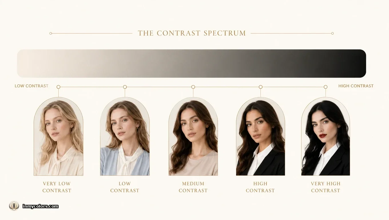
Very high contrast: dark hair (near-black, deep brown) against fair or medium skin. Or dark hair with blue-black or jet-black quality. This colouring can carry the highest contrast outfits — stark black and white, very deep colours against crisp white, bold patterns. Season most commonly: True Winter, Bright Winter, Deep Winter, Bright Spring.
High contrast: medium-dark hair against fair skin, or dark hair against medium skin. Can wear bold contrast, clear depth, and vivid colours against light. A single stark white shirt against dark clothing. Season most commonly: True Winter, Bright Spring, True Spring, Deep Autumn.
Medium contrast: medium hair against medium-light skin, or medium-light hair against medium skin. The broadest and most flexible position. Can wear both moderate contrast outfits and some bold combinations. Most seasons include medium contrast people.
Low contrast: light hair against light skin, or medium-light hair against medium skin. Soft, tonal dressing works best. High contrast outfits overwhelm the face. Stark black against crisp white can make the person appear to disappear. Seasons most commonly: Light Spring, Light Summer, Soft Summer, Soft Autumn.
Very low contrast: very light hair (platinum, ash blonde) against fair skin, or completely grey/white hair against medium skin. The lowest contrast combination requires the softest, most tonal outfit approach. Stark contrast in clothing creates a jarring visual effect. Seasons: Light Summer at its lightest extreme.
The Grey Hair Contrast Shift
One of the most practically significant contrast changes most people experience is the greying of hair. Dark hair that created high contrast against fair or medium skin transitions — through salt-and-pepper — to a lighter overall colouring with significantly reduced contrast.
This is not a change of season. The undertone remains constant. But the contrast level drops, and the optimal outfit contrast drops with it.
A person who wore bold black-and-white combinations beautifully at 35 with dark hair may find at 60 with fully grey hair that the same combination looks slightly harsh. The season's palette is unchanged. The contrast range within that palette has narrowed.
The practical adjustment: move toward medium-contrast combinations. Keep the depth if it's in season (deep tones are still valid for Deep and True seasons), but pair them with off-white or ivory rather than crisp stark white. The depth of the dark piece can remain; the starkness of the contrast is what softens.
Contrast and Pattern
The contrast principle applies not just to outfit combinations but to patterns.
High-contrast colouring: can wear high-contrast patterns — bold stripes, strong graphic prints, black-and-white houndstooth, bold plaid. The pattern's contrast matches the face's contrast. The face holds its own against the pattern.
Low-contrast colouring: is better served by low-contrast patterns — tone-on-tone, subtle prints, patterns where the colours are close in value. A bold black-and-white stripe on low-contrast colouring creates an effect where the stripe is all the eye sees.
Medium-contrast colouring: has the most flexibility — medium-contrast patterns (navy and white, not black and white; warm rust and cream, not black and cream) work without overwhelming. Very bold patterns should be balanced with a solid near the face.
Contrast and the Neckline Principle
The contrast rule has a particularly practical application at the neckline — the area of clothing closest to the face and therefore the area where contrast discrepancy is most visible.
For high-contrast colouring: a high-contrast combination at the neckline — a white shirt collar against a dark jacket, a white blouse visible at the neck of a coat — is exactly right. The contrast near the face matches and amplifies the natural contrast of the colouring.
For low-contrast colouring: a tonal combination at the neckline — a blouse in a lighter shade of the jacket's colour, or a knit and coat in close tones — keeps the face as the contrast reference point. A stark white shirt collar on low-contrast colouring can create an effect where the collar is the first thing the eye sees rather than the face.
Contrast and Makeup
The same principle extends to makeup application.
High-contrast colouring: can wear bold makeup — defined brows, dark eyeliner, vivid lip. The makeup contrast is in proportion to the face's natural contrast. Heavy eye and defined lip together can overwhelm faces with lower contrast.
Low-contrast colouring: tends to look best with one defined feature at a time. Bold lip OR defined eye — not both. The makeup should be in proportion to the face's natural softness. Soft, blended eye looks and natural lips, or a clean eye with a statement lip, rather than full drama.
This explains why the same bold eye and lip combination that reads as perfectly calibrated on one person reads as too much on another with softer colouring — it is not a difference in skill or taste. It is a contrast mismatch.
Contrast and Season: How They Interact
The contrast axis interacts with season in predictable ways.
Winter seasons tend toward higher contrast because Winter's defining quality includes relatively deep and clear colouring — the combination of cool, vivid colour and depth creates natural contrast. True Winter can be high or medium contrast; Deep Winter is often very high contrast; Bright Winter can be high contrast.
Spring seasons vary: Light Spring is low contrast (light hair, fair skin); True Spring is medium contrast; Bright Spring is often higher contrast (deeper or darker features against lighter skin).
Summer seasons tend toward lower contrast — the muted, soft quality of Summer colouring places all elements (hair, skin) in a softer, more blended range. Light Summer is very low contrast; Soft Summer is low-to-medium; True Summer is medium.
Autumn seasons are medium to medium-high — warm depth in hair and skin creates some contrast but the muted quality softens the edges. Deep Autumn can be relatively high contrast.
A Practical Test
If you are unsure where you fall on the contrast spectrum, the simplest test: look at a photograph of yourself in natural light with no makeup and your natural hair. Now ask:
If a stranger looked at this photograph from across the room, what would they see first? Your hair, your skin, or your face as a whole?
- ✦If they would see the hair-skin contrast first (one dramatically lighter or darker than the other) → high contrast colouring
- ✦If they would see the face as a relatively unified impression, hair and skin blending → low contrast colouring
- ✦Something between → medium contrast
This self-assessment does not require precise measurement. Your experience of your own photographs — which outfits look "alive" and which look "too much" or "too little" — is consistent data over time, and it is data you already have.
Contrast analysis in colour theory draws on Itten, J. (1974), The Art of Color, and the contrast axis as developed in the 12-season extension of the seasonal colour system. Clinical colorimetry: Lab colour space contrast measurement.*