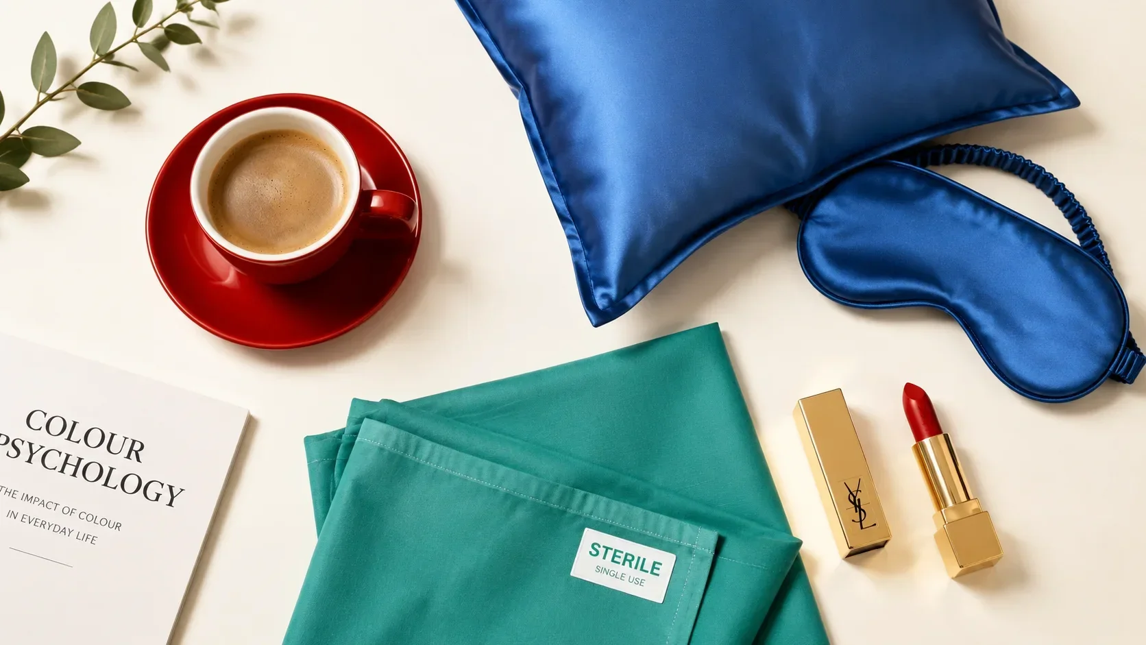
Most people understand, intuitively, that colour affects mood. What is less widely understood is how far that effect extends — into physiology, decision-making, appetite, sleep, and the fundamental perception of temperature and time.
Colour does not just make things look different. It changes measurable biological responses. It is, in this sense, not a passive visual phenomenon but an active environmental force — one that operates whether you are aware of it or not.
The Physiological Effects
The most important distinction in colour psychology is between physiological effects — which are universal and measurable — and cultural associations — which vary by geography, era, and individual experience.
Physiological effects operate independently of awareness. You do not need to know that red raises pulse rate for it to do so. You do not need to believe that blue lowers blood pressure for that effect to occur. The body responds to colour input before the conscious mind processes it.
Red raises pulse rate, elevates blood pressure, and stimulates the sympathetic nervous system — the fight-or-flight system. In red environments, time perception is accelerated (minutes feel longer), appetite increases, and physical arousal rises. Red also draws attention faster than any other colour: it is the first colour the eye processes in a competitive visual field.
Blue produces the opposite physiological response: slower pulse, lower blood pressure, reduced arousal. Blue environments feel cooler, time perception slows, and the body moves toward parasympathetic rest. Blue is also the most widely trusted colour in professional contexts — its association with reliability and competence is near-universal.
Green is associated with the lowest eye fatigue of any colour — the eye resolves green at the focal point of the lens, requiring minimal muscular adjustment. This is why green is used in operating theatres (see below) and why extended time outdoors feels restorative.
Yellow is the first colour processed by the human eye in low-contrast situations. It is the most visible colour at a distance and the fastest to register in peripheral vision. In excess, it correlates with increased anxiety — an inverse relationship to the optimism it is culturally associated with.
Red and Yellow: Why Fast Food Chains Chose Them
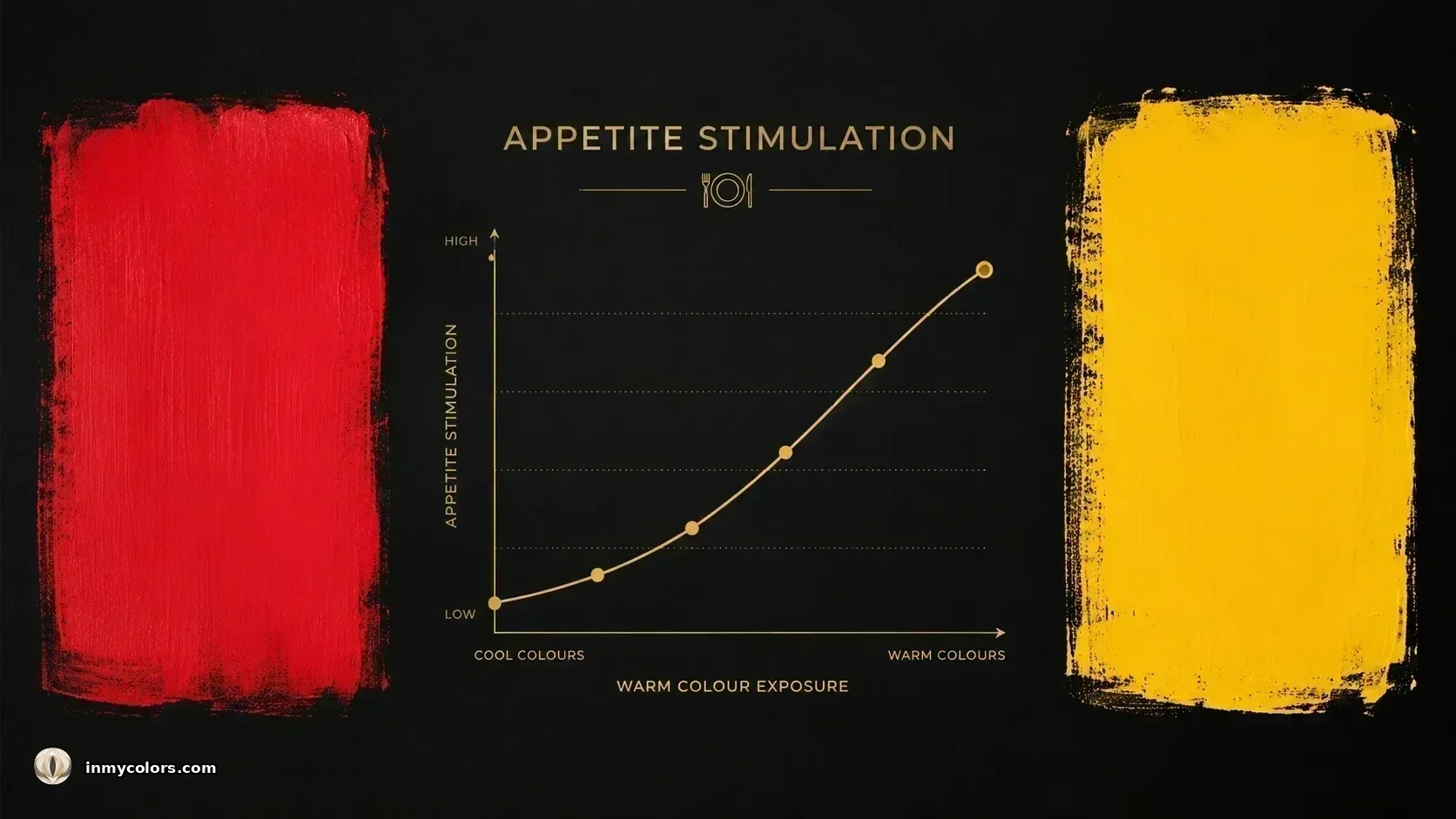
McDonald's, KFC, Burger King, Pizza Hut. Every major fast food chain is branded in red and yellow. This is not a coincidence of branding preference — it is the deliberate application of colour psychology.
Red stimulates appetite and creates urgency. Yellow is the fastest colour to register in the visual field. Together, they produce the ideal fast-food consumer response: seen first, hungry faster, eating and leaving quickly. The combination maximises revenue per customer through increased turnover.
The inverse principle is equally deliberate: fine dining environments almost never use red or yellow at the tables. Dark, cool palettes — navy, dark green, warm charcoal — slow the dining experience, signal sophistication, and encourage lingering over more expensive choices.
Blue, notably, is the least appetising colour. It is found nowhere in nature as a food colour (with the exception of blueberries, which are actually near-purple). No major restaurant chain uses blue as its primary brand colour. The physiological suppression of appetite by blue is consistent and well-documented.
Source: Birren, F. (1978). Color and Human Response.
The Operating Theatre: Green Is Not for Calm
One of the most counterintuitive applications of colour psychology is the use of green in hospital operating theatres. The popular assumption is that green was chosen for its calming effect. This is partly true but misses the primary reason.
Surgeons work for hours with direct visual focus on red tissue and red blood. The eye has a self-correction mechanism — after prolonged exposure to any colour, it generates the complementary afterimage when it looks away. The complementary of red is green.
In a white-walled theatre, a surgeon who looks away from the surgical field will see green afterimages projected onto every white surface — the walls, the instrument trays, the patient's draping. These afterimages interfere with visual acuity at precisely the moment it is most needed.
Green walls make the afterimage invisible. It blends into the background rather than appearing as a foreign visual artefact. The surgeon's vision is protected. The choice of green is not aesthetic — it is optical engineering.
This principle — that every colour forces the eye to seek its complement — is the same mechanism that makes colour harmony in personal appearance so significant. When the colours near your face fight your natural colouring, the eye works to correct them. When they harmonise, it rests.
Source: Itten, J. (1974). The Art of Color.
The Bedroom: Colour and Sleep
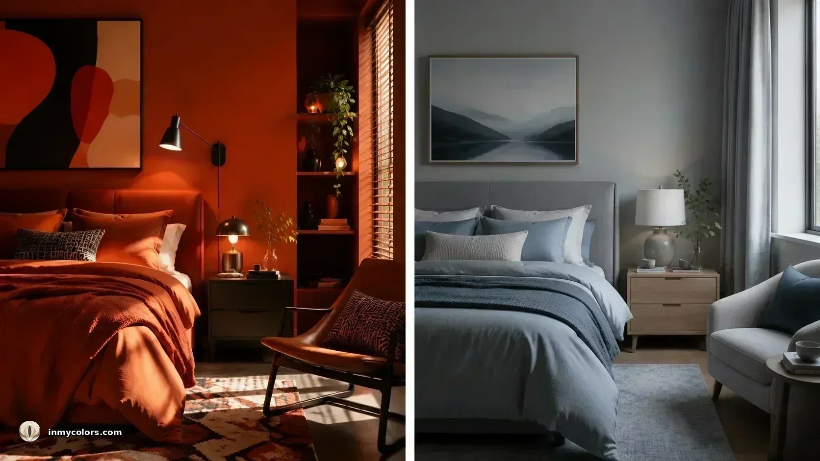
Bedroom colour choice is one of the most practically consequential applications of colour psychology, and one of the most frequently ignored.
The physiological effects of warm and cool colours on arousal operate regardless of conscious attention. A red bedroom is a physiologically stimulating environment — the body in a red room is working harder to maintain calm than the body in a blue-grey room. Sleep requires a parasympathetic state: slow pulse, low blood pressure, minimal arousal. Red works against this. Blue, grey-blue, and muted sage green work with it.
The critical variable is saturation, not just hue. Vivid blue is as stimulating as red — the saturation triggers arousal irrespective of temperature. Muted, desaturated blue-grey is calming. The rule for sleep environments: desaturate. Whatever colour you choose, take it toward grey. Muted and soft produces a physiologically restful environment; vivid and bright does not, regardless of the specific hue.
Best bedroom colours for sleep: soft blue-grey, sage green, dusty slate, cool greige.
Avoid: red, orange, vivid yellow, vivid blue.
The Cold Room and the Warm Room
One of the most cited findings in colour psychology is the cold-warm contrast experiment documented by Johannes Itten — an effect subsequently replicated in multiple studies.
Two identical rooms were painted: one in blue-green, one in red-orange. Participants were asked to report when they felt uncomfortable from cold. In the blue-green room, discomfort was reported at 59°F (15°C). In the red-orange room, not until 52–54°F (11–12°C).
A difference in perceived temperature of up to 7°F (4°C) — from colour alone. No change in actual temperature. No change in clothing. The colour changed the physiological response to temperature.
The mechanism is circulatory: warm colours stimulate blood circulation to the surface of the skin, creating a sensation of warmth. Cool colours have the opposite effect. The perception is not psychological metaphor — it is a measurable physiological response.
The practical application extends well beyond room temperature. In clothing, warm colours near the face can create a subtle sense of warmth and vitality. Cool colours create a sense of precision and alertness. The choice of colour temperature is, in this sense, a tool for managing the impression you create — and the internal state you inhabit.
Source: Itten, J. (1974). The Art of Color.
Colour at Work: What Your Environment Does to Your Thinking
Research on colour in workplace environments has established several consistent effects:
Red environments increase the speed of work on repetitive tasks but decrease performance on complex cognitive tasks requiring creative thinking or problem-solving.
Blue environments have the opposite profile: they support open-ended, generative thinking and creative problem-solving but are less effective for rapid, repetitive execution.
Green environments are associated with creativity and sustained attention, with lower fatigue over long sessions.
White environments — common in open-plan offices — produce higher error rates over time than coloured environments, with participants reporting increased fatigue and lack of stimulation.
The implication for intentional workspace design is consistent with the personal dressing principle: the colour environment shapes the cognitive work done within it. The choice is not neutral.
What This Means for Your Wardrobe
The physiological effects of colour apply to clothing as much as to rooms — perhaps more so, because clothing is the colour environment you inhabit closest to your skin, closest to your face, and for the longest uninterrupted period of any average day.
The red blouse raises your pulse. The blue jacket activates the competence association. The warm camel coat signals approachability. The stark black suit signals authority.
These effects are in addition to — not instead of — the season alignment effects described in the personal colour analysis literature. A well-chosen wardrobe deploys both: the right colour temperature for your season (harmony and luminosity) and the right colour psychology for the context (the signal you want to send and the state you want to inhabit).
Your wardrobe is not just an aesthetic system. It is a physiological and psychological one.
Sources: Birren, F. (1978). Color and Human Response. Van Nostrand. Birren, F. (2011). Color Psychology and Color Therapy. Revised edition. Itten, J. (1974). The Art of Color. Wiley. Labrecque, L. I. & Milne, G. R. (2011). Exciting red and competent blue. Journal of the Academy of Marketing Science, 40(5).