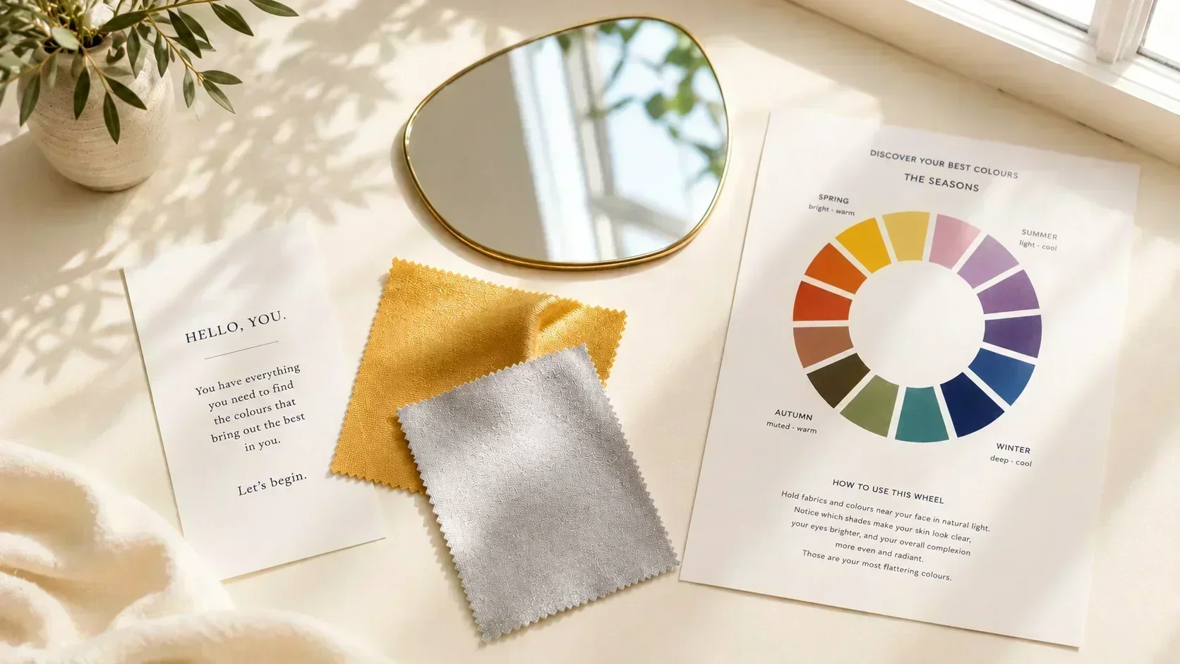
Professional colour analysis — a consultation with a trained analyst, draped in fabric samples across an hour or more — is the gold standard. It is also expensive, geographically limited, and unavailable to most people.
The practical alternative is at-home analysis: a structured process of visual self-assessment using a combination of fabric draping, physical tests, and logical elimination. Done correctly, at-home analysis can produce a reliable result for most people most of the time. Done carelessly — in the wrong light, using the wrong references, or skipping the key tests — it produces confident wrong answers.
This guide covers the correct approach: what to do, what to avoid, and what to do when the result is ambiguous.
Before You Start: The Environment
The most common reason at-home colour analysis fails is poor lighting. This matters more than any other variable.
Use natural daylight only. Stand near a window in indirect natural light — bright enough to see clearly, not direct sunlight (which is too warm and too intense). Avoid:
- ✦Incandescent bulbs (too warm — will make everything look warmer than it is)
- ✦LED bulbs (often too blue or too cool)
- ✦Overhead fluorescent (adds a green cast)
- ✦Mixed lighting (part natural, part artificial — creates unreliable colour casts)
The time of day matters slightly. Midday natural light is closest to neutral. Avoid early morning and late afternoon, when sunlight has a strongly warm cast.
Remove all coloured clothing from the neckline area. Wear a white or neutral top, or drape a white towel around your shoulders. Coloured clothing near the face casts colour onto the skin and distorts the assessment.
Remove all makeup. You are assessing the natural colouring — skin, iris, hair. Makeup (particularly foundation and blush) masks the skin's undertone. Do this test without any face product if possible.
Step 1: Determine Temperature
Temperature is the first and most important determination. It places you in either the warm family (Spring/Autumn) or the cool family (Summer/Winter).
The gold-silver test:
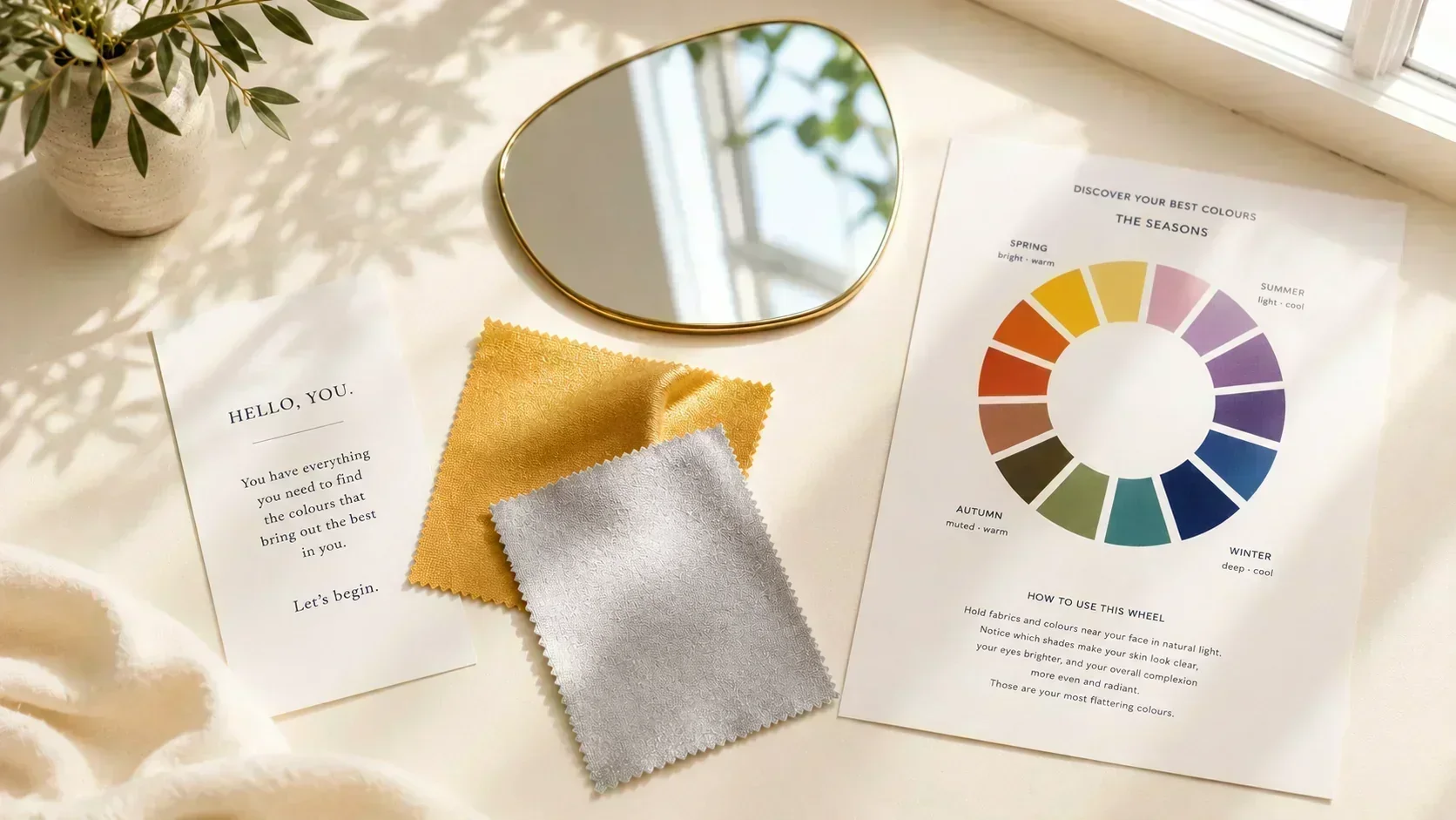
You need two pieces of fabric or card — one warm gold (golden yellow tone) and one cool silver (blue-silver tone). Hold each near your face in sequence, in natural light.
- ✦If the gold makes your skin look more alive, luminous, and healthy → warm undertone → Spring or Autumn family
- ✦If the silver makes your skin look more alive and clear → cool undertone → Summer or Winter family
If neither is clearly better, try the vein test: look at the veins on the inside of your wrist.
- ✦Greenish or olive veins → warm undertone
- ✦Blue, purple, or blue-violet veins → cool undertone
Confirm with white: look at yourself against a plain white wall or card. Does your skin read slightly golden or peachy against white? Warm. Does it read slightly pink or grey-cool against white? Cool.
Write down your result: warm or cool.
Step 2: Determine Value (Light vs Deep)
Value determines whether you sit in Spring vs Autumn (within warm), or Summer vs Winter (within cool).
Look at your overall impression in natural light without makeup. Consider:
Your skin depth: are you fair, medium, or deep/dark in overall skin tone?
Your hair depth: is your natural hair colour light (blonde, light brown), medium (medium brown), or dark (dark brown, near-black, jet-black)?
Your overall contrast level: is the difference between your hair colour and your skin colour large (high contrast) or small (low contrast)?
Light value indicators: fair skin, light to medium hair, lower contrast overall. The lighter end of your season family.
Deep value indicators: medium-deep to deep skin, dark hair, or high contrast between hair and skin. The deeper end of your season family.
Determining your season family so far:
- ✦Warm + light → Spring family
- ✦Warm + deep → Autumn family
- ✦Cool + light → Summer family
- ✦Cool + deep → Winter family
You now know your season family. The next step narrows to the specific season within the family.
Step 3: Determine Chroma (Clear vs Muted)
Chroma tells you which of the three sub-seasons within your family is yours.
Look at your iris colour in natural light. The iris is often the best indicator of chroma because it is less affected by lighting variation than skin.
Clear/vivid iris indicators: the iris has a striking, saturated quality — vivid blue, clear green, warm hazel with distinct colour. The iris is one of the more noticeable features of the face. Associated with the brighter sub-seasons: Bright Spring, True Spring, True Summer, True Winter, Bright Winter.
Muted/soft iris indicators: the iris is softer, more blended — greyed-blue, dusty hazel, soft brown. Less striking, more nuanced. Associated with the softer sub-seasons: Light Spring, Light Summer, Soft Summer, Soft Autumn, True Autumn.
Deep/dark iris: dark brown or very dark hazel with depth. Associated with the deeper sub-seasons: Deep Autumn, Deep Winter, True Winter.
Mapping chroma to sub-season:
Within Spring:
- ✦Light + very clear but delicate → Light Spring
- ✦Clear and warm, moderate depth → True Spring
- ✦Very vivid, high contrast → Bright Spring
Within Summer:
- ✦Very light, very soft → Light Summer
- ✦Medium soft, classic muted cool → True Summer
- ✦Most muted of all, slightly deeper → Soft Summer
Within Autumn:
- ✦Lightest, most muted Autumn → Soft Autumn
- ✦Full warm Autumn character → True Autumn
- ✦Deepest warm colouring → Deep Autumn
Within Winter:
- ✦Deep cool clarity → True Winter
- ✦Highest vivid chroma → Bright Winter
- ✦Greatest depth → Deep Winter
Step 4: Draping Confirmation
The most reliable confirmation method is draping: placing fabric swatches of known colour and temperature against the face in natural light and observing the effect on the skin.
What you need: at least four fabric swatches — one clearly warm (a warm camel or warm terracotta), one clearly cool (a cool grey or cool navy), one in a warm vivid (coral or warm teal), one in a cool muted (dusty mauve or cool sage).
What to look for: against the swatch that is in your season, the skin appears more luminous and alive. Shadows under the eyes look softer. The skin looks healthy. The overall impression is that you look well.
Against the wrong swatch: the skin can appear slightly grey, flat, or washed out. Shadows under the eyes deepen. Any redness or blemishes become more noticeable.
The critical discipline: you must look at the skin and face, not at the swatch. The swatch's attractiveness is irrelevant. You are looking at what the swatch does to the face next to it.
Step 5: Confirm Against Known Season Palettes
Once you have a provisional season, look at a full palette for that season and test three to five specific pieces from your existing wardrobe that you know you look good in. They should align with that palette.
Then test three to five pieces you know don't work for you. They should not align with the palette.
If the alignment is strong in both directions — your best pieces are in-season and your worst pieces are out-of-season — your result is reliable.
If there are anomalies — pieces that work but are clearly out of season, or pieces that don't work but are in season — consider whether the issue is shade (the piece is in the right colour family but the wrong temperature within it) or whether your season determination needs reconsideration.
What Makes At-Home Analysis Fail
Wrong light. The single most common failure. Incandescent light makes everything look warmer; LED and fluorescent light can introduce cool or green casts. Artificial light cannot substitute for natural light for undertone assessment.
Not removing makeup. Foundation, blush, and lip colour mask the skin's true undertone. Even light foundation changes the visible skin temperature enough to mislead.
Assessing the swatch rather than the face. During draping, the eye is naturally drawn to the fabric colour. The assessment is of the face, not the fabric. This requires deliberate redirection of attention.
Trusting a single test. No single test gives a definitive result. Gold-silver + vein + white wall + draping together give a reliable result. One test alone can mislead.
Confusing preference with harmony. You may prefer cool grey even though it doesn't harmonise with your warm undertone. The assessment is about what harmonises, not what you like. These are often different.
When the Result Is Ambiguous
Some people reach the end of this process with a clear result. Others remain genuinely uncertain — typically at a season boundary, or because their colouring genuinely sits between two adjacent seasons.
Common ambiguous cases:
Soft Autumn vs Soft Summer: both are muted. The difference is entirely in temperature — warm vs cool. Re-do the gold-silver test three times on different days in good natural light. Vein test. The temperature should resolve with enough repetition.
True Winter vs Bright Spring: both have high chroma and clarity. The difference is temperature. The draping test with warm and cool versions of vivid colours (warm coral vs cool fuchsia) should reveal the distinction clearly.
Light Spring vs Light Summer: both are light value and relatively soft. Temperature again is the differentiator. Focus on the gold-silver test specifically.
If the result remains ambiguous after multiple sessions: you are likely a neutral or boundary case. The neutral-warm position (close to True Spring and True Summer) and the neutral-cool position (similar overlap) both exist. Wearing colours from both adjacent seasons and observing which photographs better over a period of weeks is the most practical disambiguation method.
An AI analysis — measuring skin, iris, hair, and sclera simultaneously — provides the objective three-axis measurement that visual self-assessment cannot always achieve at the boundaries.