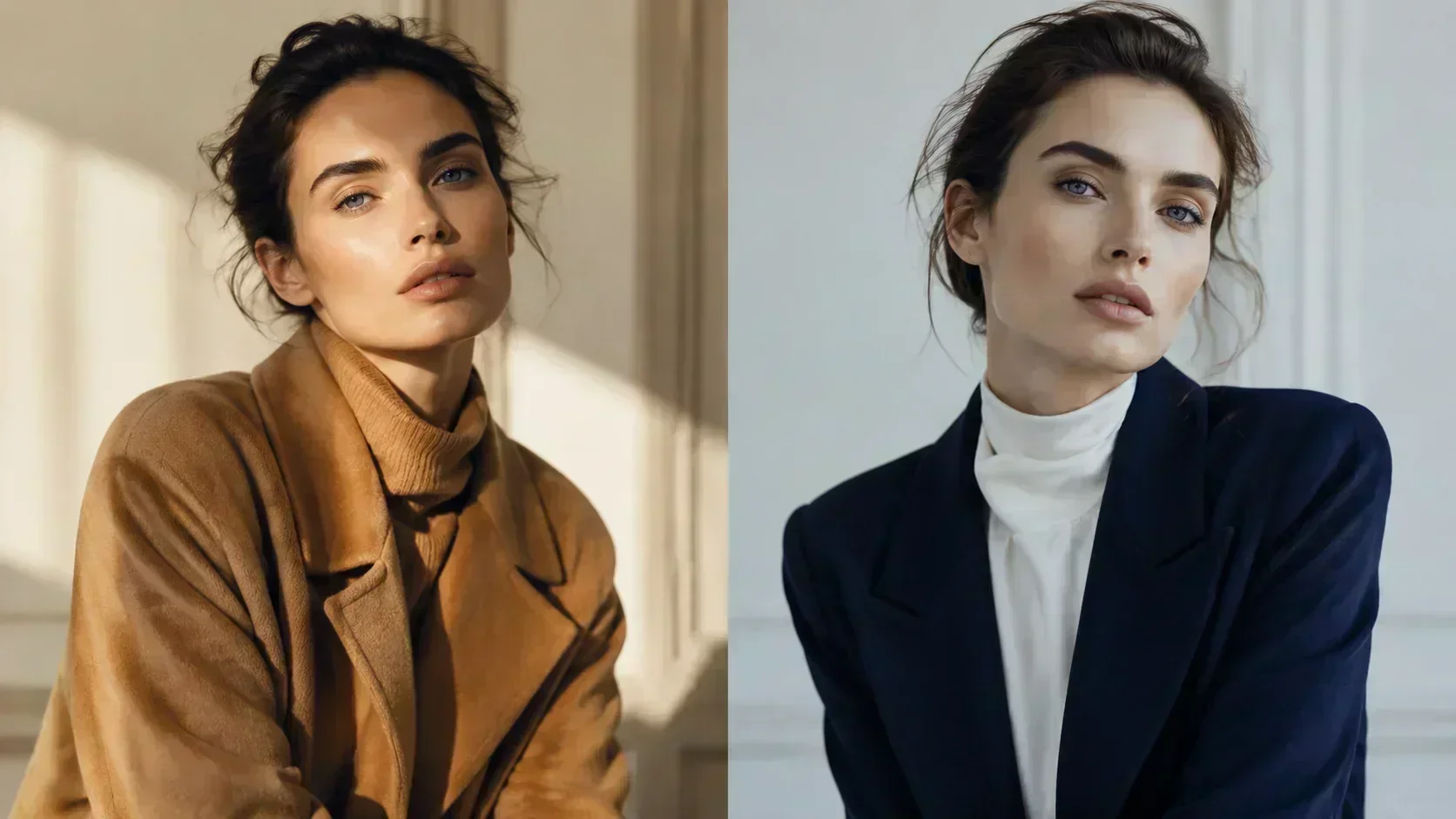
When a celebrity appears on a red carpet and something looks subtly wrong — the look is technically flawless, the dress is expensive, the styling is professional, but something in the overall impression falls flat — the reason is almost always colour temperature.
The dress is fighting the face.
This is not a matter of taste or trend. It is a function of simultaneous contrast and undertone harmony: the same perceptual mechanism that makes certain colour-face combinations feel immediately right and others feel persistently off, regardless of how objectively beautiful the garments are.
Celebrity looks offer a uniquely clear window into this principle because the production values are high (professional lighting, skilled photographers), the variety is vast (celebrity wardrobes span every colour family), and the before-and-after documentation is publicly available. When a celebrity consistently looks most alive in one colour range and most strained in another, they are showing you their season in real time.
Reading a Celebrity's Season
You do not need to run a colour analysis to observe season alignment. You need to look at a celebrity across multiple looks and ask a simple question: in which colour environments does the skin look most luminous, the eyes most vivid, and the overall impression most coherent?
The answer will almost always be consistent. A person with warm golden undertone will look most alive in warm tones — camel, rust, warm teal, golden bronze — and most strained in stark navy or cold grey. A person with cool undertone will look most alive in cool, crisp tones — navy, white, burgundy, cool teal — and most drained in warm camel or orange.
You are not looking for the most expensive dress, the most flattering cut, or the most skilled makeup application. You are looking for the temperature.
What Season Alignment Looks Like
When a celebrity is dressed in season, several things happen simultaneously:
The skin appears more luminous. The warm-cool balance between face and clothing is in harmony, and the skin's natural tone — its warmth or coolness — is amplified rather than cancelled.
The eyes appear more vivid. Simultaneous contrast works in both directions: the right surrounding colours make the iris appear more saturated and clear.
The overall impression feels effortless. When colour temperature is correct, there is nothing to fight. The eye lands on the face rather than getting caught in the tension between face and clothing.
When a celebrity is dressed out of season:
The skin can read flat or grey. The wrong temperature cancels the undertone rather than harmonising with it. Warm highlights on a Winter drain the cool clarity. Cool ash on an Autumn neutralises the golden warmth.
The face can look tired. The wrong-temperature colours create visual dissonance — the eye fights to correct the mismatch, and the person reads as less alert, less present.
The garment draws more attention than the person. When the colour temperature is wrong, the clothing becomes the dominant element. The person becomes secondary to their outfit.
The Misclassification Problem
The colour analysis community has a long-standing credibility problem: confident, well-produced analyses that get the season wrong.
The most common error pattern is assigning a celebrity to a season based on a single surface trait rather than the full three-dimensional analysis. Dark hair triggers Winter. Fair skin triggers Summer. Warm undertone triggers Autumn.
These heuristics are, at best, starting points. At worst, they produce consistently wrong results.
The correct approach requires all three dimensions. A celebrity with dark hair and warm golden skin is not Winter — they are Deep Autumn or True Autumn. A celebrity with fair skin and warm golden undertone is not Summer — they are Light Spring or True Spring. The hair and the skin depth are one dimension each. The season requires all three.
When a well-produced analysis gets this wrong, the evidence is always visible in the celebrity's actual looks. Put a True Autumn celebrity in a Winter palette and watch what happens to the skin — it goes flat, the warmth disappears, the golden luminosity that defines their colouring is cancelled. The misclassification is not just theoretically wrong. It is visually demonstrable.
The Shade Principle in Celebrity Looks
One of the most instructive patterns in celebrity dressing is the case where a celebrity wears a colour family "outside their season" — and either succeeds or fails depending entirely on the shade.
A True Autumn wearing blue. Pure cobalt is too cool and too vivid — it fights the warm undertone and the muted chroma simultaneously. But a warm teal, a muted olive-blue, or a deep warm navy-teal sits comfortably within the Autumn range. The colour family is blue in both cases. The shade is everything.
A True Winter wearing brown. Warm caramel brown is too warm — it cancels the cool undertone and reads flat against Winter skin. But cool espresso, cool dark chocolate, or grey-brown — these sit within the Winter neutral range. Same colour family. Different temperature. Different result.
When a celebrity looks unexpectedly good in a colour that "shouldn't" work for their season, it is almost always because the shade of that colour is actually within their range — even if the colour family sits outside the stereotype. The season does not ban colour families. It specifies shades.
What Celebrity Dressing Teaches You About Your Own
The reason celebrity colour analysis has such high reach is that it provides a visible, large-scale demonstration of principles that are abstract when applied to oneself.
It is easier to see that a warm amber dress makes a particular celebrity's skin glow and the same celebrity in a cool lavender looks strained than it is to apply that observation to yourself in a dressing room mirror. But the mechanism is identical. The same temperature conflict that shows up on a celebrity's professionally lit red carpet photo shows up on your face in a changing room or bathroom mirror — it is simply harder to name when you are the subject.
Celebrity examples are useful because they externalise the principle. Once you can see it clearly on someone else, you can begin to identify it in your own wardrobe: the pieces that always make you look tired, the colours you love but that never seem to photograph well, the items that hang in your wardrobe unworn because something is always slightly off.
Those are your out-of-season pieces. The colours fighting your face rather than harmonising with it.
How to Use Celebrity Analysis
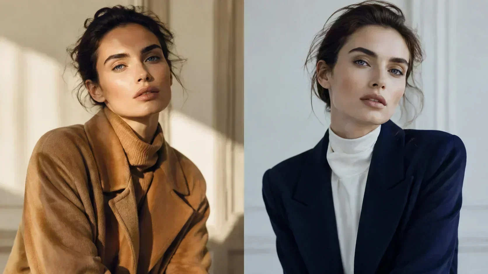
If you find celebrity colour analysis compelling, the most productive way to use it is as a learning tool rather than a definitive reference.
Use celebrity examples to train your eye to distinguish warm from cool, muted from vivid, in-season from out-of-season. Look at before-and-after era comparisons. Ask which looks make the skin glow and which make it read flat. Notice the pattern.
Then apply that trained eye to your own situation: your own photos, your own wardrobe, your own colouring. The celebrity is the teaching example. You are the subject.
And if you want a definitive result rather than a trained intuition — run the analysis. The three dimensions that determine your season can be measured. The guess-work is optional.
Celebrity colour analysis in the In My Colors content library uses publicly available press and editorial photography for educational purposes. All season classifications are based on the 12-season Gaussian scoring methodology. Classifications reflect the analyst's assessment; reasonable people familiar with the system may differ on ambiguous cases.