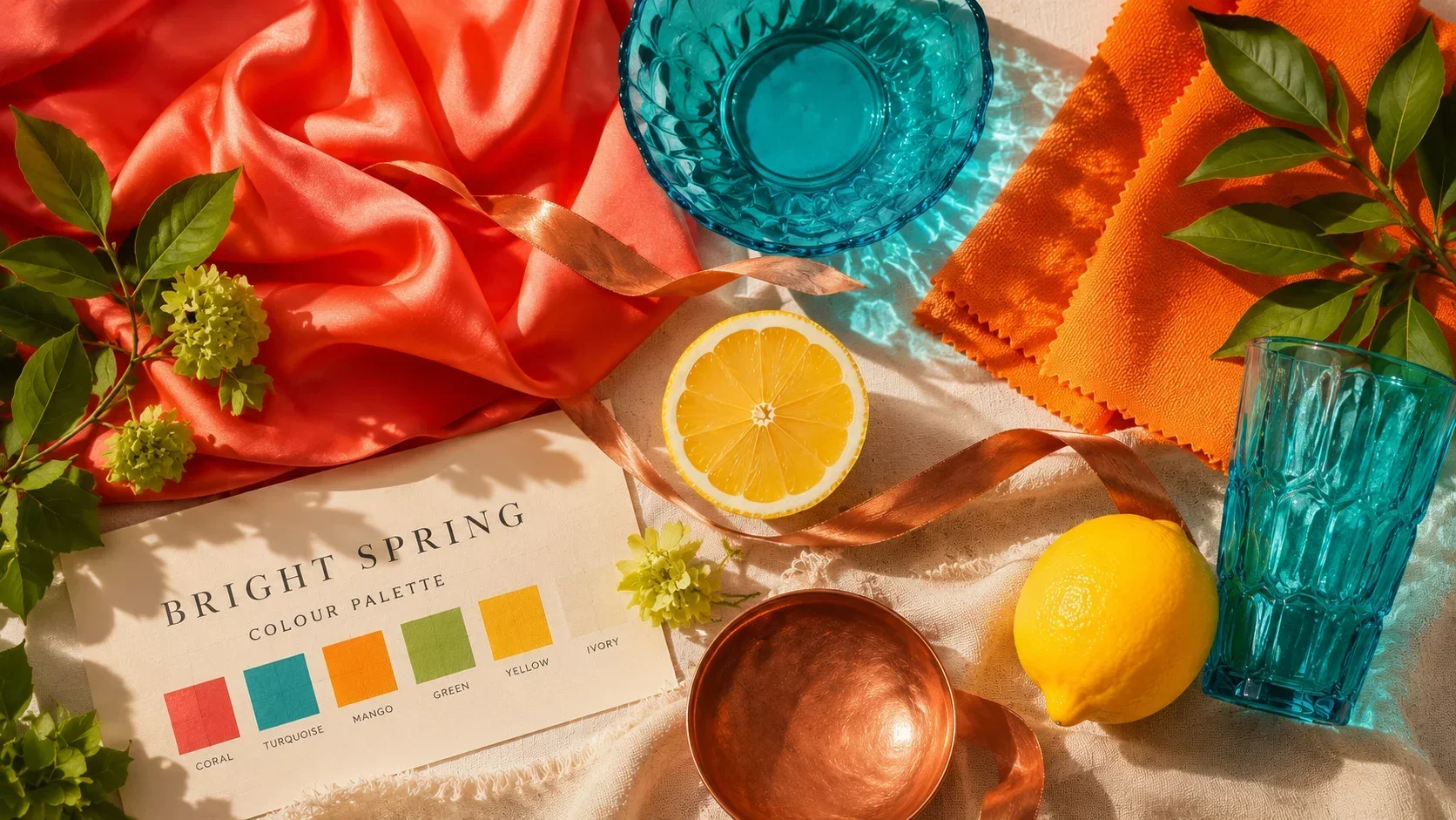
There is a season in colour analysis that confounds people, because it does not fit neatly into the story people tell themselves about their colouring. They know they are warm — the gold jewellery, the peachy skin, the reddish tints in the hair make that much clear. But the usual Spring palette, with its soft peaches and delicate butter yellows, never quite feels right. It looks pretty enough, but something is missing. These people reach for brighter, more vivid colours and look unexpectedly, undeniably good in them. If this sounds familiar, you may be a Bright Spring.
Bright Spring is the most vivid and high-energy sub-season in the Spring family. It sits at an unusual position in the 12-season system: it is the bridge season between Spring and Winter, sharing Winter's high chroma while anchoring it in Spring's warmth. Bright Springs are warm — that is non-negotiable — but they are also vivid enough to handle colours that would overwhelm a True Spring and look flat on a Light Spring. The seasonal image is spring at full bloom: not the pale promise of early spring, but flowers in their peak brightness, colours at full intensity in clear warm light.
What Makes a Bright Spring
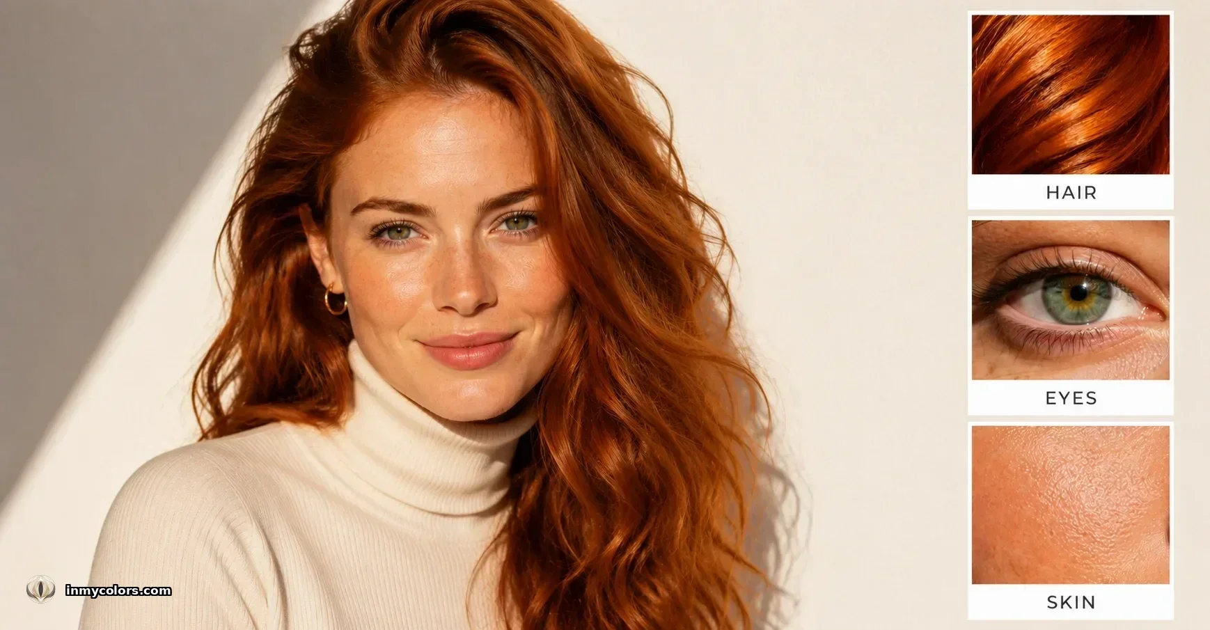
The three-axis analysis tells the story clearly for Bright Spring.
Temperature: Warm. The Spring family is warm, and Bright Spring is no exception. Skin has a warm or neutral-warm undertone — peachy, golden, or simply warm-neutral rather than cool or pink. Gold flatters more than silver. Warm coral flatters more than cool berry. The warmth may be less immediately visible than in True Spring — Bright Spring can have slightly more neutral skin — but it is present, and cool-toned colours will eventually reveal themselves as wrong.
Value: Moderate to moderate-high. Bright Springs are not particularly fair (that is Light Spring's domain) nor particularly dark. They tend to have medium contrast overall, often with features that stand out from one another — vivid eyes against clear skin, striking hair that reads as warm but with real presence. This moderate value means they can carry more depth than a Light Spring without tipping into Dark Season territory.
Chroma: High — the defining axis. This is what makes Bright Spring distinct within the Spring family. Chroma — the saturation and clarity of colour — is at its highest here. Bright Springs have the most vivid, electric colouring of the three Spring sub-seasons. Their eyes are striking. Their hair, whether copper, auburn, or warm vivid brown, has an intensity that commands attention. Their skin is clear. Muted or dusty colours do to Bright Springs what they do to most Springs — they flatten the complexion — but the effect is particularly dramatic because the natural colouring has such clarity that anything less reads as dull immediately.
This combination — warm and highly chromatic — is exactly what places Bright Spring as a bridge to Winter. Bright Winter is the corresponding bridge from the Winter side: cool but extremely vivid. The two seasons share the vivid chroma and sometimes appear similar, but the warm-cool axis separates them clearly once it is correctly identified.
The Bright Spring Colour Palette
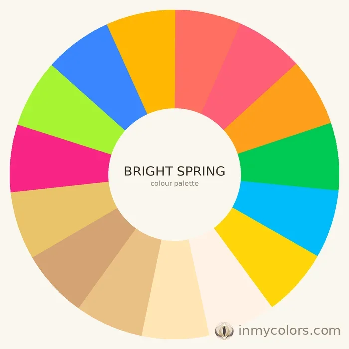
Bright Spring's palette is the most vivid in the Spring family and rivals the Bright or Clear Winter palettes in intensity. The key is always that warmth underlies every colour.
Foundation neutrals are fewer in this palette than in other seasons — Bright Springs are not primarily neutral dressers. Warm ivory, clear camel, and warm nude form the base. Note that even the neutrals have clarity: not dusty camel but clear camel, not greige but warm nude. Black can work for Bright Spring as an accent or grounding element in a way that it absolutely cannot for True Spring or Light Spring — but a warm ivory or clear camel is always preferable as a base.
Core colours are where Bright Spring comes alive. Bright coral, vivid warm turquoise, clear warm yellow, warm cobalt (with a warm rather than cold cast), bright spring green, and vibrant mango are the working colours of this palette. These are not subtle. They are confident, energetic, and vivid — and in a Bright Spring's wardrobe, they look exactly right rather than loud. A vivid warm turquoise blouse on a Bright Spring makes their eyes and skin look extraordinary. The same blouse on a Light Spring or True Autumn would look aggressively oversaturated.
Accent colours push further: electric warm teal, vivid fuchsia with a warm rather than cool cast, and pure warm orange. These are statement pieces, designed to create a focal point. Bright Springs are one of the few seasons that can genuinely wear vivid fuchsia without it looking cool or jarring — the key is ensuring the fuchsia leans warm rather than blue-pink.
What to avoid: Muted and dusty tones are the primary enemies of Bright Spring. Dusty terracotta, sage, mauve, and earthy Autumn tones suppress the vivid quality of Bright Spring colouring and make the complexion look dull. Overly soft, light pastel versions of colours — the Light Spring palette — can similarly look washed out. Cool greys land badly for the same reason they do in all Spring seasons. The palest, most delicate colours in the Spring family are not Bright Spring's territory; vivid, clear, and warm is.
Bright Spring in the Wardrobe

A Bright Spring wardrobe is one of the most distinctive in colour analysis — vivid, warm, and clear. Building it requires some courage, because mainstream fashion advice rarely accounts for seasons that need strong, saturated colour rather than the safe neutrals that dominate most capsule wardrobe guides.
The neutral foundation: Clear camel, warm ivory, and warm nude form the practical base. These can anchor every outfit and allow the vivid colour pieces to do their work without creating chaos. Even outerwear — typically the domain of the most conservative colour choices — can go to camel or a warm sandy beige rather than black or grey.
Vivid colour pieces are the heart of this wardrobe. A bright coral top, a vivid warm turquoise blouse, a clear warm yellow dress, a spring green jacket — these are not occasional fashion risks for Bright Springs, they are the most flattering and appropriate choices in the wardrobe. The error Bright Springs most often make is buying muted or toned-down versions of colours they know they like, thinking they are being sophisticated. The result always reads as slightly flat.
Patterns suit Bright Springs extremely well when they are bold and warm-toned: vivid floral prints, warm geometric patterns, tropical prints in warm tones. High contrast within a pattern — warm ivory and vivid coral, for example — works well. Cool or muted patterning does not.
In outerwear and tailoring, Bright Springs can introduce more depth than other Springs. A warm camel coat is excellent. A vivid warm turquoise coat, while bold, is actually one of the most correct choices this season can make. Black tailoring can work as a functional piece in a way it cannot for lighter Springs — but it should not be the default.
Bright Spring Makeup
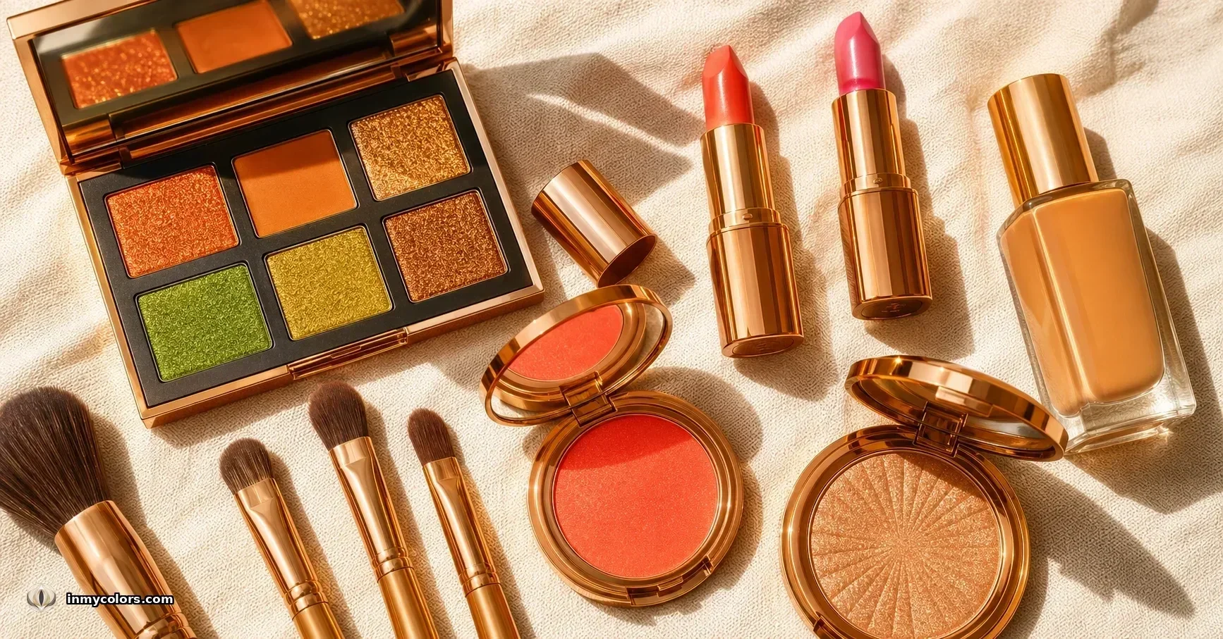
Makeup for Bright Springs follows the same principle as the wardrobe: warm, clear, and vivid enough to match the natural colouring rather than understate it.
Foundation should have a warm undertone and medium coverage. Bright Spring skin is generally clear, and the goal is to maintain that clarity while correcting for evenness. Peachy-beige and warm formulas are correct. Pink or cool-neutral undertones will fight with the warmth of the skin.
Blush at higher intensity than other Springs: bright coral and vivid warm peach are the correct shades, applied with enough presence to register. Bright Springs can carry more colour on the cheek than lighter or more muted seasons — a soft blush disappears, while a vivid warm coral blush works correctly with the overall colouring.
Lips are a statement for Bright Spring. Vivid coral, warm fuchsia, and bright warm red are signature lip colours — they match the vivid quality of the natural colouring and create a coherent, finished look. Warm fuchsia on a Bright Spring is striking in exactly the right way. Cool-toned reds, cool pinks, and muted nudes will look flat or slightly wrong.
Eyes at the vivid end of the warm spectrum: bright copper, vivid warm green shadow, warm chartreuse, bold warm eyeshadow colours that most seasons would never attempt. Bronze and copper metallic shadows are excellent. Warm graphic liner in deep warm brown or copper can replace the cooler black liner that would be standard on a Winter. Muted, dusty shadow looks dull rather than sophisticated on this season.
Bright Spring Hair
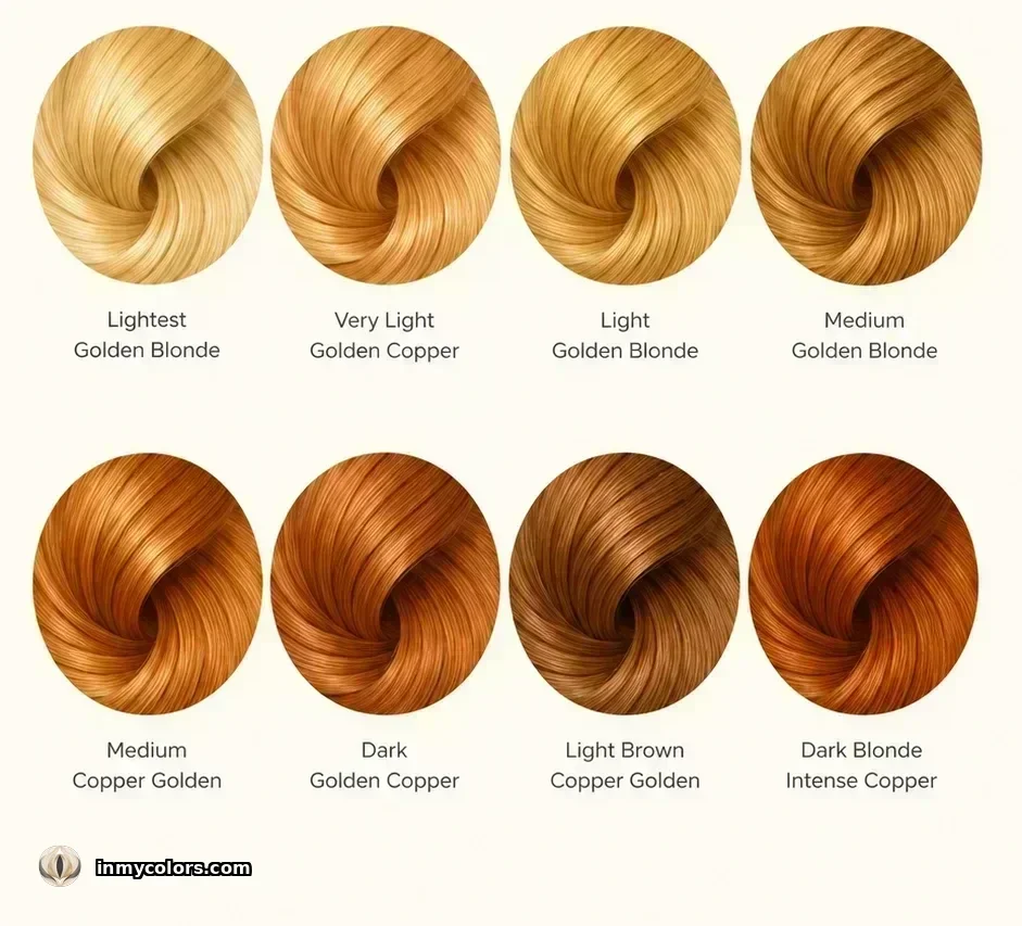
Bright Spring natural hair is one of the most visually striking features of this season — vivid copper, warm auburn, bright red-brown, or warm vivid brown with real colour presence. This is not the gentle golden warmth of True Spring or the delicate lightness of Light Spring; Bright Spring hair has drama and clarity.
Natural Bright Spring hair at its best needs little intervention — it is already vivid, warm, and clear, which is exactly what the season requires. Copper and auburn are particularly signature tones.
Colour guidance: Vivid copper highlights, warm auburn, and bright red-brown all enhance what is naturally present. For those whose hair is at the brighter red-copper end, maintaining that vibrancy is the priority. For those closer to warm vivid brown, copper or auburn highlights can amplify the Spring quality. Balayage in vivid warm copper is an excellent option.
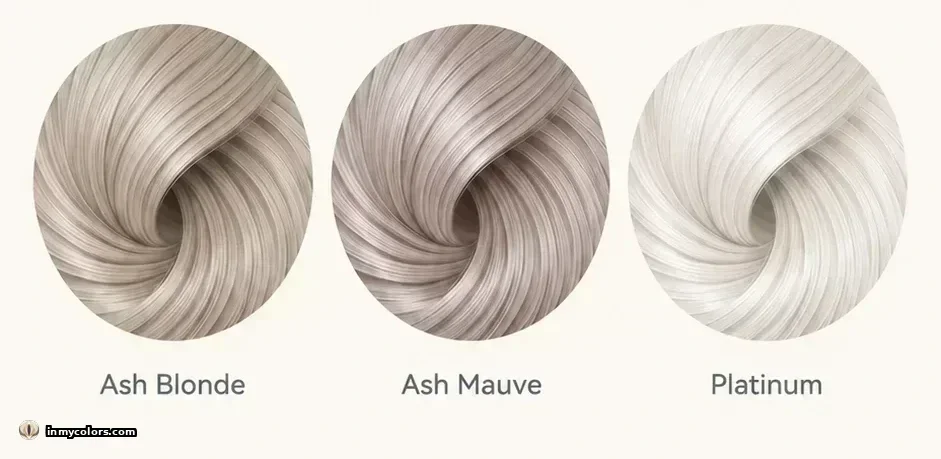
What to avoid: Ash tones in any form will suppress the vivid warmth of Bright Spring hair and create a flat, dull quality that fights with the overall colouring. Muted brown — whether warm or cool in cast — reduces the chroma that defines this season. Very dark hair, despite having some warmth, obscures the vivid quality and creates more contrast than this season needs. Platinum removes all warmth and is the most damaging choice.
Bright Spring Celebrities
A note on celebrity examples: these assignments are educated guesses — celebrity photos are professionally edited, lighting varies, and makeup is always applied. These names are commonly cited examples, not verified classifications. Use them as a rough visual reference, not a confirmation of your own season. The only reliable way to find your season is an objective analysis of your actual colouring — not a comparison to someone else's. Find yours at inmycolors.com.

Brittany Snow shows Bright Spring with warm auburn-red hair and striking clear blue eyes against fair warm skin — the kind of vivid warm-clear contrast that characterises the season's highest-chroma expression.

Sadie Sink shows the auburn variant of Bright Spring — warm auburn hair, clear blue eyes, and fair warm freckled skin — with the vivid warm-clear contrast that is the season's signature.

Amy Adams demonstrates Bright Spring with warm auburn hair with real colour intensity, clear blue-green eyes, and fair warm peachy skin — a vivid warm presentation that is a widely cited example of the season's high-chroma character.

Bryce Dallas Howard shows Bright Spring at its most vivid: intense copper-red hair with both warmth and clarity, clear green eyes, and fair warm skin. Her colouring represents the maximum-chroma, maximum-warmth end of the season.
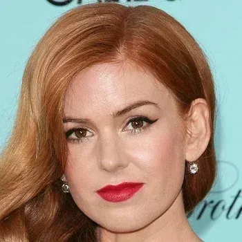
Isla Fisher demonstrates the copper-auburn variant: vivid warm hair with real colour presence, clear freckled peachy skin, and warm brown eyes. She is at her most striking in exactly the vivid warm colours — coral, turquoise, mango — that define this palette.

Jane Levy shows the golden-blonde end of Bright Spring — warm golden hair, clear blue eyes, and fair warm freckled skin. Her colouring has the clarity and warmth of the Spring family at its most vivid, without the auburn intensity of the copper variants.

Lindsay Lohan in her earlier career is one of the clearest Bright Spring references — vivid warm auburn-red hair, clear warm peachy skin, and bright blue eyes. Her colouring has the high chroma and warmth that are the season's defining signature.
Common Misclassifications
Bright Spring vs Bright Winter: This is the critical confusion for this season, because both share the defining trait: extremely high chroma. The separator is temperature. Bright Winter is cool — its skin has a cool or neutral-cool undertone, its hair tends toward cool brown or black, and its most flattering colours include icy brights and cool cobalt. Bright Spring is warm — peachy or golden skin, warm-toned hair, and an affinity for coral over cool pink, warm turquoise over icy blue. The diagnostic: hold a vivid warm coral and a cool clear cobalt against the face separately. If the warm coral is clearly better, Bright Spring is the answer. If the cool cobalt is equally good or better, Bright Winter should be investigated.
Bright Spring vs True Spring: Both are warm and clear, but Bright Spring turns up the chroma significantly. True Spring's most flattering colours are fresh and moderate in intensity — warm peach, soft coral, golden yellow. Bright Spring's most flattering colours are vivid — electric turquoise, vivid coral, bright spring green. If the moderate Spring palette always feels slightly tame, and the most vivid possible versions of warm colours look exactly right, Bright Spring is the correct sub-season.
Bright Spring vs True Autumn: Both have warm undertones and can have copper or reddish hair. The distinction is chroma: Autumn is muted, Spring is clear. Autumn's most flattering colours are earthy and rich — terracotta, olive, warm rust. Bright Spring's most flattering colours are vivid and clear. If dusty terracotta looks gorgeous and rich, Autumn is likely correct. If it looks flat and the face needs vivid, clear colour to come alive, Bright Spring fits better.
Getting Your Season

Bright Spring is one of the most empowering seasons to identify, because it resolves a specific frustration: the feeling that Spring colours are almost right but not quite vivid enough, or that vivid colours look good but something about the cool brightness of Winter doesn't quite land. Bright Spring sits exactly at that intersection, and knowing it means the wardrobe can be built without compromise.
The challenge is that vivid colouring is sometimes misread as Winter colouring, and warm undertones are sometimes missed when the chroma is high. A careful analysis of all three axes together — particularly the warm-cool distinction, which is the most diagnostic — is essential to placing this season correctly.
Find your season at inmycolors.com.