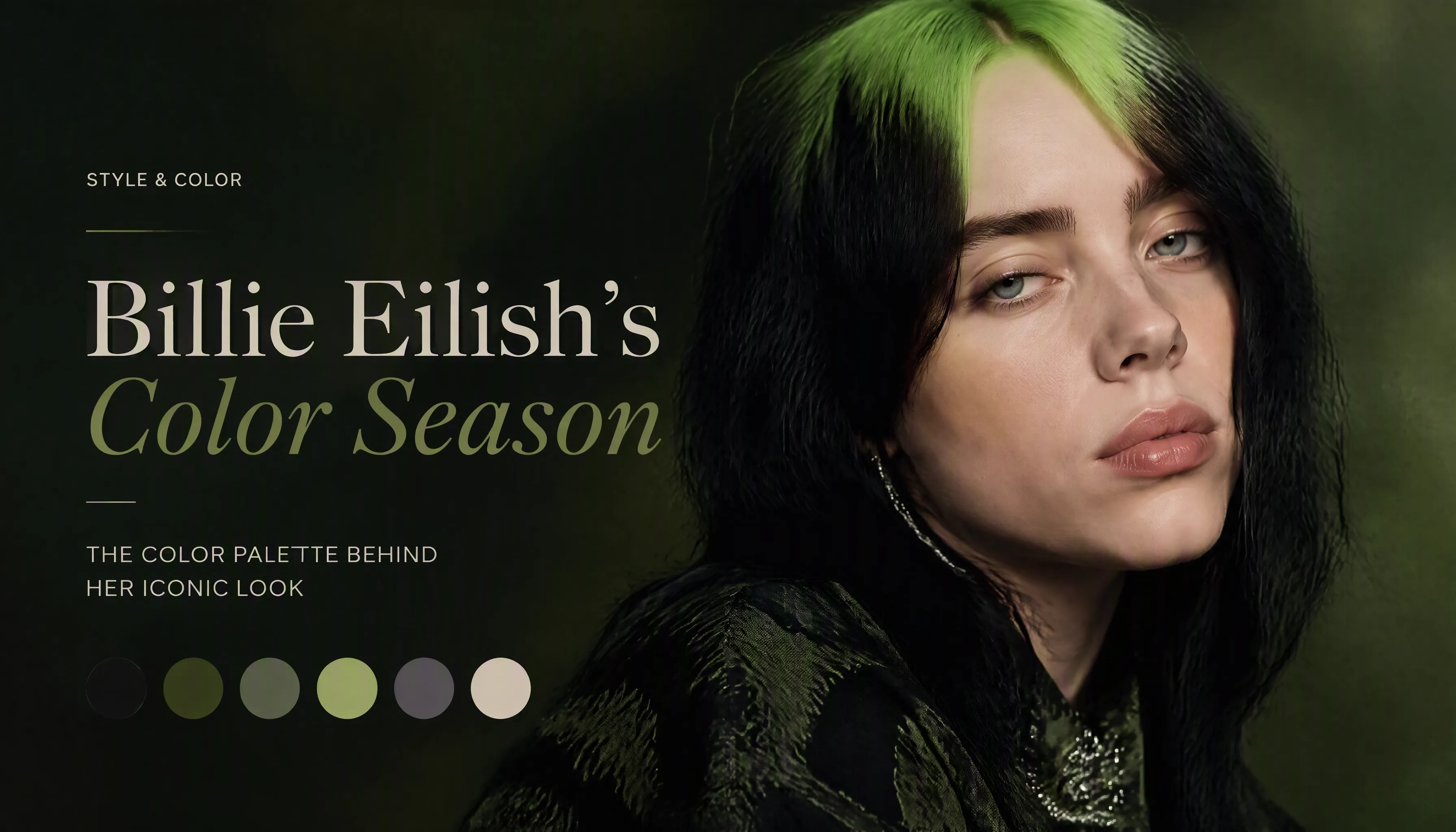
Billie Eilish is genuinely one of the harder celebrity typing cases in colour analysis. She has worn warm colours, cool colours, warm hair, cool hair — and in her music video and performance work, she has experimented with practically every palette on the spectrum. Colour analysis communities online are split: Spring, Summer, Winter, even Autumn have all had their advocates.
The disagreement is not arbitrary. There are real visual reasons why people read her as both warm and cool. The mistake is treating this as evidence that the question cannot be answered — rather than evidence that the answer requires looking more carefully at what is actually happening when she wears each.
Here is the full analysis.
Why She's Hard to Type
The first source of confusion is her skin. Billie has very fair, porcelain skin with visible pink undertones — redness and flush that read as warmth to some analysts. Fair skin with visible rosiness is a common source of mistyping: the warmth people are seeing is the surface skin's vascular activity, not the deeper undertone. When a warm swatch is placed near skin like this, the warmth of the flush can make the comparison feel more equal than it actually is.
The second source of confusion is her artistic identity. Billie has always dressed and styled herself for a specific aesthetic — oversized dark streetwear, fantasy hair colours, maximalist makeup — rather than for colour harmony. Some of her most famous looks are in colours that work because they're visually bold and on-brand, not because they match her season. She can "get away" with many colours because of the strength of her overall image. This makes it harder to isolate what's happening at the undertone level.
The third source of confusion is her natural hair colour. Before she went black, Billie had warm-toned brunette roots. Warm-toned hair near a cool face is another common source of undertone misreading — the hair colour introduces warmth that the skin reads against.
All three of these factors make her appear warmer than she is. Remove them, and the picture is clear.
Testing the Warm Seasons

True Spring is warm, vivid, and light — coral, golden yellow, warm peach, warm green. Against this palette, Billie's skin reads with a slight yellow cast that doesn't appear under cool palettes. Her blue-grey eyes, which are one of her most distinctive features, look less vivid. The palette doesn't fight her badly — she has enough contrast to hold her own — but the relationship is neutral at best. She doesn't glow the way warm-undertoned people do against these colours.

True Autumn is the clearest elimination. The deep earthy warmth of the Autumn palette — mustard, rust, olive, terracotta — introduces a visible flatness to her skin that isn't there under cooler palettes. Her face loses definition against the warmth; the earthy quality of the colours fights the cool, porcelain quality of her complexion. Autumn is not a season built for her features, and this image makes that immediately visible.
If there were any case to be made for warm, it would be Spring — not Autumn. But even Spring only produces a mediocre result.
Testing the Cool Seasons

True Summer is already a significant improvement. The cool temperature of the Summer palette responds correctly to Billie's undertone — the yellowing and flatness disappear, and her skin reads as what it actually is: cool and porcelain. The problem is that True Summer is a muted season: dusty rose, soft sage, mauve, muted teal. These colours are correct in temperature but don't match the contrast level of her colouring. A person with near-black hair and very fair skin is a high-contrast person. Muted, low-contrast Summer colours work — they just don't work as well as they could.
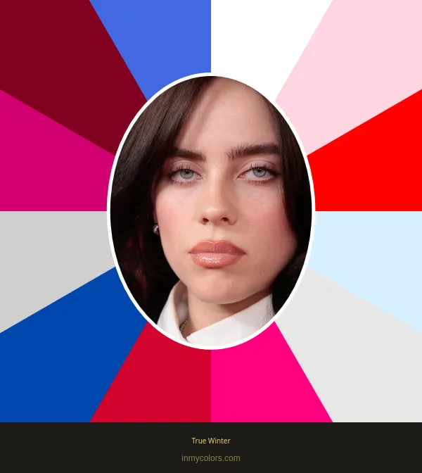
True Winter closes the case. Cool temperature, vivid chroma, high contrast — all three axes of the Winter palette match Billie's actual colouring simultaneously. Against cobalt blue, hot pink, true red, and icy neutrals, her skin looks luminous, her eyes are visibly more vivid, and the overall impression is electric rather than flat. No other palette produces this result for her.
The difference between Summer and Winter is not about which is "more correct" in temperature — both are cool. The difference is chroma and contrast. Billie needs the vividness and depth of Winter, not the muted softness of Summer.
What Her Hair Tells You
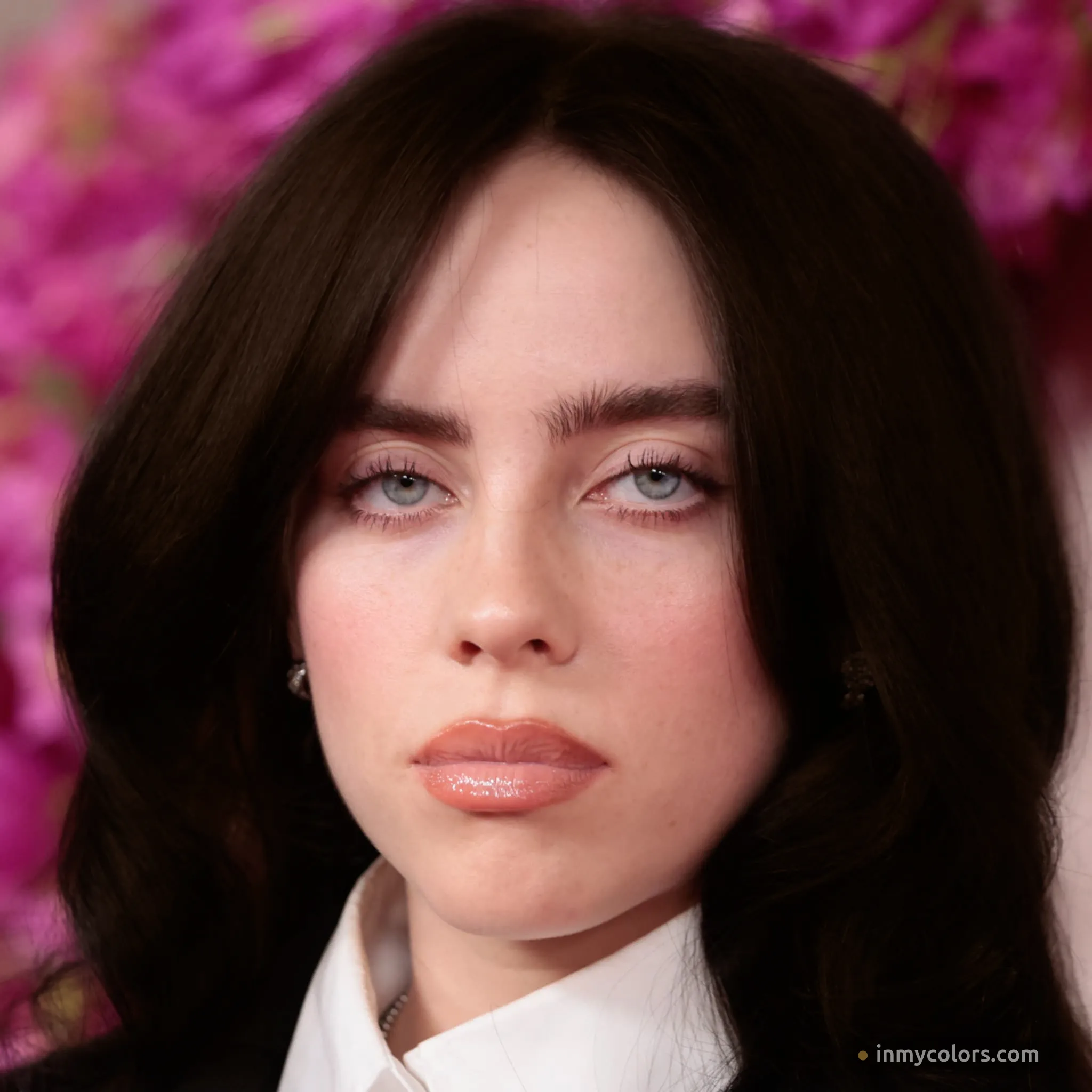
Near-black is the hair colour most associated with Billie's visual identity — and it's also her most flattering. The depth and cool tone of near-black hair creates exactly the high-contrast ratio that True Winter requires: very dark hair against very fair cool skin. Her features sharpen, her eyes read as more striking, and the overall impression is exactly what her brand has always aimed for. This is her season expressing itself naturally.
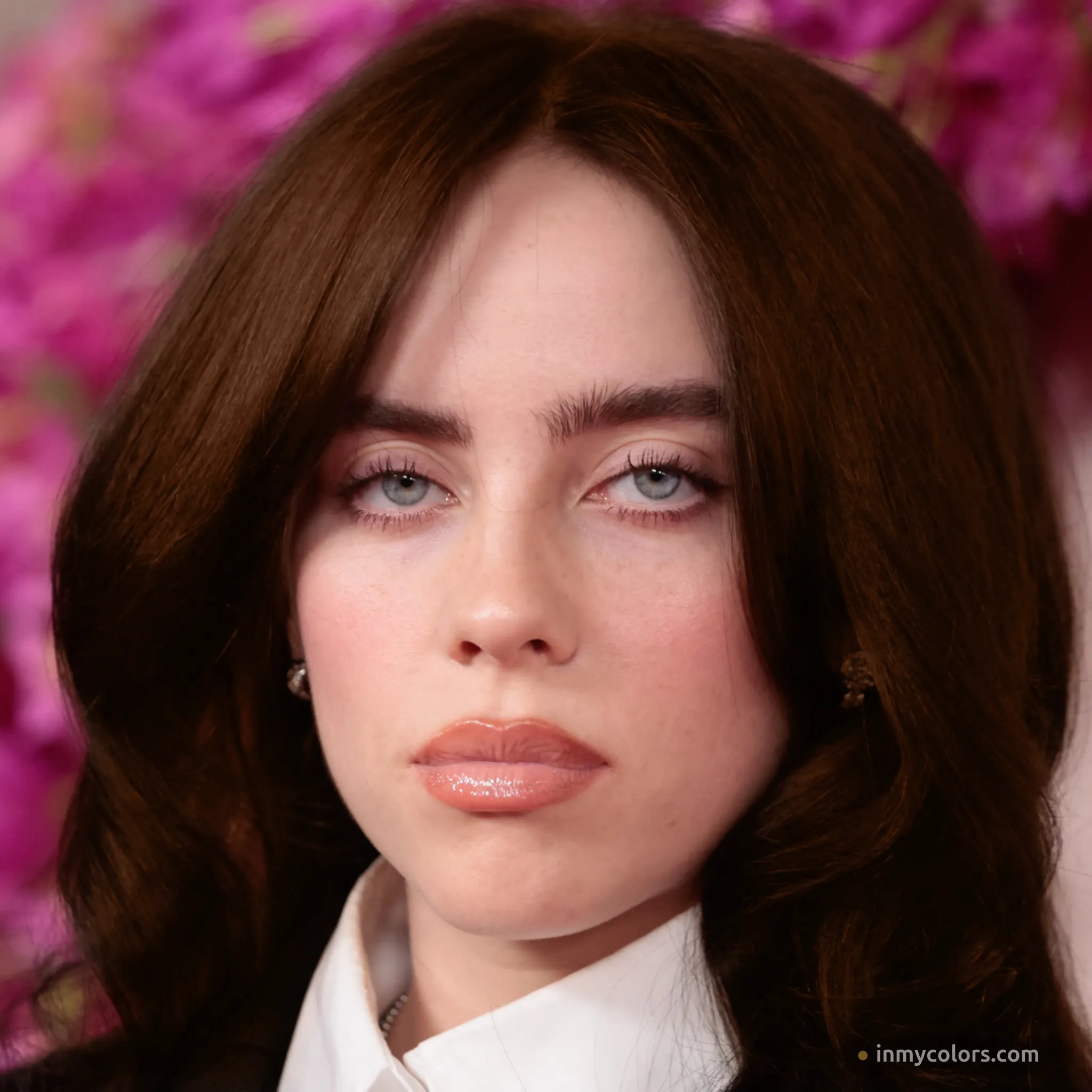
Warm brown is what you'd call "fine." It's a natural-looking hair colour that doesn't obviously clash. But it lacks the electricity of her cool options — the warmth of the brown fights slightly against her cool undertone, reducing rather than enhancing the contrast between hair and skin. This is a useful comparison because it illustrates that "not wrong" and "right" are different things.
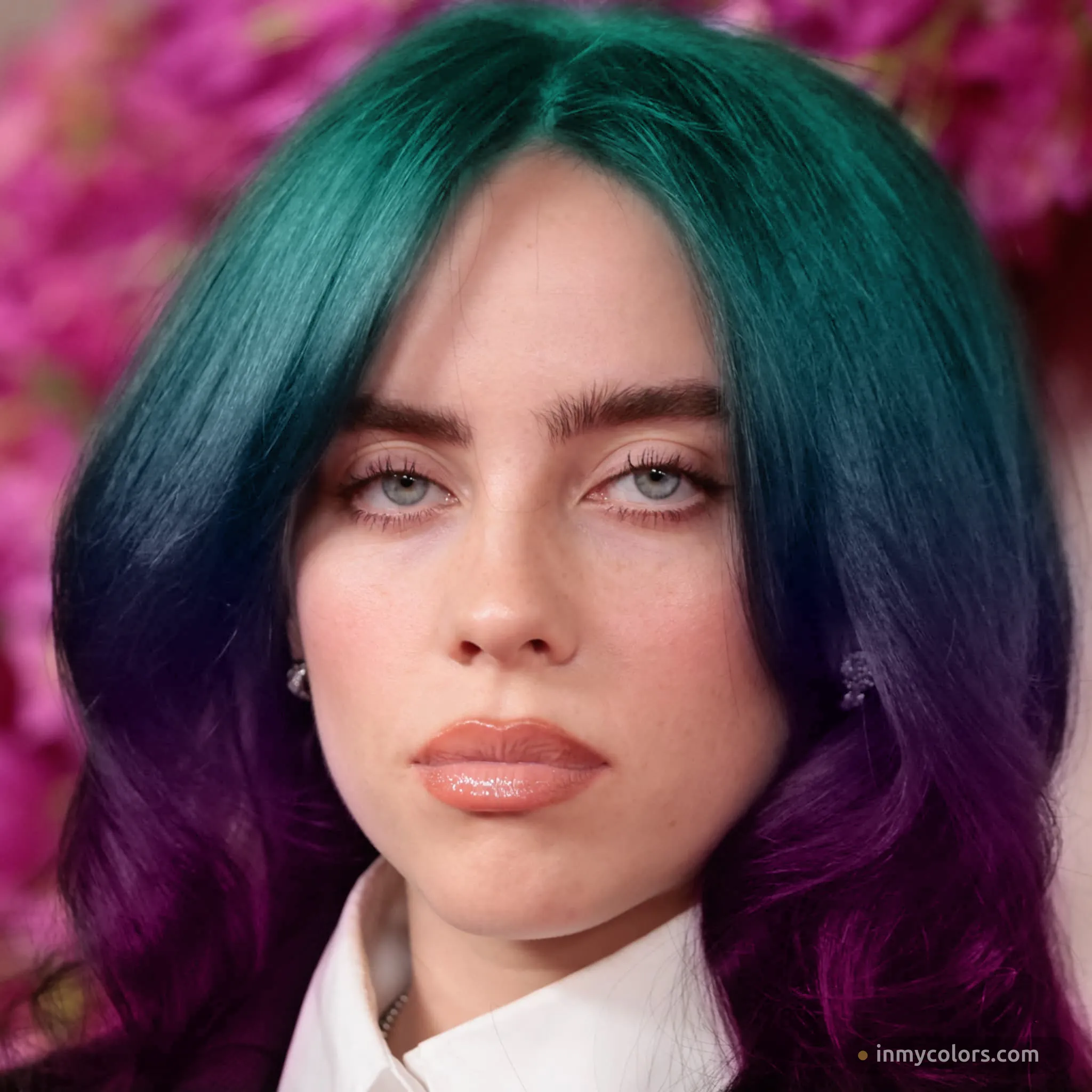
Billie's fantasy hair colours have always been cool: neon green, teal, blue, purple. This is not a coincidence. Cool fantasy colours naturally harmonise with cool-undertoned skin in a way that warm fantasy colours (orange, warm red, copper) never would. Her colour instincts — whether conscious or not — have consistently pointed toward the cool end of the spectrum, even when she was making choices purely for artistic impact.
What Her Makeup Tells You
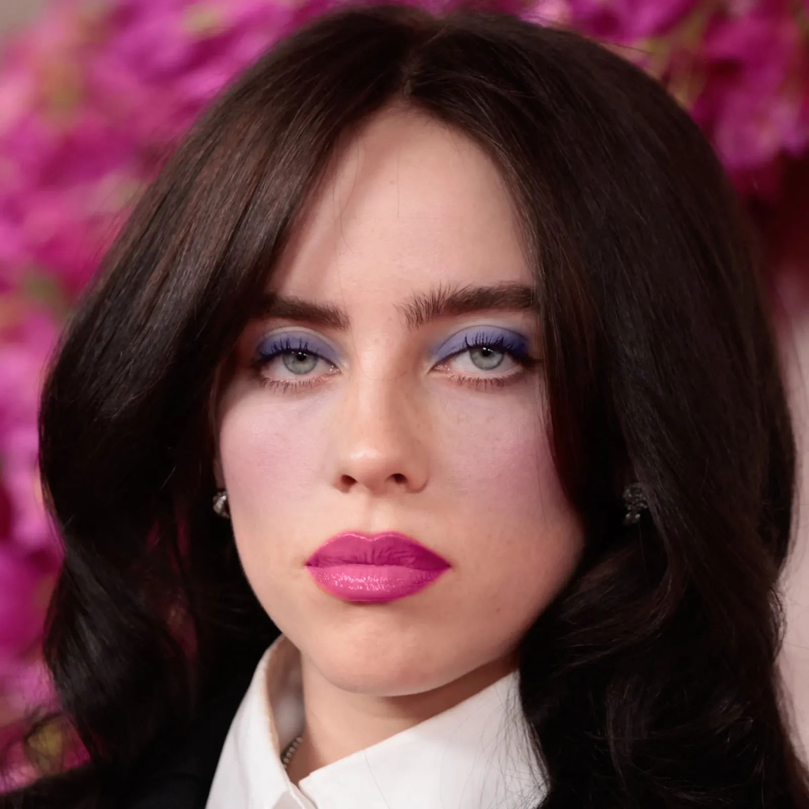
The most revealing comparison is makeup. With cool, high-chroma makeup — periwinkle eyeshadow and a vivid fuchsia lip — the result is striking. Her blue-grey eyes pop, her skin looks alive, and the boldness of the colour feels proportionate to her features rather than overwhelming them. This is exactly the kind of makeup True Winter can carry: cool temperature, high saturation, bold contrast.
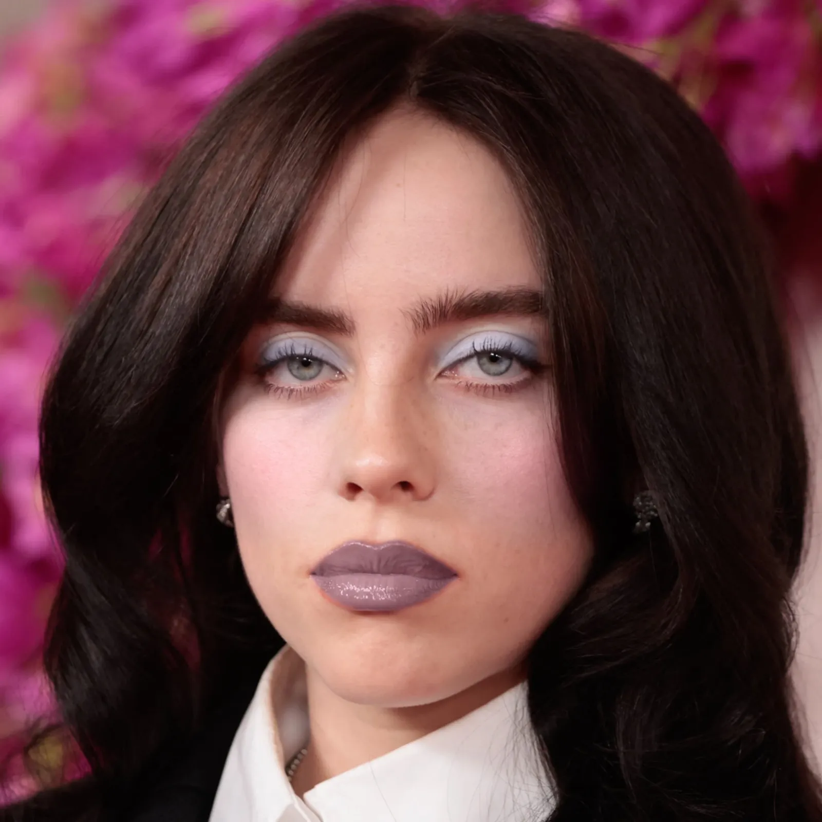
A quieter cool look — icy blue shadow and a deep mauve lip — produces the same basic result at lower intensity. Still harmonious, still flattering. The cool temperature is the constant; only the chroma level changes. This demonstrates that True Winter doesn't require maximum intensity to work — it just requires cool colours.
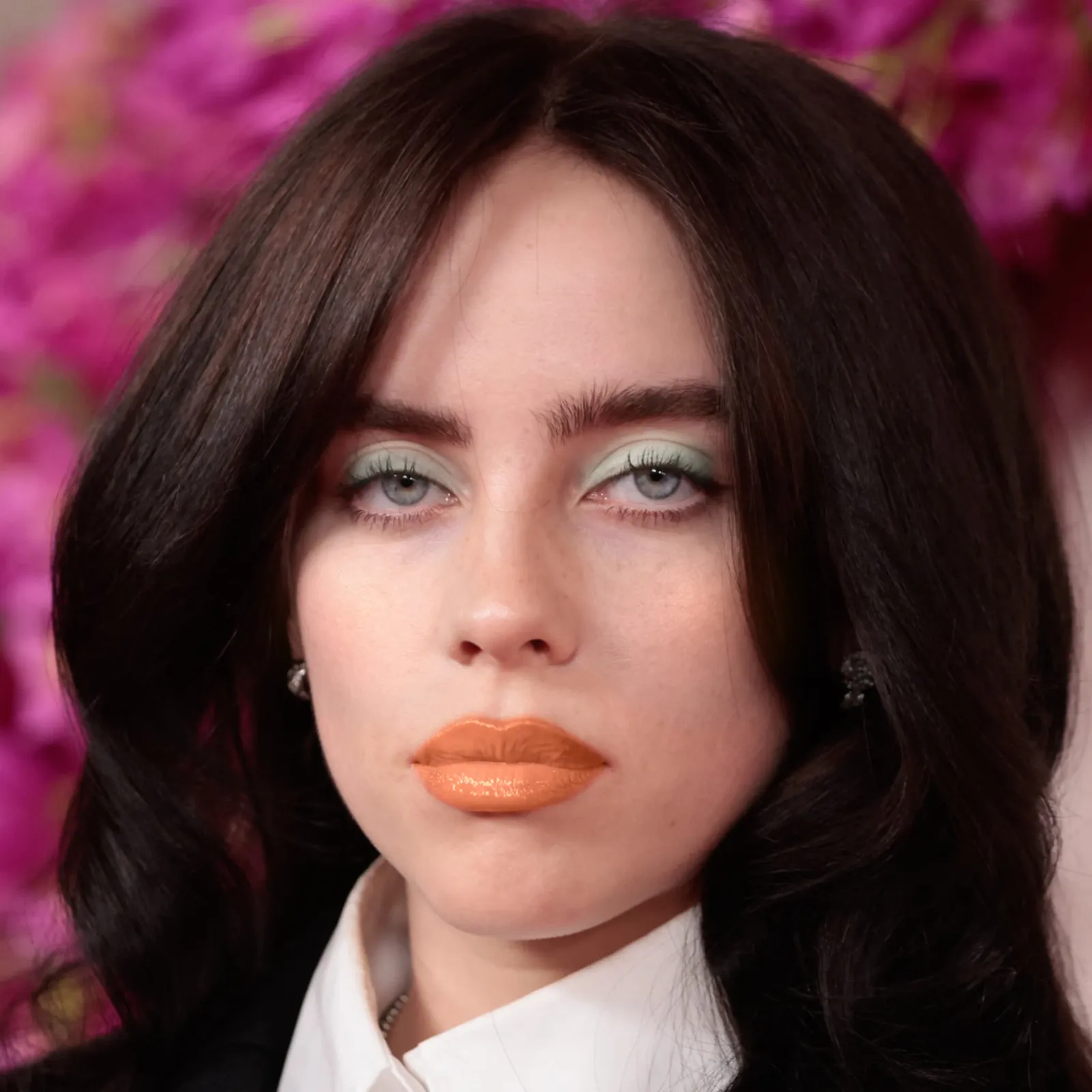
The Spring comparison makes the same point with a lighter warm palette: mint eyeshadow and a warm orange lip. The warmth is softer than the Autumn look but the same mismatch appears — the orange lip fights against her cool undertone and her skin reads as less alive than it does under cool colours.
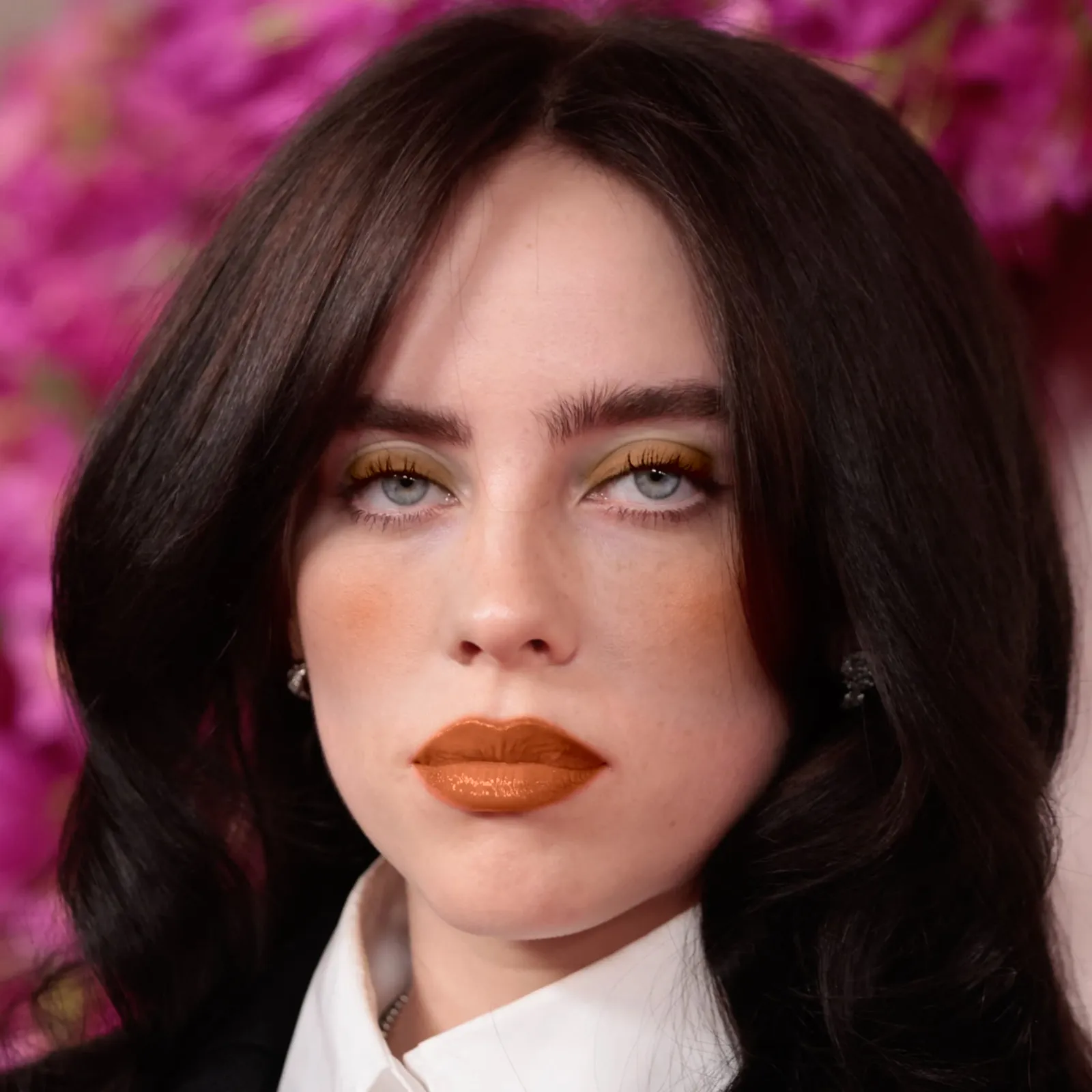
The warm comparison closes the argument. Olive-gold eyeshadow and a burnt orange lip — both warm, both the kind of colours associated with Autumn seasons — introduce exactly the sallow, slightly discordant quality that warm colours produce on cool skin. Her skin reads as less alive, the orange of the lip sits awkwardly against the pink of her undertone, and the overall effect is heavier without any of the compensation that comes from harmony.
The Verdict: True Winter
Billie Eilish is a True Winter.
Her skin is cool-undertoned — not warm despite the visible pinkness, which is vascular rather than pigment-driven. Her colouring is high in contrast: deep hair against very fair skin. Her best feature — her blue-grey eyes — responds dramatically to cool, vivid colours and is muted by warm ones.
The online disagreement about her season exists because she is a genuinely complex case: her artistic persona is powerful enough to make many looks "work" in the sense of being visually compelling. But compelling and harmonious are different things. When the palette evidence, hair evidence, and makeup evidence are all examined together, they point in the same direction.
Her career-defining aesthetic — jet black hair, porcelain skin, cool fantasy colours, high-contrast bold makeup — is not an accident. It is a True Winter expressing itself at full volume.
→ Find your own season at inmycolors.com
Celebrity colour analysis at In My Colors uses the 12-season Gaussian scoring methodology. Classifications reflect analytical assessment; reasonable people familiar with the system may reach different conclusions on ambiguous cases. All season visualisations generated using inmycolors.com tools.