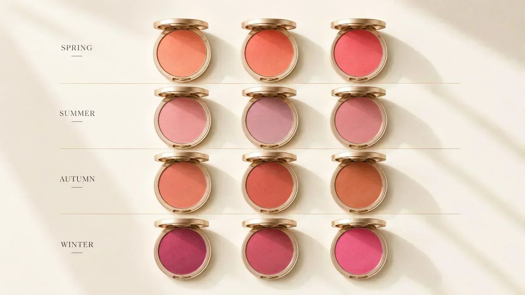
Of all makeup products, blush is the most directly influenced by season. The reason is placement: blush sits on the cheeks, immediately adjacent to the skin's own undertone, in the area closest to the eyes and lips where colour impression is strongest. A foundation can be off-temperature and the mismatch accumulates slowly. A blush in the wrong temperature is immediately visible — it either harmonises with the face or sits on it as a discordant note.
The principles that govern clothing colour apply directly to blush: the temperature of the blush should match the temperature of the undertone, the chroma should match the season's chroma level, and the value should complement rather than overwhelm the natural skin tone.
This guide covers the best blush for all 12 seasons, with the reasoning behind each choice.
The Two Mistakes Most People Make With Blush
Mistake 1: Wearing one blush regardless of season. The "universal" blush — typically a pink or peachy-pink — is universal in the sense that it doesn't aggressively wrong for anyone. It is not correct for most people. A cool-toned peachy-pink sits at a temperature boundary that neither harmonises fully with warm undertones (not warm enough) nor fully with cool undertones (not cool enough). The blush that is good for everyone is perfect for no one.
Mistake 2: Matching blush to the clothing, not the face. Blush should harmonise with the face, not match the outfit. A warm-undertone person in a cool-toned blue outfit does not need a cool-toned blush. They need a warm blush to harmonise with the skin — which, when applied, will create the natural warmth that makes the skin look alive regardless of what the outfit is doing.
Spring Blush — Warm, Clear, Light
All Springs need warm blush — no cool pink, no mauve, no cool berry. The warmth is non-negotiable for the spring undertone.
Light Spring: The most delicate blush of all the seasons. Very light peach or apricot with no strong saturation. A sheer wash of warmth — enough to give the skin a natural flush without overwhelming the light colouring. Look for: sheer peach, soft apricot, warm champagne-rose. Avoid: vivid coral (too strong for the season's delicacy), cool pink, mauve.
Product cues: anything described as "nude peach," "sheer apricot," "warm blush," or "sun-kissed" at very low saturation.
True Spring: warm peach, warm coral-pink, golden rose. Can carry slightly more saturation than Light Spring. The blush should read warm and clear — vivid enough to be visible as a colour, warm enough to harmonise with the golden Spring undertone. Look for: coral peach, warm rose with a golden quality, warm pink-orange. Avoid: mauve, cool pink, fuchsia.
Product cues: "coral," "warm rose," "peachy pink," "mango." The warmth should be the defining quality.
Bright Spring: can carry the most vivid and saturated blush of the Spring family. Bright warm coral, vivid warm rose, clear bright peach. The season's high chroma means the blush can match that vividity without being overwhelming. Look for: vivid coral, bright warm pink (warm-toned, not cool), clear warm fuchsia. Avoid: muted tones (too soft for the season's chroma) and cool versions of bright pink.
Product cues: "coral pop," "bright rose," "clear peach." Vivid but warm.
Summer Blush — Cool, Soft, Dusty
All Summers need cool blush — no warmth. The cool rose family. But crucially, for most Summer sub-seasons, the blush should be soft and muted rather than vivid.
Light Summer: the softest, most muted pink blush in the system. A barely-there cool rose or cool pink. The season's very low chroma and low contrast means strong blush application overwhelms the face easily. Look for: soft cool rose, pale cool pink, dusty rose at very low saturation. A sheer "your lips but better" type quality. Avoid: coral (too warm), vivid pink, mauve that is too dark.
Product cues: "baby pink," "cool blush," "sheer rose," "barely there." Light-handed application is key.
True Summer: cool rose, dusty mauve-rose, soft cool berry. More depth and colour than Light Summer while remaining cool and muted. The dusty, slightly grey quality of the Summer palette extends to blush — not vivid, but visible. Look for: cool rose, dusty pink, muted cool mauve. Avoid: warm pink, coral, peach.
Product cues: "cool rose," "dusty mauve," "rose water," "muted pink."
Soft Summer: the most muted blush of all. The Soft Summer palette is the most greyed-down of all seasons, and the blush should reflect this. A very muted, slightly greyed cool rose or cool mauve. Barely more than a hint of colour — the effect should look like natural flushing rather than applied blush. Avoid: anything vivid, anything warm. Look for: greyed mauve, dusty cool rose, muted plum at very low saturation.
Product cues: "taupe rose," "muted mauve," "dusty blush." Almost a neutral.
Autumn Blush — Warm, Rich, Earthy
All Autumns need warm blush — and specifically, the blush should have an earthy, muted quality rather than the clear brightness of Spring. Terracotta, warm brick, bronze, warm berry.
Soft Autumn: warm peach or warm soft terracotta at low saturation. The most muted Autumn blush — warm but gentle. Not vivid coral, not deep brick. A warm, dusty peach or warm bronze-peach. Look for: warm nude-peach, muted terracotta, dusty warm rose. Avoid: cool pink, cool mauve, vivid coral.
Product cues: "warm sand," "peach fuzz," "nude coral," "dusty warm peach."
True Autumn: the full earth-tone blush. Warm terracotta, warm brick, warm spice, warm copper-rose. This is where blushes described as "terracotta" or "brick" actually belong. A warm blush with an earthy, muted quality — not vivid, not cool, not rosy-pink. Look for: terracotta, warm brick, warm copper, spiced rose. Avoid: cool pink, baby pink, mauve.
Product cues: "terracotta," "brick," "spice," "warm copper," "canyon." The most earth-toned blush range.
Deep Autumn: deep warm terracotta, warm deep brick, warm bronze. Can carry more depth than True Autumn given the deeper value of the season's colouring. A rich, warm, earthy blush with significant pigmentation. Look for: deep warm terracotta, warm bronze, cognac blush. Avoid: cool tones of any depth.
Product cues: "warm bronze," "deep terracotta," "burnt coral." Rich and warm.
Winter Blush — Cool, Clear (or Near-Absent)
Winter blush is the most complex category — Winters often have such clear, defined colouring that blush can easily overwhelm. The direction is cool: cool berry, cool deep rose, cool fuchsia, or vivid cool pink.
True Winter: cool berry, cool rose, or cool deep pink. Applied with precision and relatively lightly — the Winter face often has natural colour from the high contrast of the colouring, and over-application of blush makes the face look flushed rather than structured. Look for: cool berry, raspberry, cool rose. Avoid: warm tones of any kind — coral, terracotta, peach.
Product cues: "cool berry," "raspberry," "cool rose," "wine." Temperature is everything here.
Bright Winter: can carry the most vivid cool blush — vivid cool fuchsia, electric cool rose, vivid berry. The season's high chroma means the most saturated cool-pink blushes are available. Look for: vivid fuchsia, bright cool rose, electric berry. This is the only season that can genuinely wear neon-adjacent pink blush. Avoid: muted tones (too soft) and warm tones.
Product cues: "fuchsia," "vivid rose," "bright berry," "electric pink." Clear and vivid.
Deep Winter: deep cool berry, deep plum-rose, cool burgundy. The deepest Winter blush — rich and dark enough to register against the season's deep colouring. A sheer cool plum or a deep berry. Look for: deep cool berry, cool plum, wine rose. Avoid: warm tones, peach, terracotta.
Product cues: "plum," "cool wine," "deep rose," "burgundy blush."
Application: Depth Matters as Much as Colour
The season colour is one variable. Application depth is the other.
Light-value seasons (Light Spring, Light Summer): apply very lightly. These seasons have low natural contrast; over-applied blush becomes the dominant facial feature rather than a harmonising detail. Build slowly, check in natural light.
Deep seasons (Deep Autumn, Deep Winter): can carry more pigment. The deeper value of the colouring provides a foundation that absorbs more blush without it overwhelming. Apply with more confidence.
High-contrast seasons (True Winter, Bright Winter, Bright Spring): blush should be precise rather than diffuse — a defined flush, not a wide sweep. The season's naturally high contrast means a wide soft blush can conflict with the precision of the colouring.
Muted seasons (Soft Summer, Soft Autumn): a diffuse, soft-edged application in a muted shade. The blush should blend entirely into the skin rather than sitting on top of it as a visible colour.
The Seasonless Blush: Does It Exist?
Several makeup brands market a "universally flattering" blush — typically described as a "your cheeks but better" or "natural flush" shade. These products exist at a warm-neutral position (slightly peachy neutral) that genuinely works for a wide range of skin tones without being dramatic.
However, these products are "universally acceptable" rather than "universally ideal." A cool Summer wearing a warm-neutral blush is not making a mistake — but she is also not achieving the luminosity she would achieve with a cool rose. A Deep Winter in a warm-neutral blush looks fine but not struck.
The universally flattering blush is a safe compromise. For anyone who wants more than safe — who wants the blush to actively work with the face rather than simply sit on it without conflict — the season-specific choice produces a noticeably more alive result.