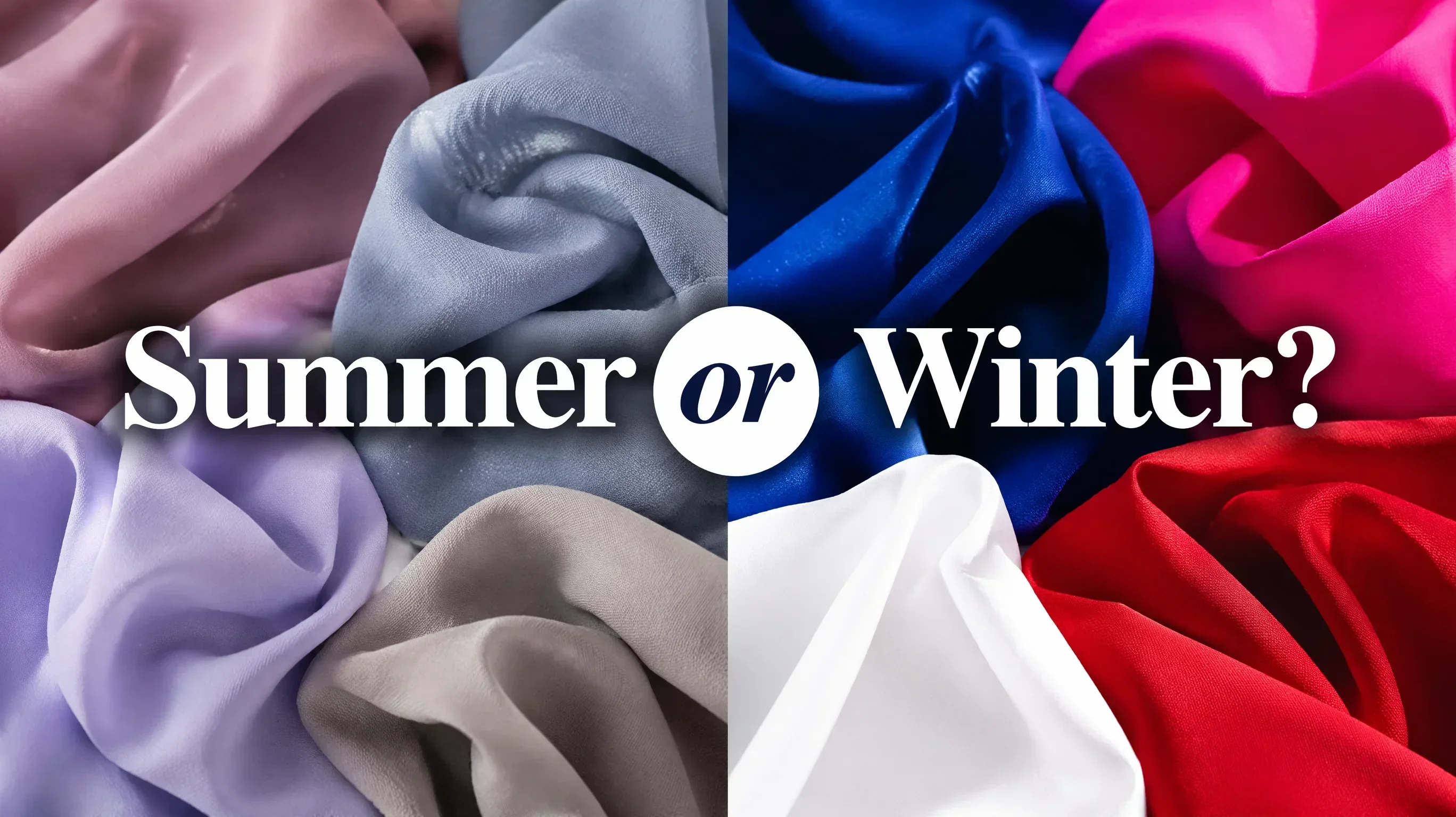
Summer and Winter are both cool seasons. If you've ruled out warm (Spring and Autumn) with confidence, but can't decide between Summer and Winter, you're stuck on a different axis entirely. This time, the question is not temperature — it's chroma and contrast.
Winter is cool, clear, and vivid. Summer is cool, muted, and soft. Those two descriptions may sound like they're pointing at the same person in different lighting, but in practice they produce strikingly different results in fabric and colour choices.
What Summer and Winter Share

Before getting to the differences, it's worth acknowledging what brings people to this confusion. Both seasons:
- ✦Have cool undertones — pink, rosy, blue-tinged, or neutral-dark
- ✦Have blue or purple-toned veins (not greenish)
- ✦Look better in silver than gold
- ✦Suit cool-based colours: blues, purples, greyed neutrals
- ✦Are poorly served by warm, golden, or orange-based tones
If you've confirmed your coolness but can't decide between the two, these shared traits are not helping you. What you need to examine is entirely different.
The Diagnostic: Chroma and Contrast
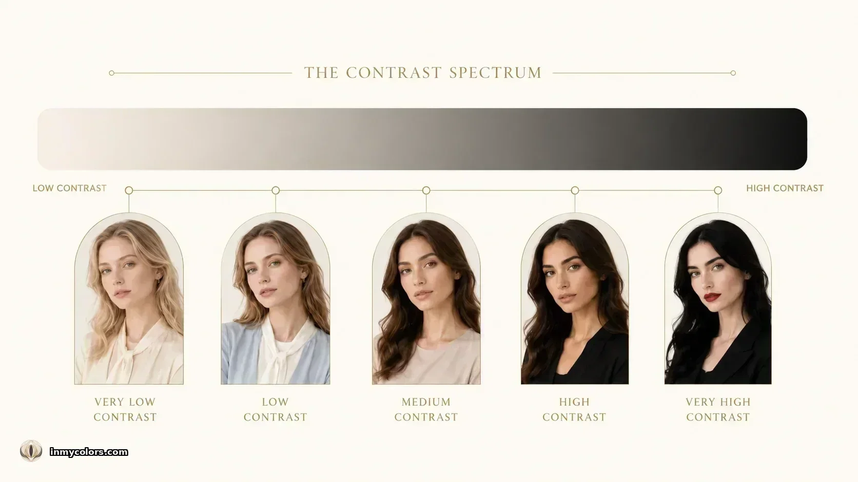
Chroma is the saturation or vividness of a colour. A cobalt blue is high-chroma. A dusty slate blue is low-chroma. Winter thrives in high-chroma, clear, saturated colour. Summer is overwhelmed by it.
Contrast is the visual difference between your skin, hair, and eyes. A person with very pale skin and very dark hair has high natural contrast. A person with fair skin and light ash-blonde hair has low contrast.
Winter = high chroma + typically higher contrast.
Summer = low chroma + typically lower contrast.

Test 1 — The Fabric Test (Vivid vs Dusty)
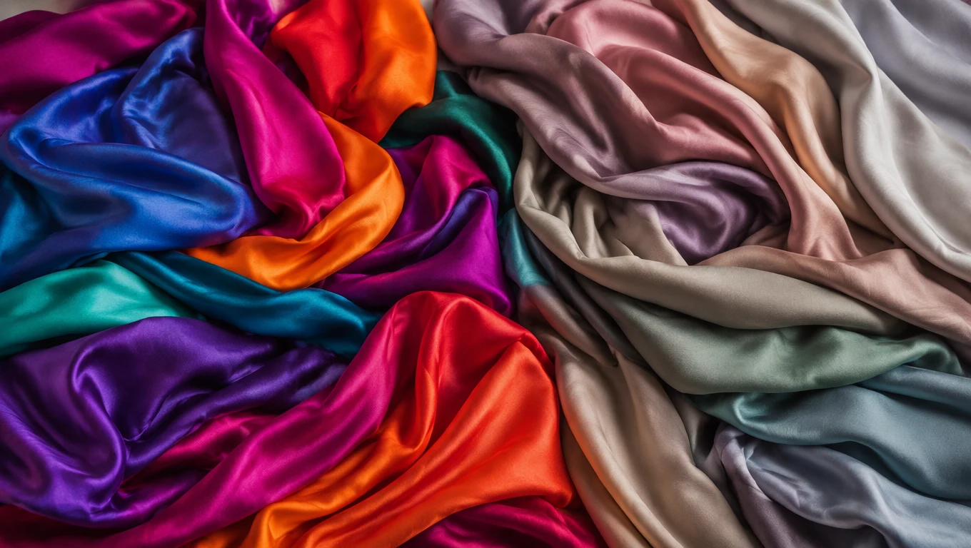
Hold a vivid cobalt blue next to your face. Then hold a dusty, muted steel blue.
- ✦Cobalt flatters you — it makes you look awake, clear, powerful: Winter
- ✦Cobalt overwhelms you — it makes your face look washed out or your skin look mottled: Summer
- ✦The dusty blue looks right — it harmonises, softens, and doesn't fight your skin: Summer
This test can be done with any vivid/muted pair in the cool spectrum. Vivid fuchsia vs dusty mauve. Royal purple vs greyed lavender. Bright cool red vs dusty raspberry.
The principle is always the same: Winter's palette is clean and clear; Summer's palette has grey mixed in.
Test 2 — The White Test
Hold a stark, bright, optical white fabric to your face. Then hold a soft white or off-white (but cool-toned, not warm cream):
- ✦Stark optical white looks excellent — you look crisp and fresh: Winter
- ✦Stark optical white washes you out or makes you look tired: Summer
- ✦Soft white suits you better: Summer
Bright Winter specifically looks extraordinary in pure white — it is one of the season's best neutrals. True Summer cannot wear pure white well; it needs the softness removed from stark contrast.
Test 3 — Natural Contrast Check


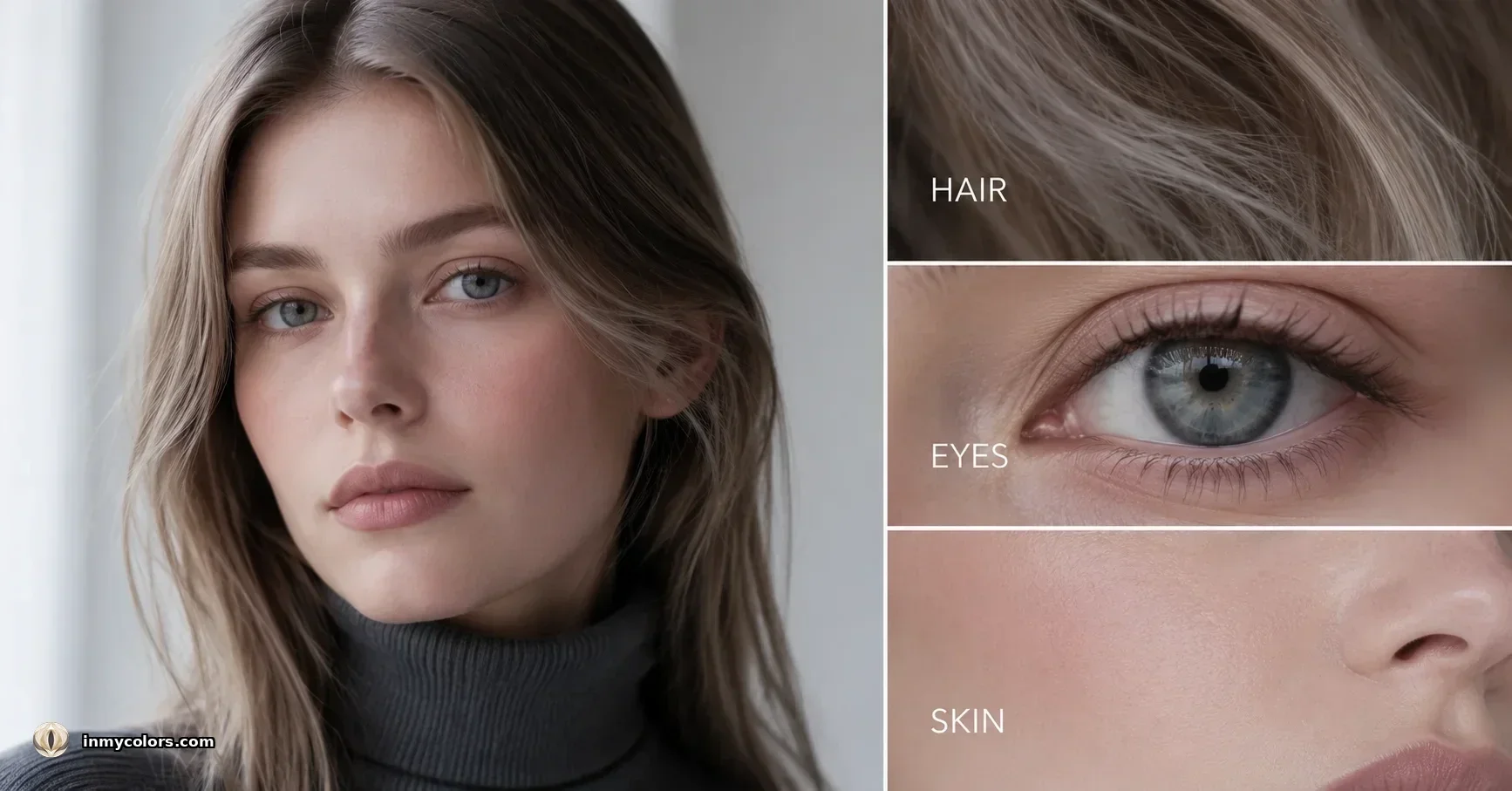
Look at yourself in natural daylight without makeup. What is the contrast between your skin and hair, your skin and eyes, your hair and eyes?
- ✦High contrast — strong visual difference between features: Winter (particularly Dark Winter and Bright Winter)
- ✦Low to medium contrast — features blend together softly: Summer (all three Summer types have lower natural contrast)
This is not a perfect test on its own because True Winter can have medium contrast, and Bright Winter is specifically high-chroma rather than necessarily high-contrast. But as a supporting signal, it's useful.
Comparing the Core Seasons
True Summer vs True Winter
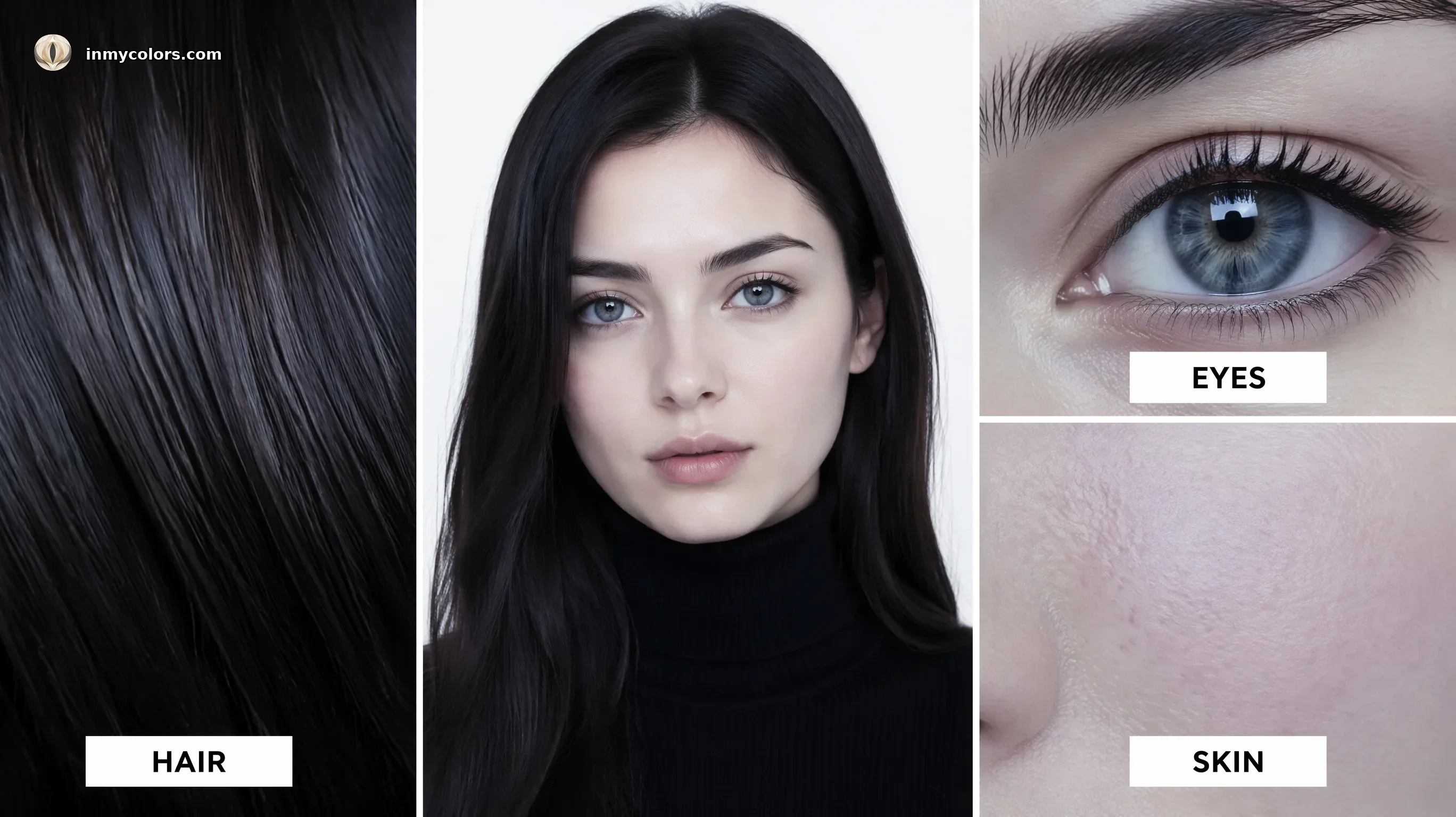
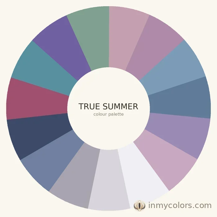
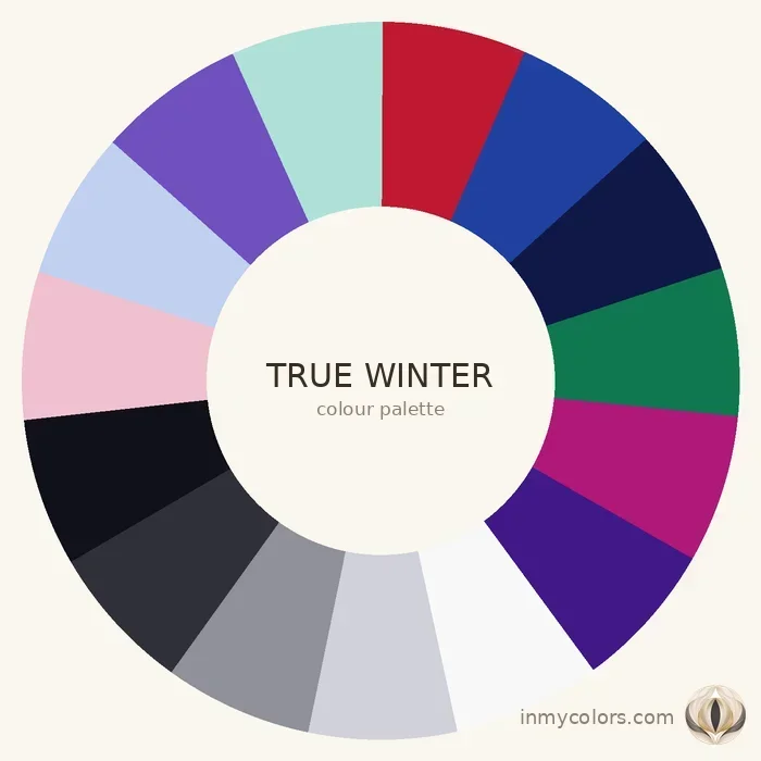
True Summer has soft, muted cool colouring. Medium contrast, no vividness, rosy-cool undertone. Best colours: dusty rose, raspberry, mauve, soft navy, cool grey, lavender. True Winter has clear, cool colouring with moderate to high contrast. Best colours: true black, pure white, cool red, royal blue, deep emerald. The difference in palette is dramatic — put both side by side and they read entirely differently.
Soft Summer vs Bright Winter
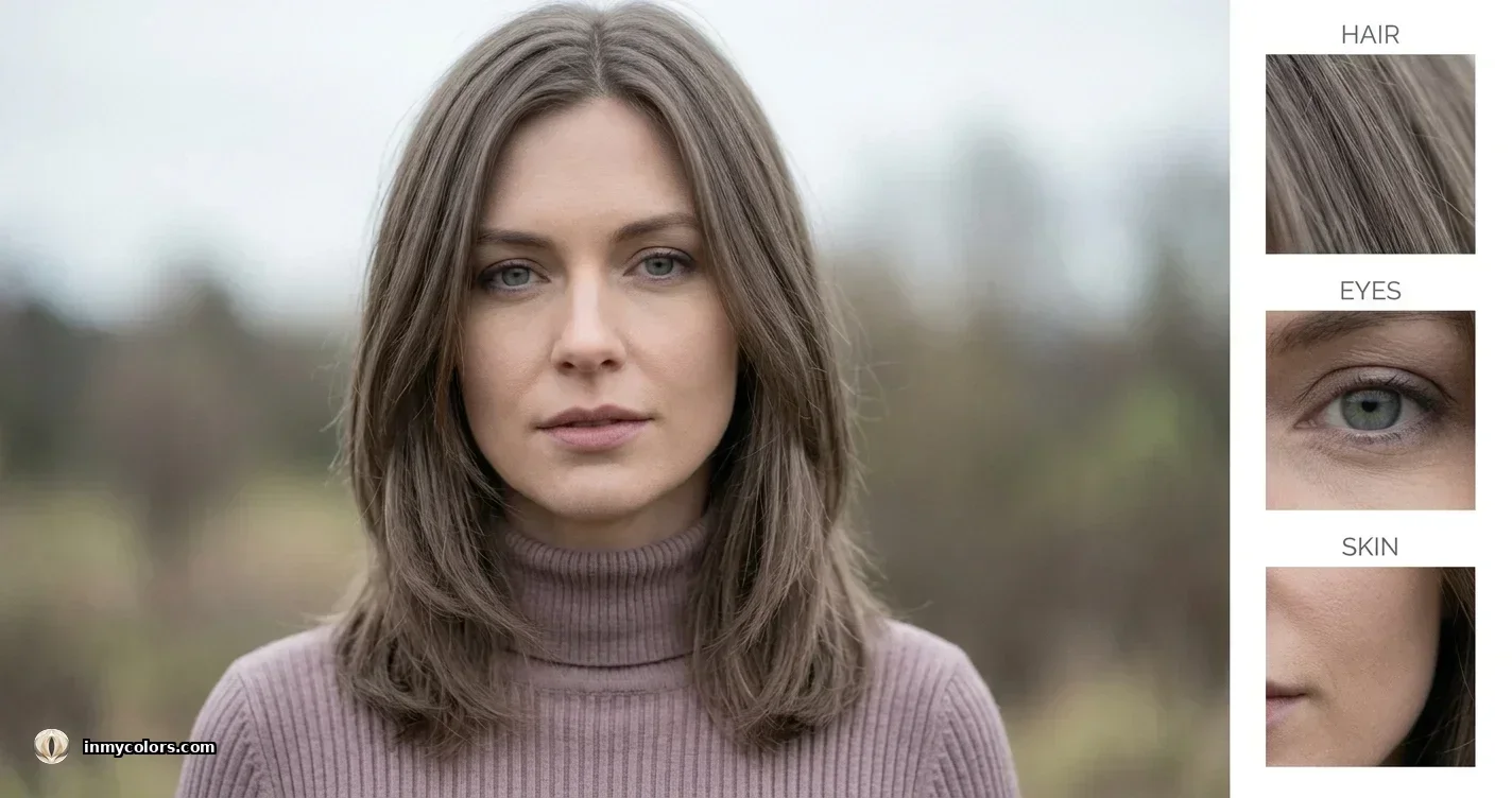
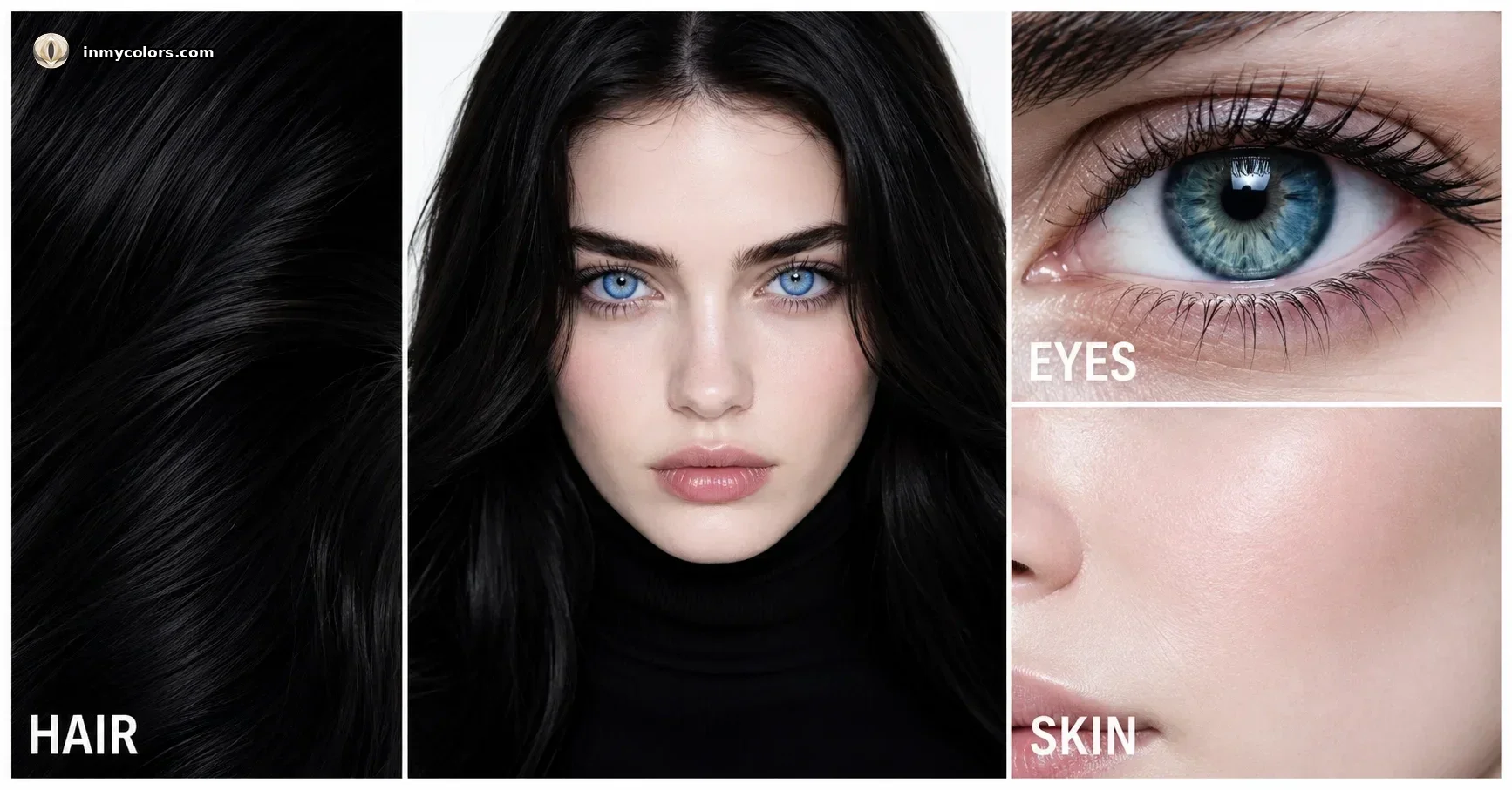
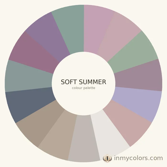
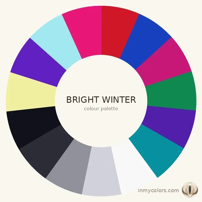
This is the most confusing comparison because Soft Summer and Bright Winter seem to share little surface similarity. Soft Summer is the most muted and neutral of all 12 seasons — greyed, cool, delicate. Bright Winter is the most vivid cool season — intensely saturated, high-chroma, often surprisingly high-contrast. If you're between these two, the chroma test is definitive. Put the most vivid cobalt you can find against your face. If it works, you're Bright Winter. If it overwhelms you entirely, Soft Summer.
Light Summer vs Dark Winter
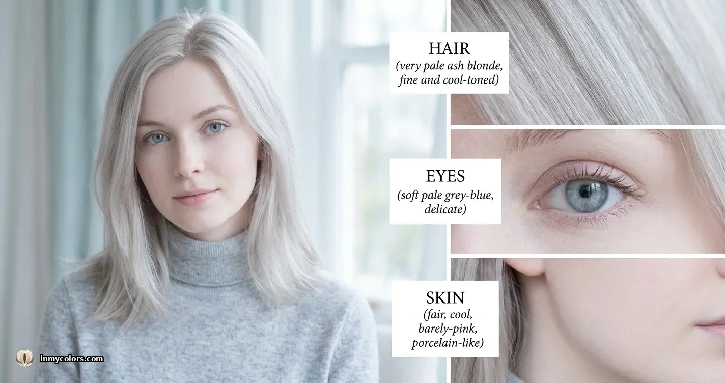
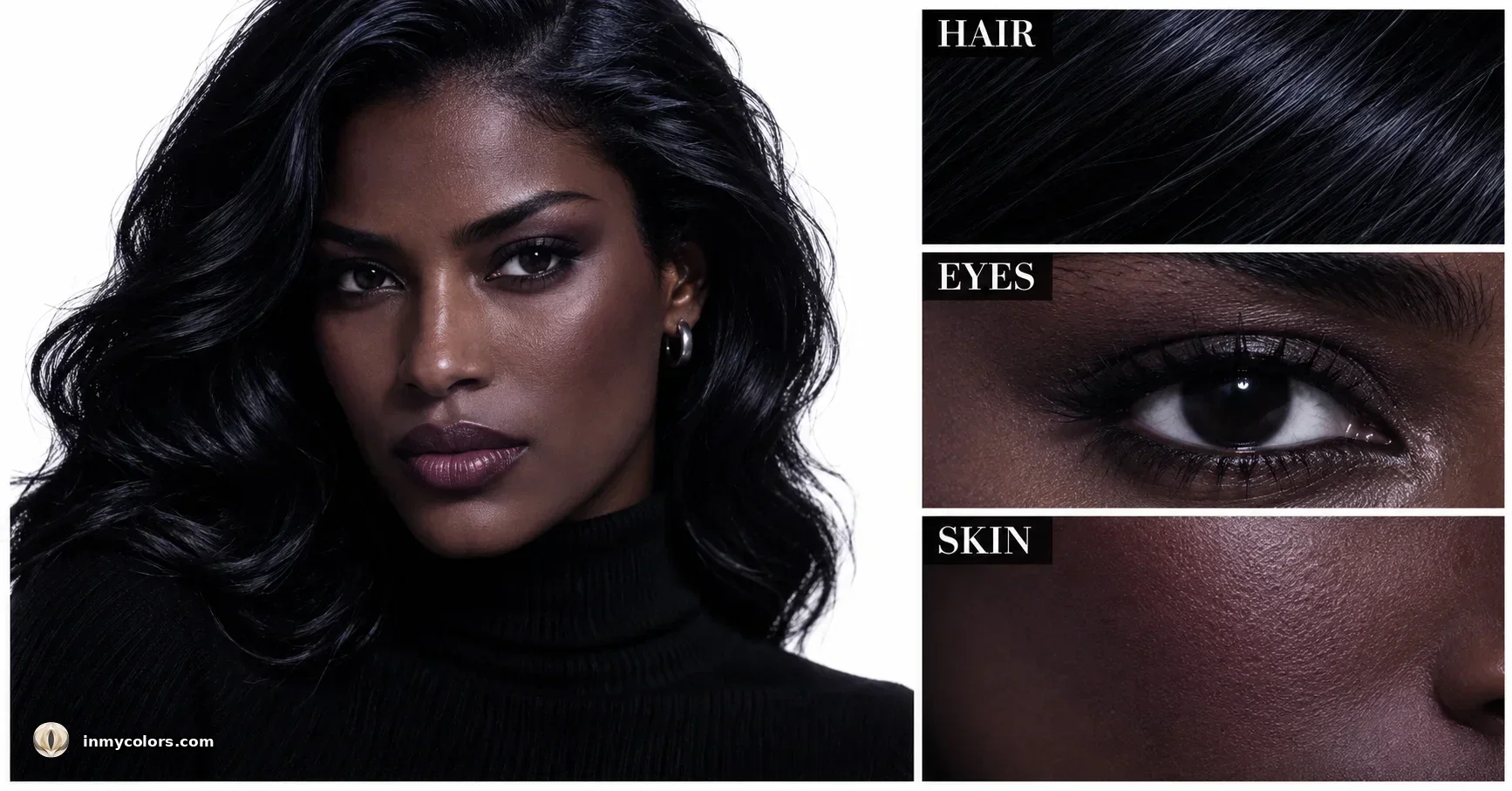
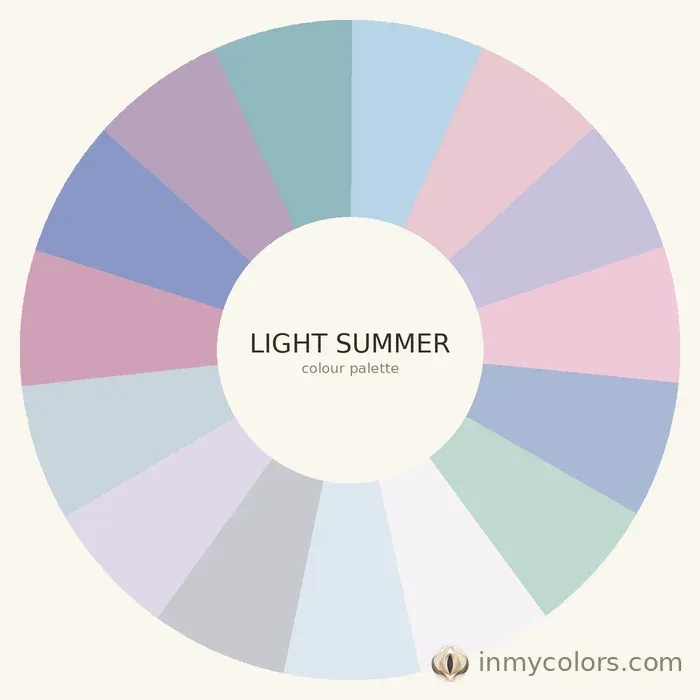
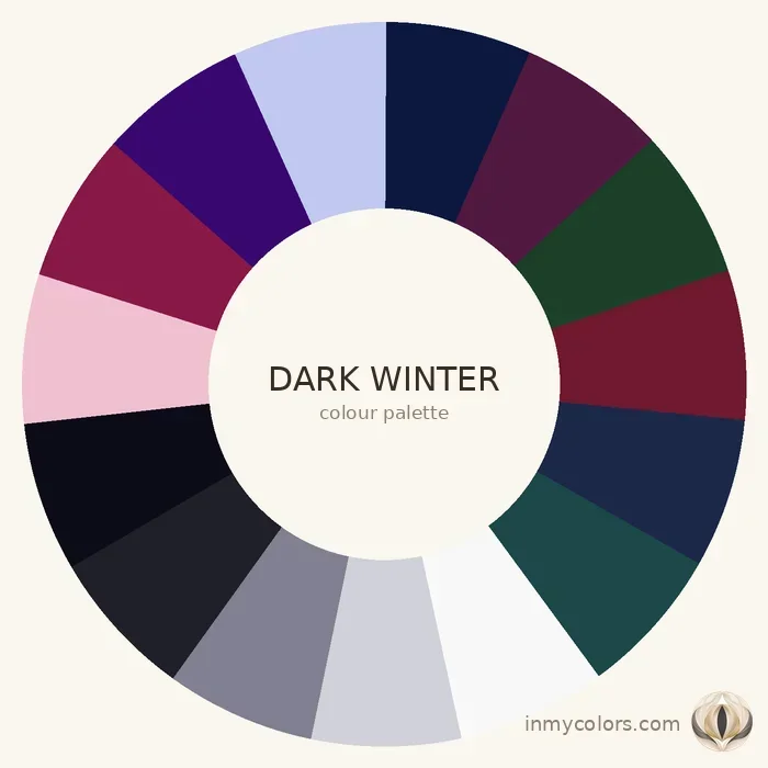
This may seem like an unlikely pairing but both can appear at the lighter end of their families. Light Summer is the fairest, most delicate Summer — very low contrast, very muted, rosy-cool palette. Dark Winter is the deepest, most dramatic cool season — near-black hair, deep cool skin, and a palette built around true black, deep burgundy, and midnight navy. The chroma and value difference between them is the largest of any Summer/Winter pairing.
What Happens When a Summer Wears Winter Colours
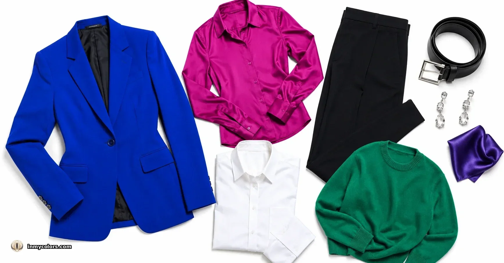
A Summer person in Winter colours — stark white, vivid cobalt, fuchsia — typically looks as though they're being worn by the colour rather than wearing it. The vivid, clear colours draw all attention away from the face. The skin can appear drained, sallow in an unexpected way (even though you're cool-toned), or simply overpowered. The face retreats.
This is the paradox of wearing colours that are technically "your temperature" but wrong in chroma: even though Summer and Winter are both cool, a Summer in vivid Winter colours does not look cool and elegant. They look faded against a loud backdrop.
What Happens When a Winter Wears Summer Colours
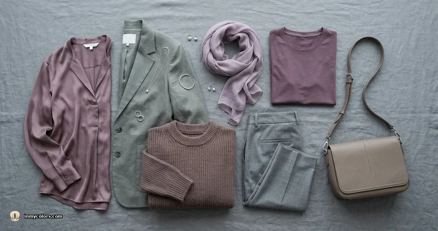
A Winter person in Summer's muted, dusty palette typically looks flat and underpowered. The natural contrast and clarity of Winter colouring needs clear, vivid colour to activate it. In dusty rose or muted mauve, a Winter person can look almost unwell — the muted colours absorb their natural contrast rather than working with it. The face loses its sharpness.
Getting Your Answer

If you're cool-toned and unsure, do these three checks:
- 1.Vivid cobalt or fuchsia against the face: does it activate or overwhelm?
- 2.Stark white against the face: does it work or wash you out?
- 3.Natural contrast level: high or low?
Two or three pointing toward vivid/clear/high contrast = Winter. Two or three pointing toward muted/soft/low contrast = Summer.
From there, your specific sub-season depends on where within Summer or Winter you sit on the value and chroma scales.
Find your season at inmycolors.com.